Skip to content
Let's Talk
NavigateMENU / 04
01About
02Our Work
03Services
StrategyCreativeWebsite DevelopmentSoftware DevelopmentBusiness Automation
04Contact
More
BlogFlight Program
Elsewhere
Case study

A brand you can lean on

Updated July 2, 2026

Brand

Strategy

Creative

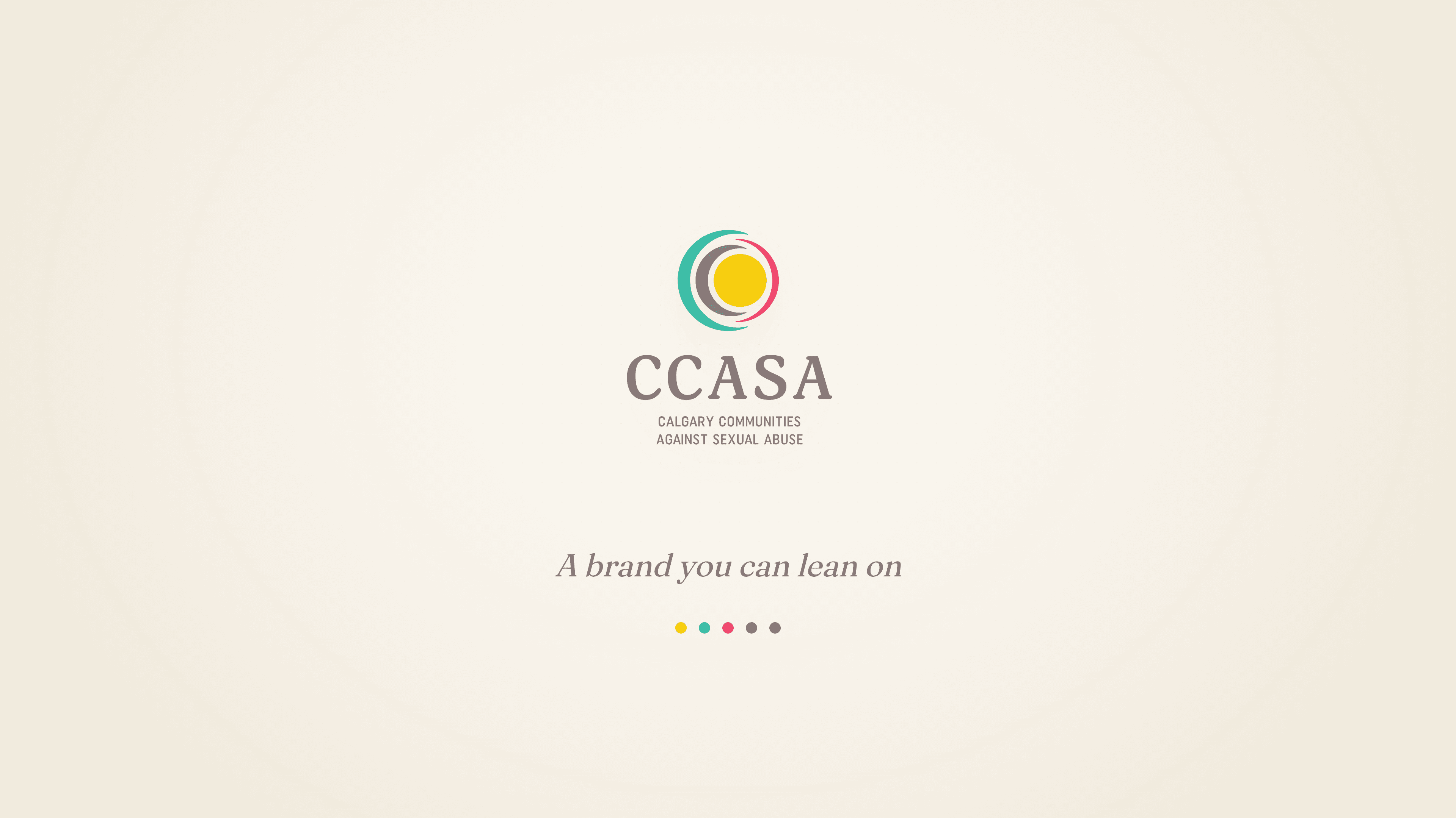
For more than 25 years, Calgary Communities Against Sexual Abuse has been a steady presence for people affected by sexual violence. When they were ready to carry that work into a new decade, they came to us for a brand that felt less like a help line and more like a friend. We rebuilt their identity from the ground up.

See the Site
CCASA's mark: a warm sun embraced by open concentric rings
Detail

An older look, ready for a warmer face.

CCASA arrived with an identity that no longer matched the organization it had become. The care was there. The visual language was not.

They needed a face that could hold hard conversations gently, something people in distress could lean on. Less a help line, more a partner and a pillar. So we started from scratch.

The CCASA logo system: preferred, horizontal and icon lockups
Field note

A mark for unity and wholeness.

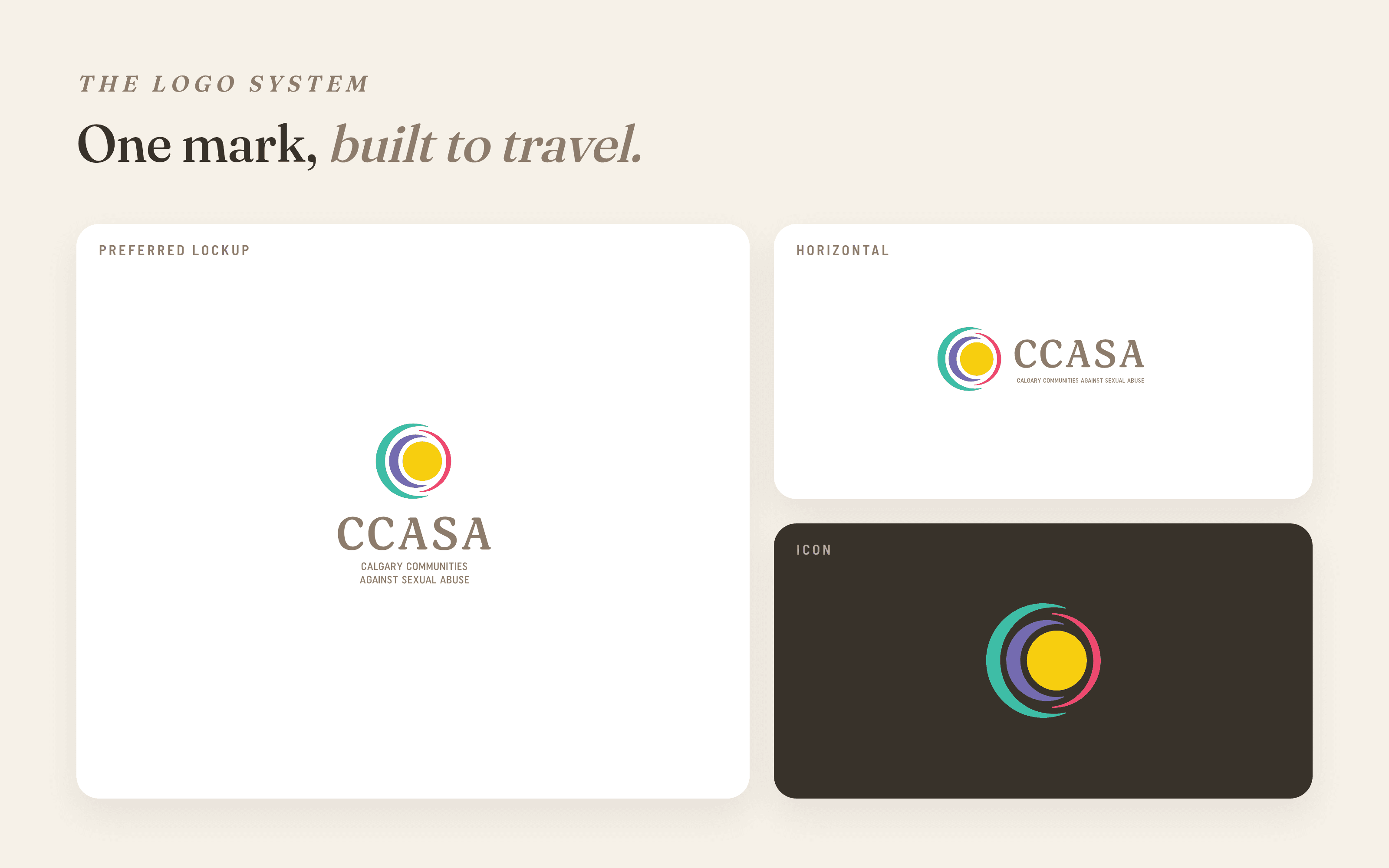
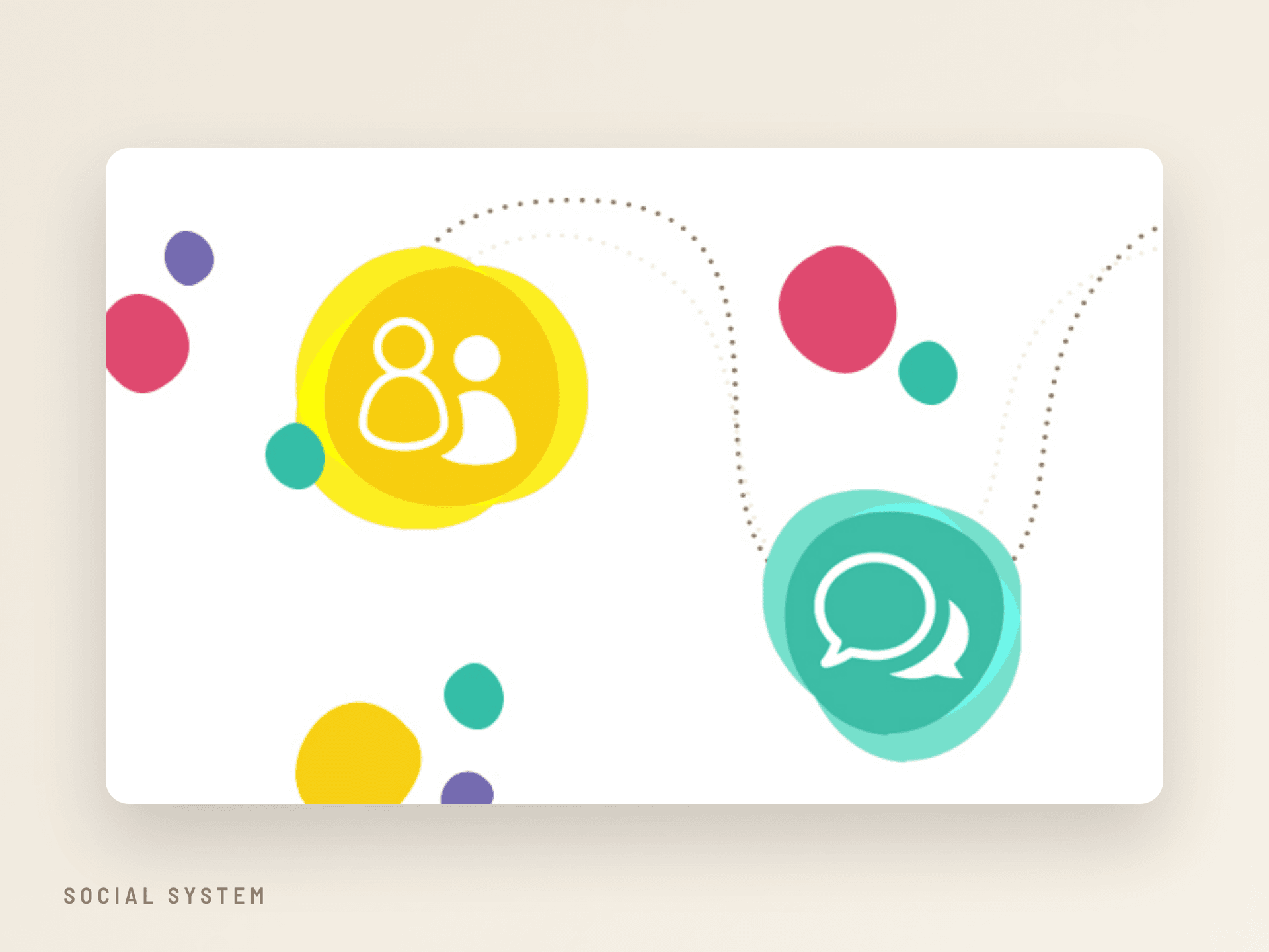
At the centre sits a sun, warm and steady. Around it, open rings reach out like arms of support, never quite closing, always leaving room for someone to step inside.

It reads as personal evolution and as the community surrounding those affected. One mark, built to travel from a business card to an event banner without losing its warmth.

Detail

A colour system with meaning.

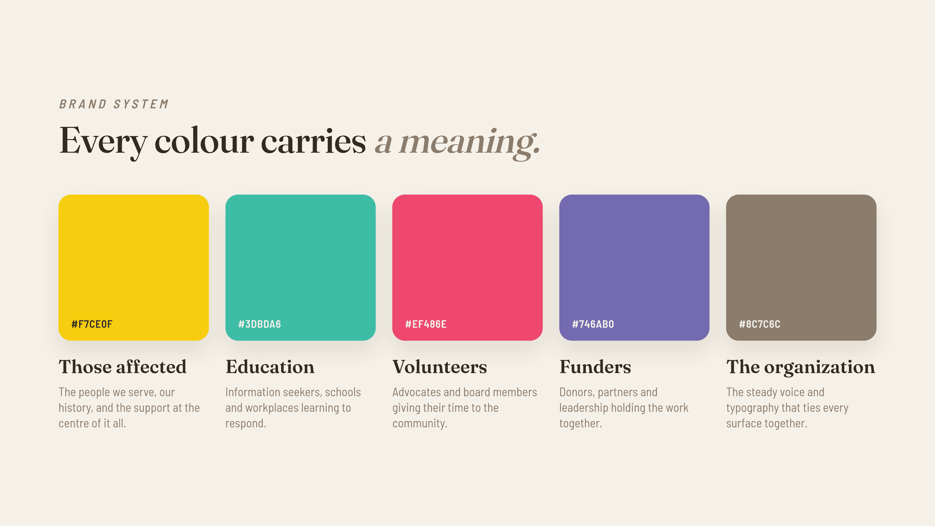
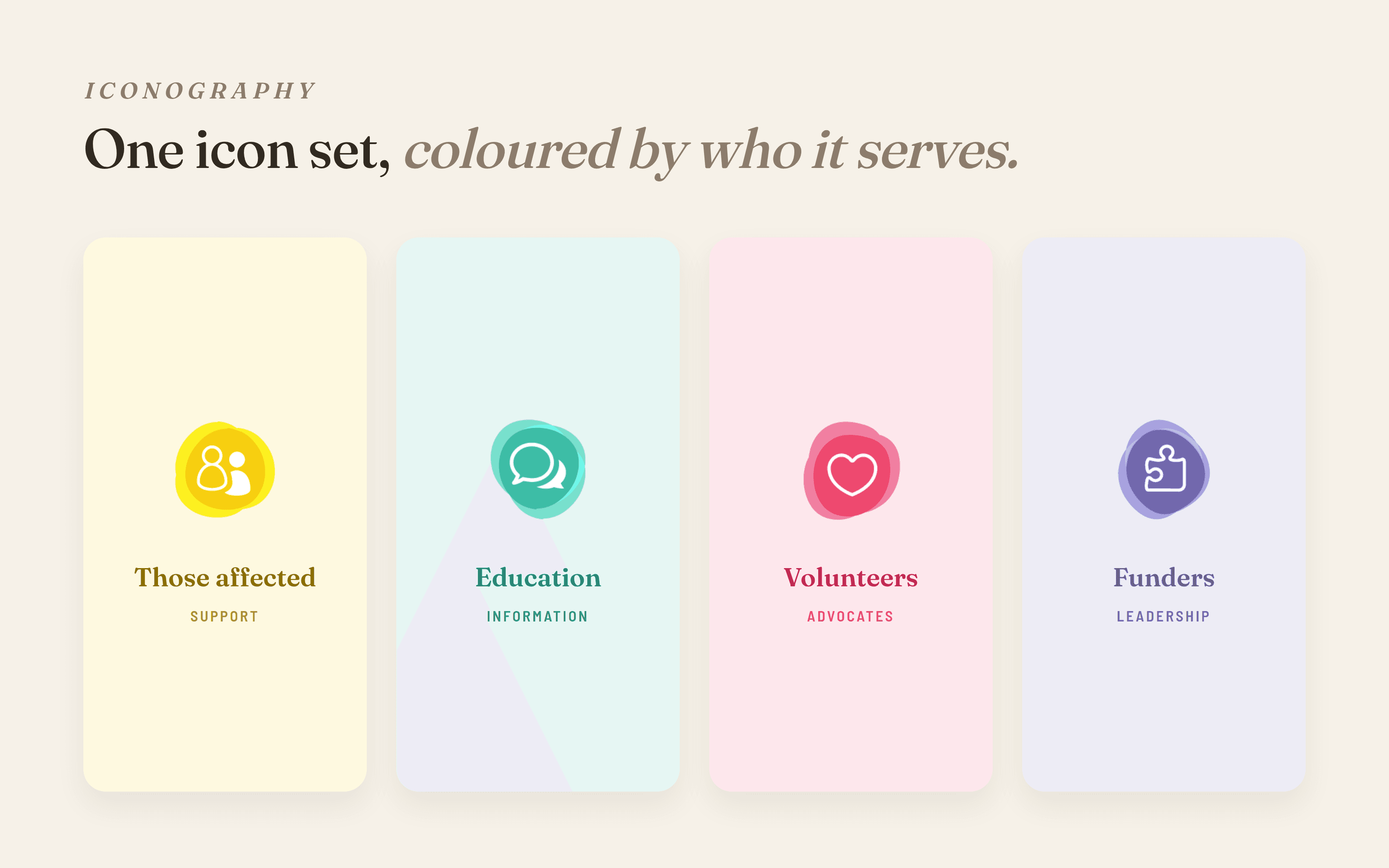
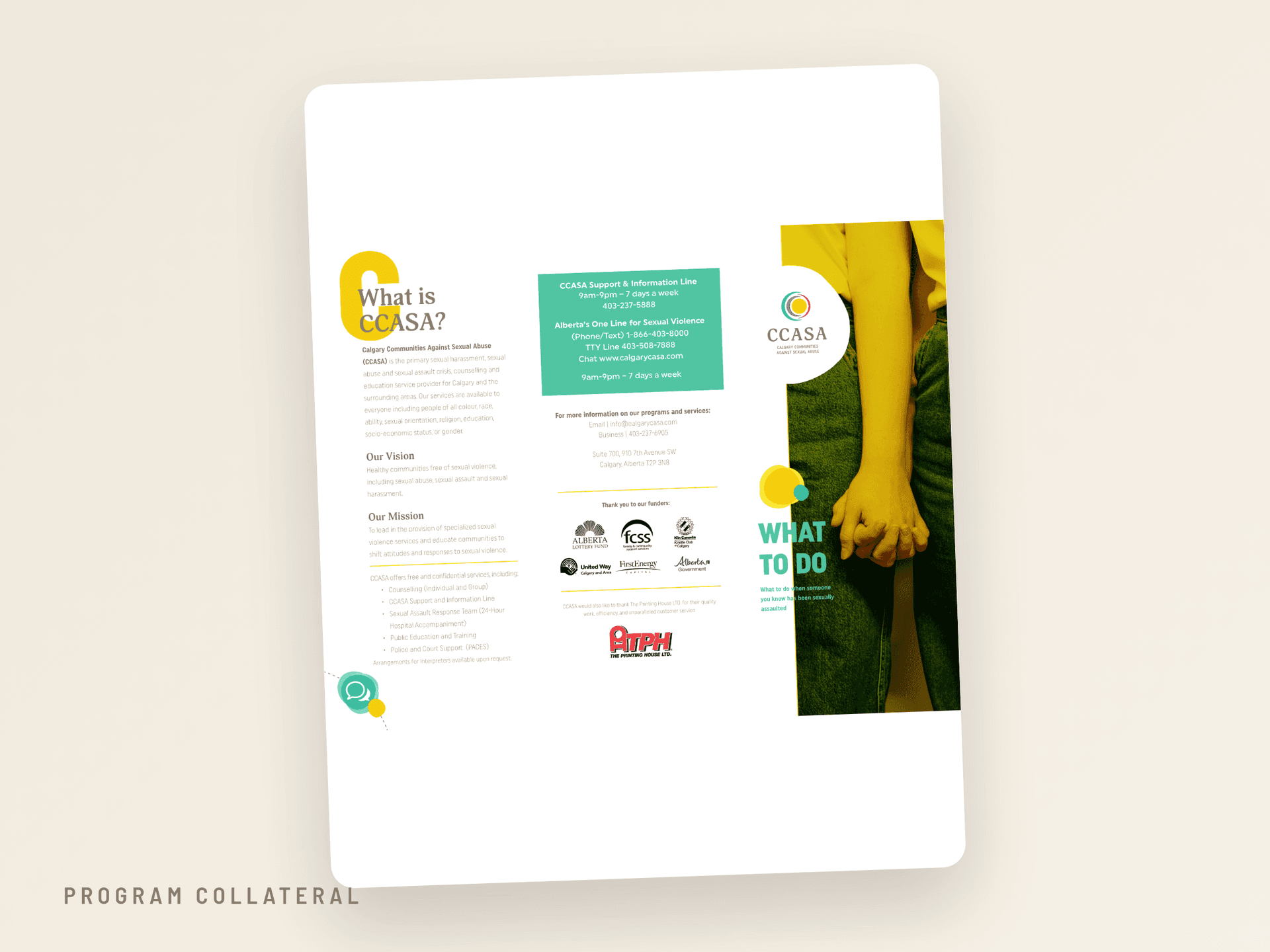
The palette does more than look friendly. Every colour is tied to the people CCASA serves, so the brand can speak to each audience before it says a word.

Yellow for those affected. Teal for education. Pink for volunteers. Purple for funders. A steady warm gray for the organization itself.

CCASA's five brand colours, each tied to an audience it serves
One icon set, coloured by the audience it serves
Detail

Then we built it into the world.

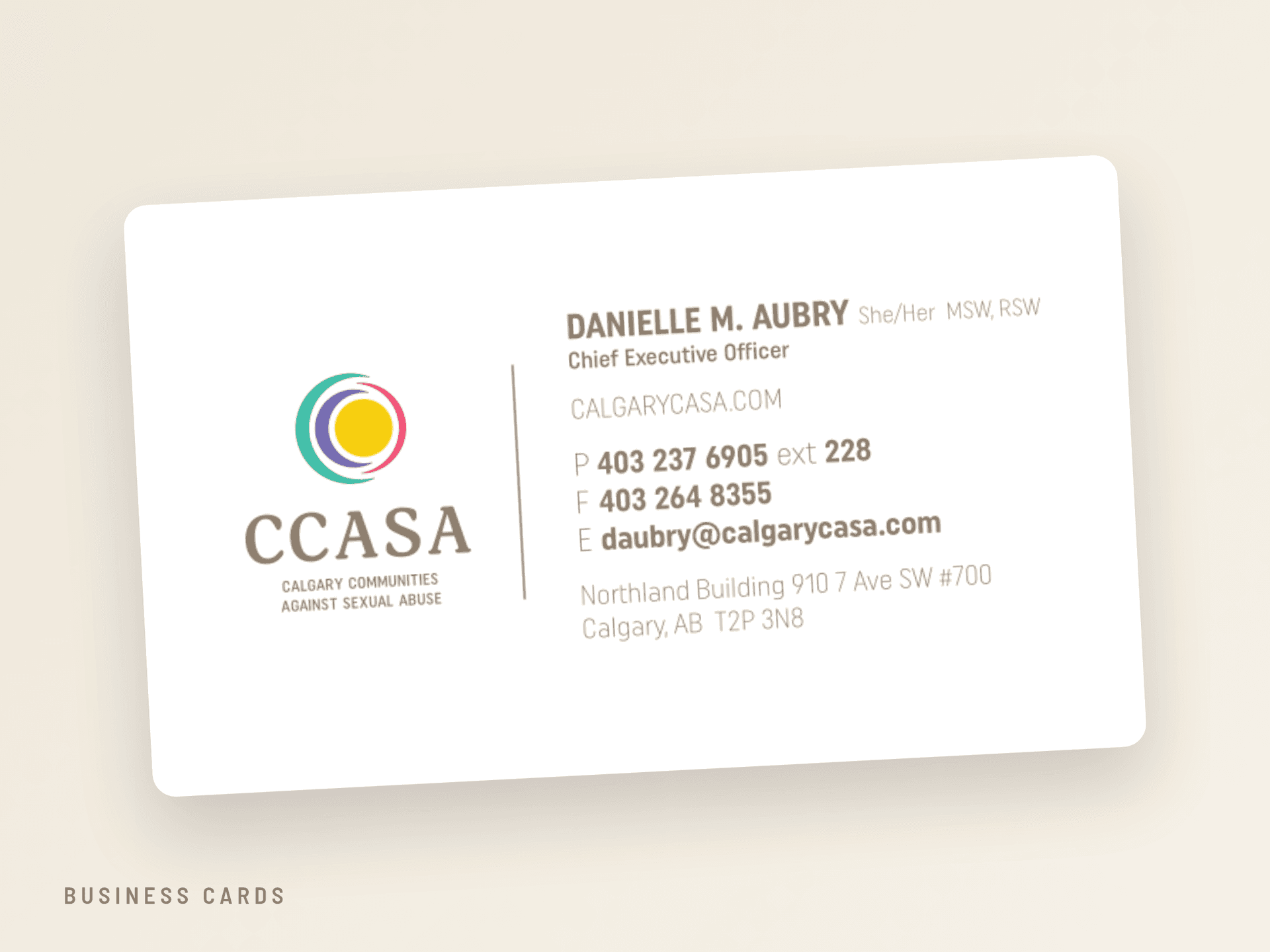
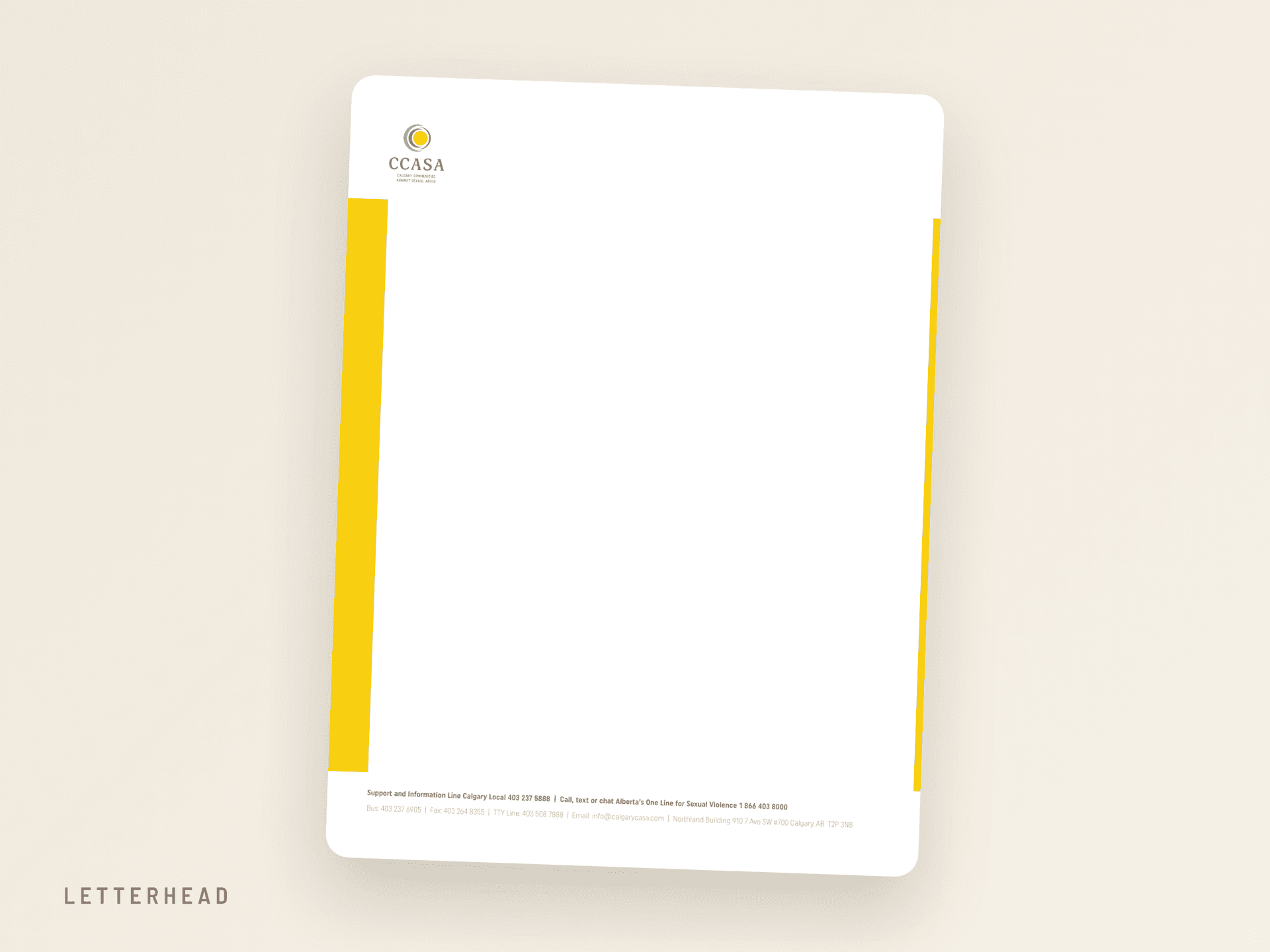
From there we produced the full kit: logo lockups, business cards, letterhead, event banners, social templates and brand guidelines. Everything an organization needs to show up looking like itself, everywhere.

CCASA business cards
CCASA letterhead
CCASA program collateral
CCASA social system
CCASA mark and colour tokens carried into the website
Field note

From identity to interface.

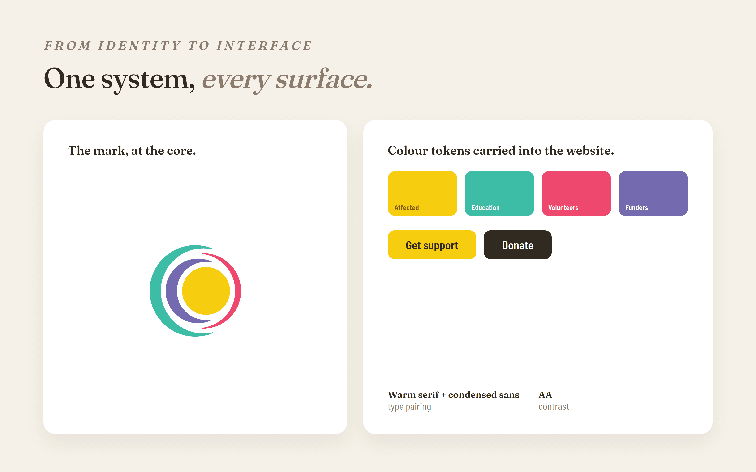
The brand did not stop at print. We turned it into a design system: type, colour tokens, spacing and components that carried straight into the website build.

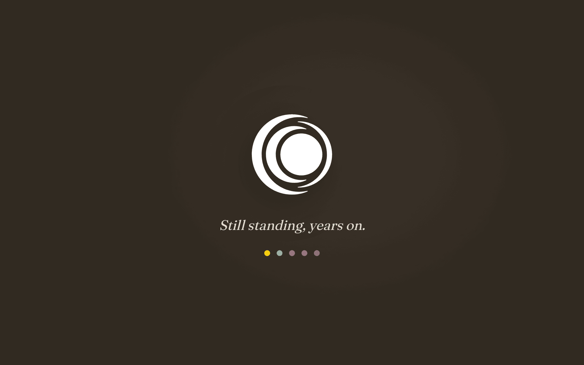
Years on, that same system still runs under the hood of their site. The brand we set did not just launch. It stuck.

Detail

Still standing, years on.

We still spot the mark at events and activations, on banners and across their social feeds. The logo we asked them to stand behind has become genuinely recognizable in Calgary.

For a one off brand project, that longevity is the whole point.

In closing

A brand that still feels like a friend.

CCASA is one of the earlier non profits we worked with, and it set the tone for how we approach this work: warm, careful, and built to last. We are proud every time we see it out in the community, still doing its job.

Visit CCASA
The CCASA mark on a warm dark field

MORE PROJECTS

Centre for Co-operative Learning pentagon ring and co-op houses
StrategyBrandWebsite Design+1

Co-op Learning for CHF BC

With an aging main site, building and managing events and resources was becoming a tall task for the CHF BC team. Our project work was scoped around simplifying the CMS experience to allow the marketing and resource teams to easily build and modify their site without the restrictions of their old, regulated infrastructure.

Explore
The Explore Lethbridge app logo on brand blue
Software DevelopmentStrategyWebsite Design+2

Tourism Lethbridge

Tourism Lethbridge is the destination marketing organization for Lethbridge, Alberta. We rebuilt their website, then brought their gamified tourism app, Explore Lethbridge, across the finish line: one cohesive design system, a refined Python platform, and points-and-rewards exploring at 350+ locations.

Explore
CHF Canada brand mark on Federation Blue
BrandStrategyWebsite Design+2

CHF Canada

CHF Canada is the national voice of co-op housing, supporting over 900 member co-ops from coast to coast. We refreshed their brand, untangled a sprawling legacy site, and rebuilt it as a fast, fully bilingual platform their team can run on their own.

Explore
See all projects
Paper Crane / Studio
CALGARYVANCOUVER·© 2026

A digital transformation studio building considered, durable web work for ambitious operators.

Services
  • Creative
  • Strategy
  • Website Development
  • Software Development
  • Business Automation
  • ─AI Automation
  • ─Workflow Automation
Navigate
  1. 01About Us
  2. 02Our Work
  3. 03Contact Us
Elsewhere
© 2026   PAPER CRANE MEDIA LTD.
Terms & Conditions
Privacy Policy