Skip to content
ServicesOur WorkAbout
Let's Talk
NavigateMENU / 04
01About
02Our Work
03Services
StrategyCreativeWebsite DevelopmentSoftware DevelopmentBusiness Automation
04Contact
More
BlogFlight Program
Elsewhere
Case study

Marketing Gone Maisie!

Updated July 14, 2026

Brand

Creative

Strategy

Marketing

Website Design

Maisie Eatery brought something new to Calgary's Sam Centre: an elevated all day eatery with a cheeky, fairy tale heart.

We built the whole brand, from name and packaging to website and launch, and it went on to win three MUSE Creative Awards.
See the Site
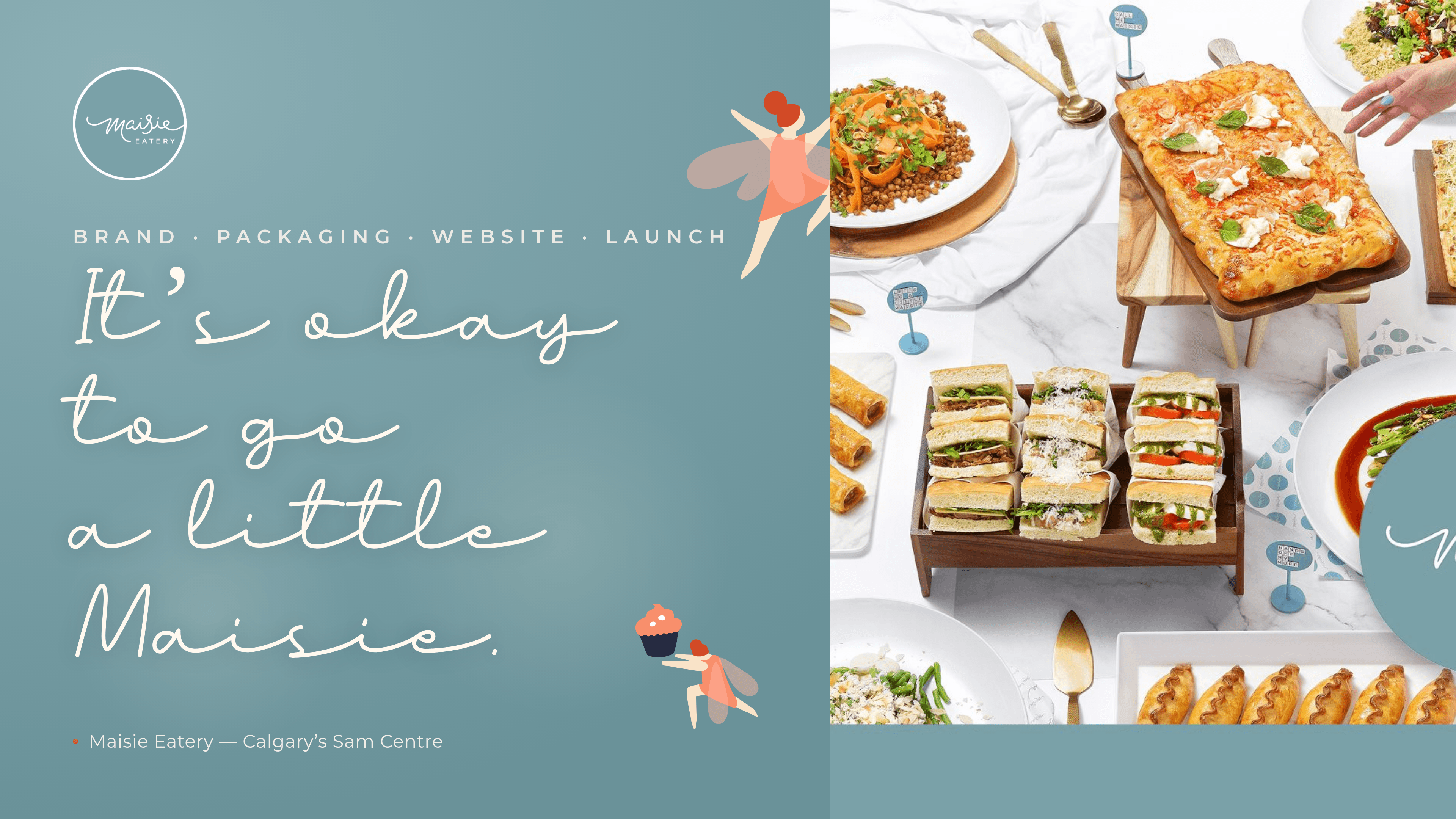
Maisie Eatery hero: the script wordmark and cheeky fairies over a fresh catering spread
Detail

Who is Maisie?

Maisie Eatery arrived as an unknown name attached to a very known one. Built in partnership with the Calgary Stampede Foundation, it needed to carve out its own place in the city: an elevated all day spot that Calgary was missing, with breakfast and lunch, cocktails and sweet treats, and a menu that changes daily.

The name is personal. Maisie was the figurehead who first inspired the Executive Chef to cook, a woman who fed fairy cakes to the people she loved as little tokens of care. In a building where every gallery is named for a Stampede legend, Maisie became the only space named after a woman.
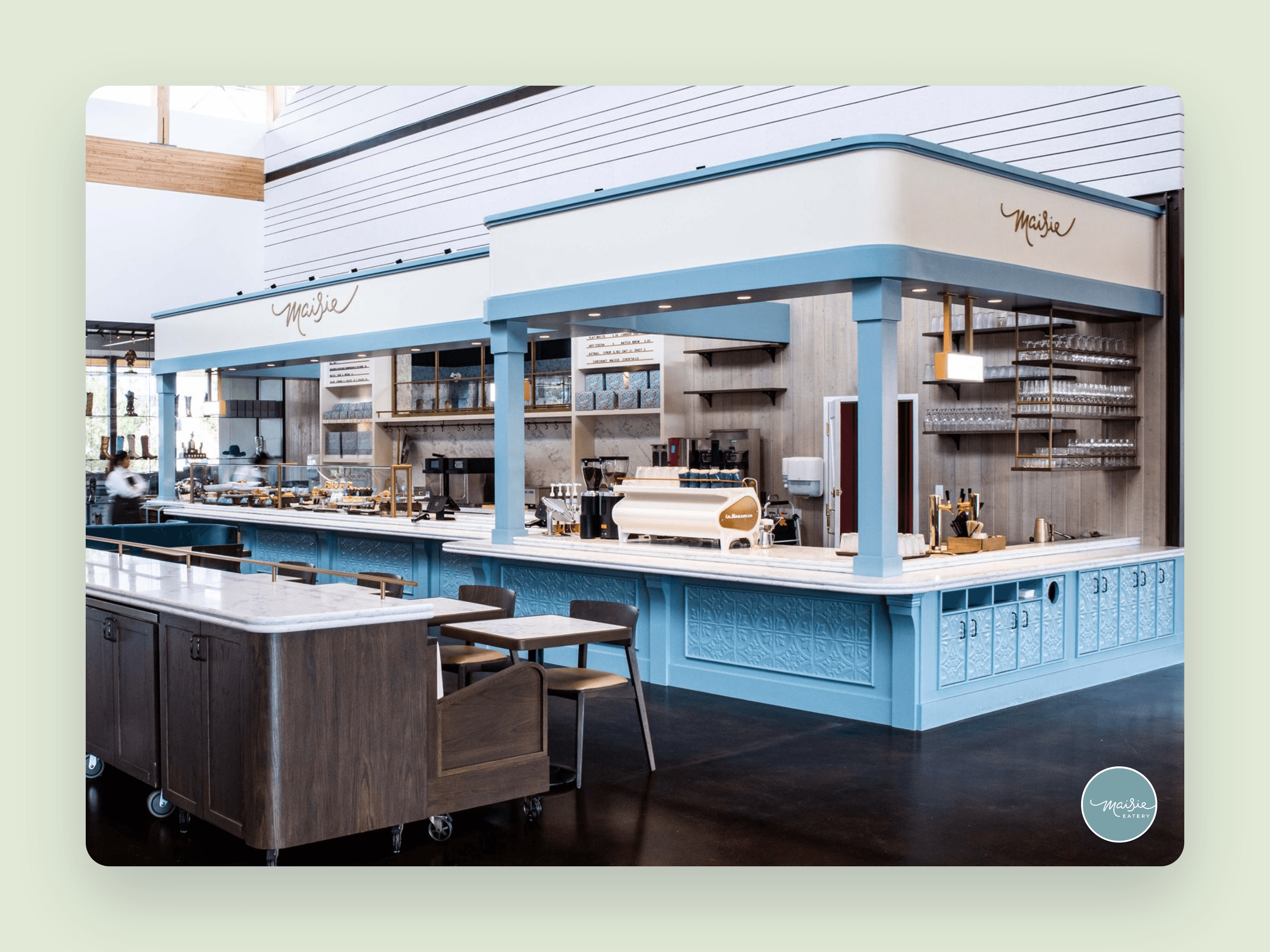
The Maisie Eatery counter inside the Sam Centre, soft blue millwork and the script mark overhead
Field note

A place worth the photo.

We built Maisie from the ground up, then built it into the room. Inside the Sam Centre the eatery reads as unmistakably hers: soft blue millwork, the script mark overhead, a bright and open counter.

Guests do not need a ticket to visit. They just wander in, and more often than not they photograph it before they order.

Detail

What we built.

A full brand, not just a logo. From the first sketch to the last van, everything came out of one idea:
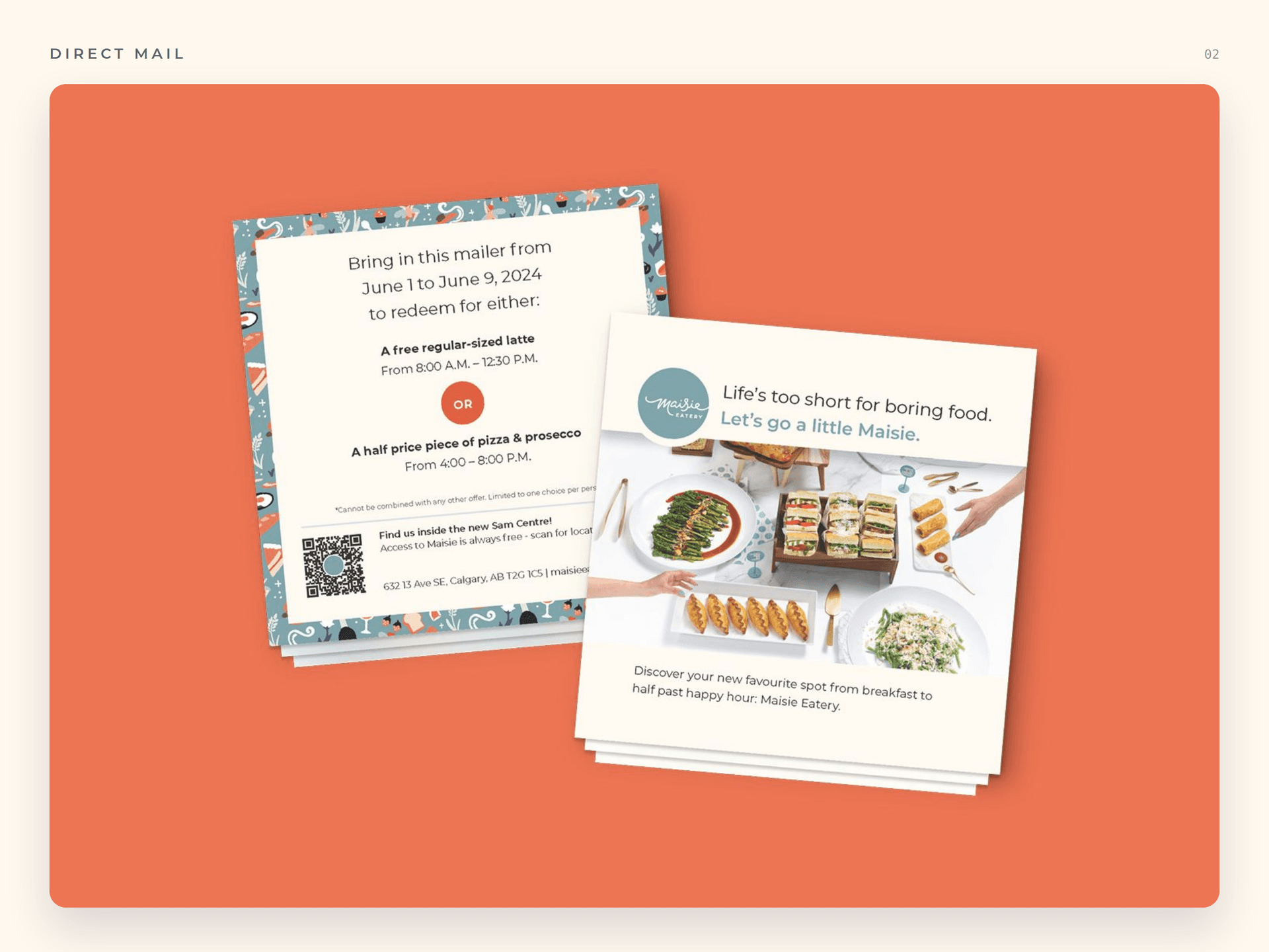
  • Name, story and full visual identity
  • Brand guidelines and the fairy illustration world
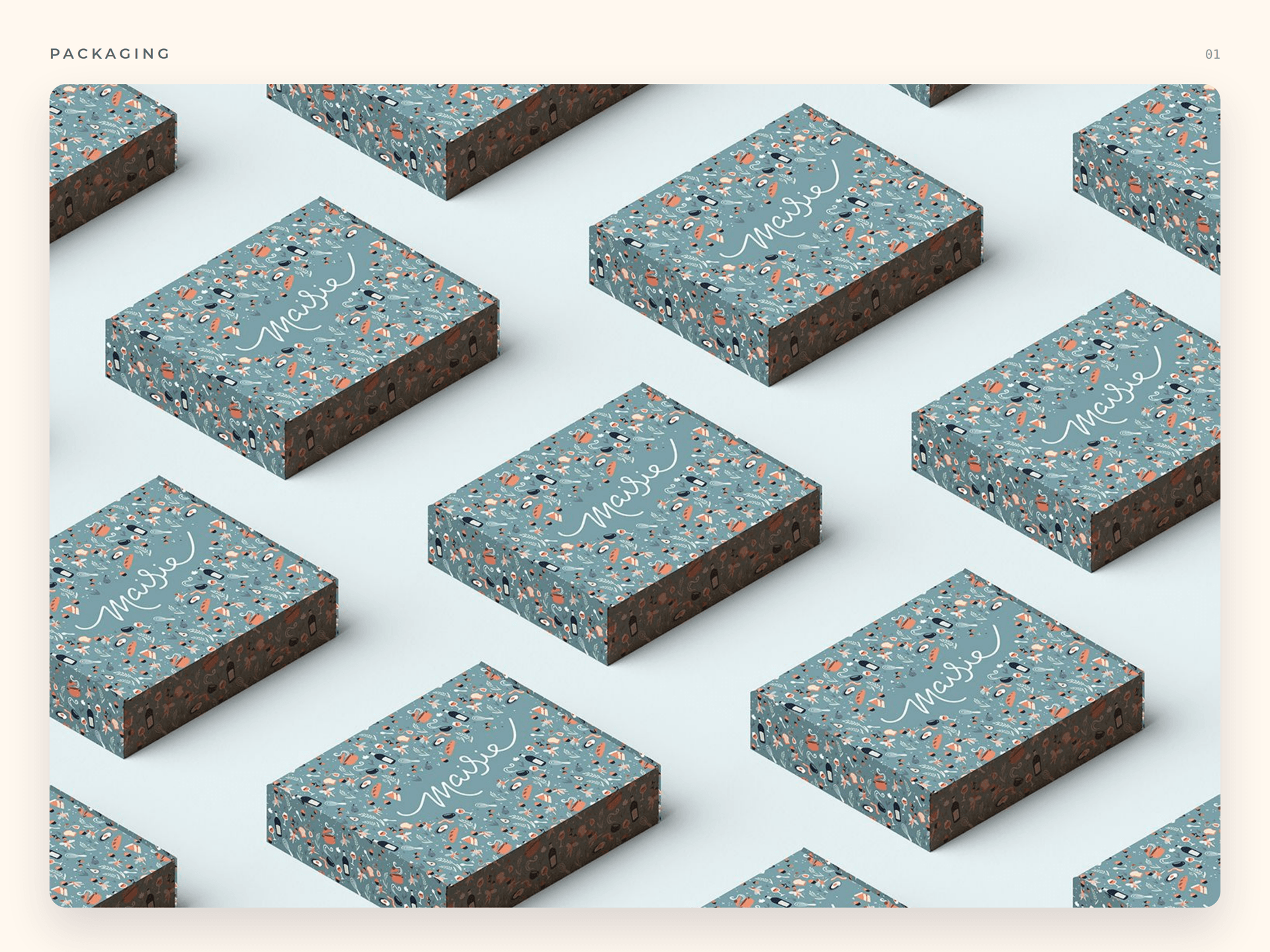
  • Custom packaging across coffee, catering and treats
  • Website design and launch
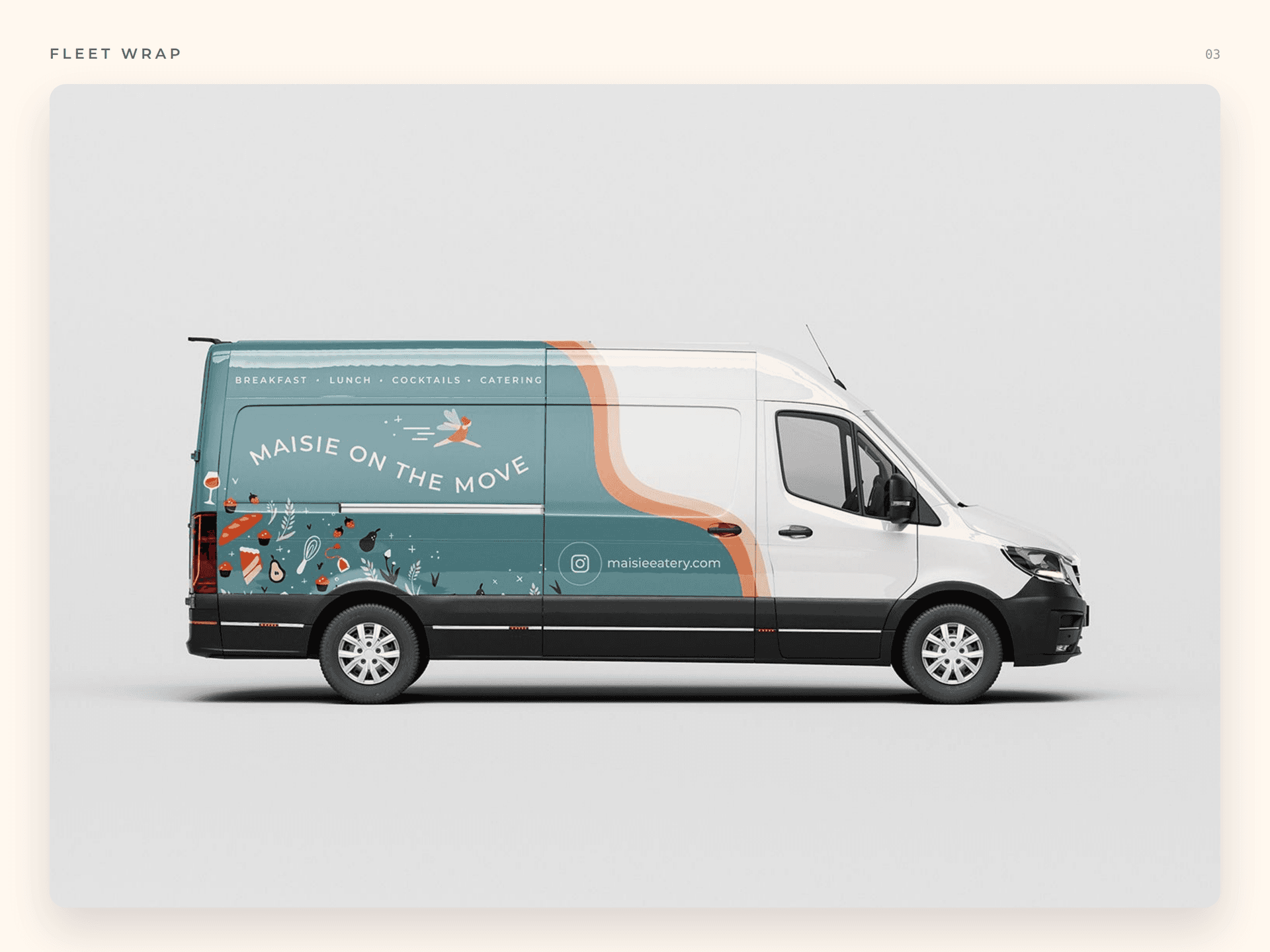
  • Signage, billboards and van wraps
  • Uniforms, PR and campaign planning
Maisie patterned catering boxes
Maisie direct mail campaign
Maisie on the Move delivery van wrap
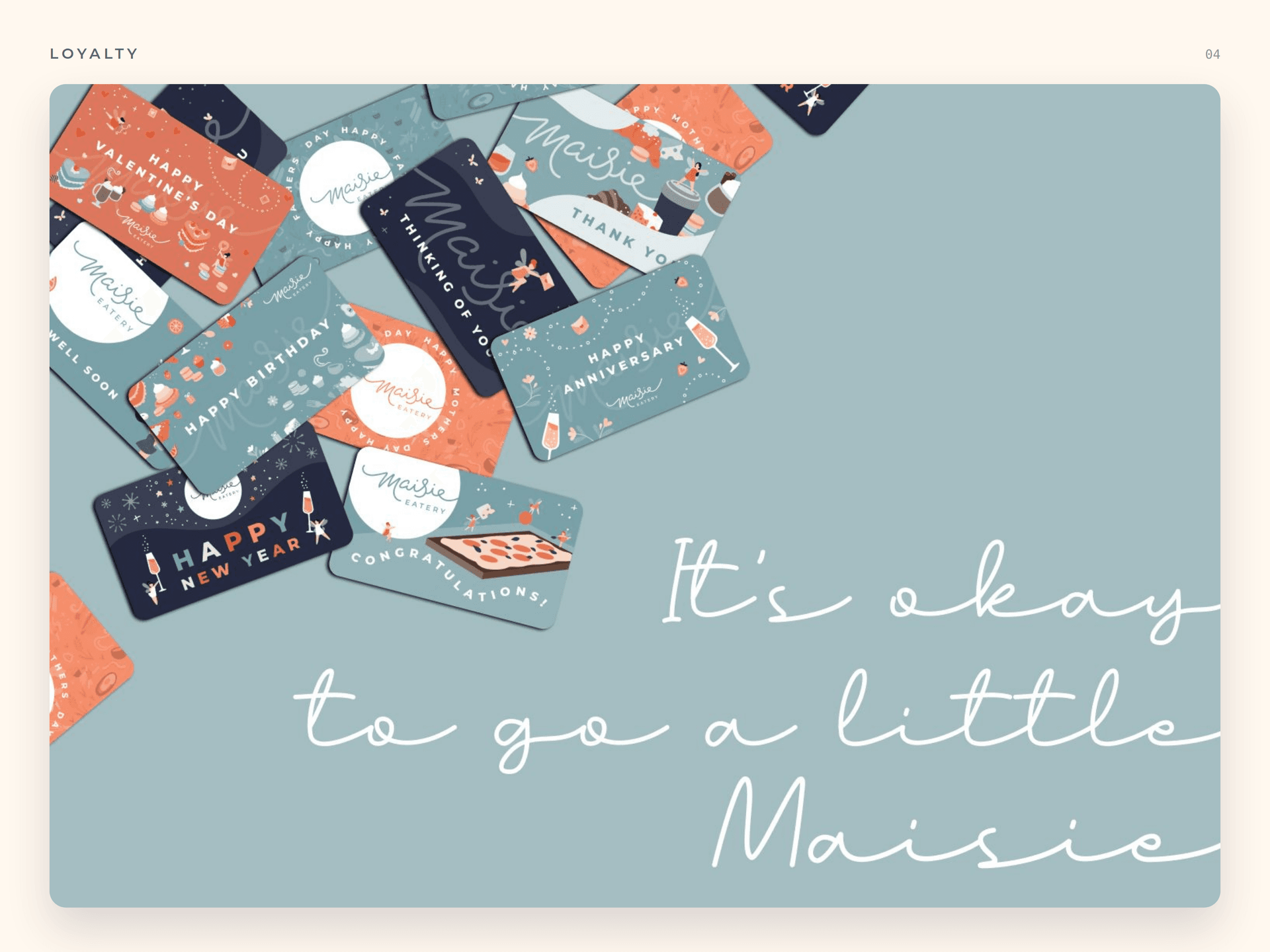
Maisie loyalty and gift card system
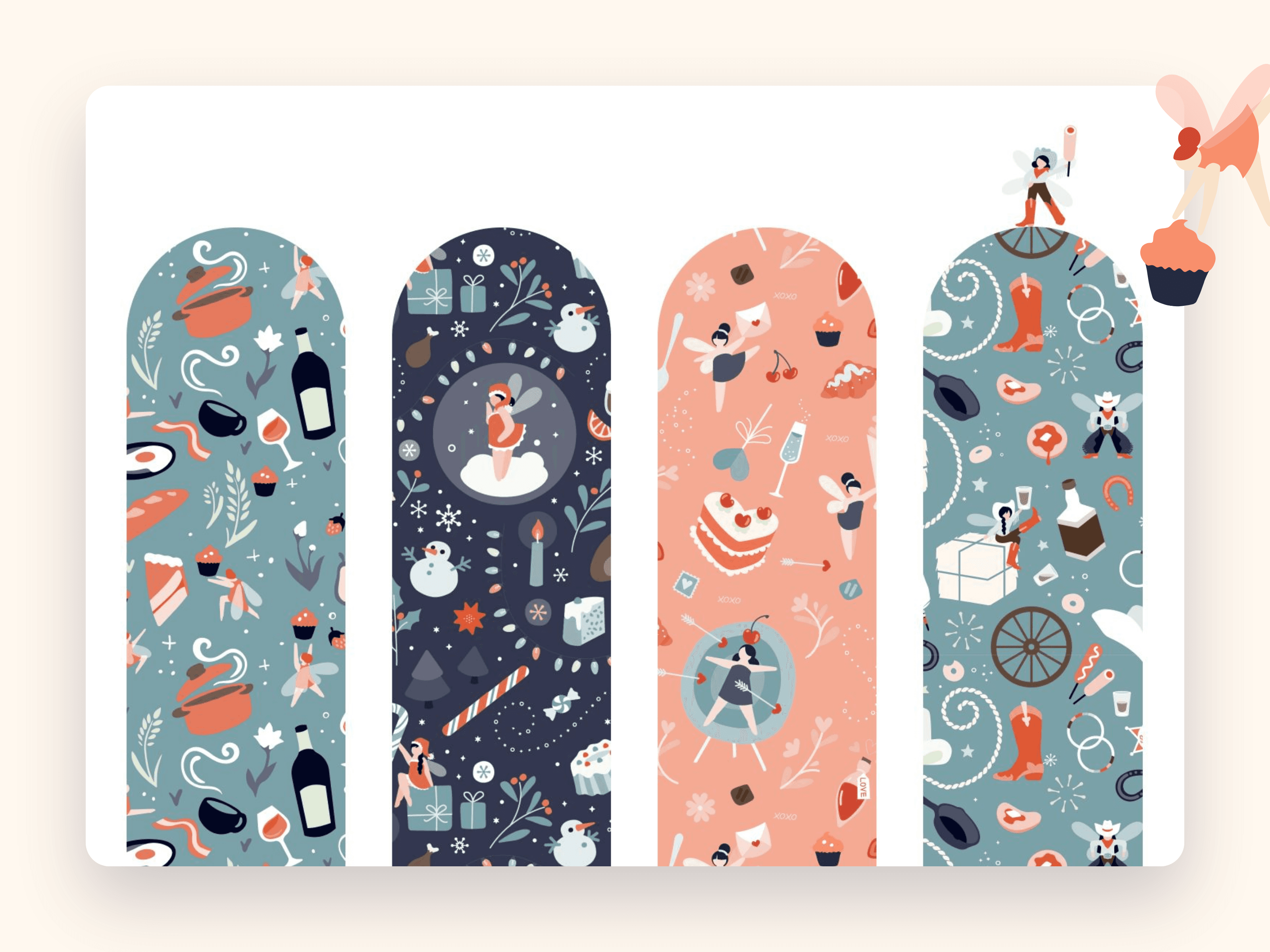
Maisie's seasonal illustration patterns, full of cheeky fairies and food motifs
Field note

A cheeky little world.

At the centre of it all is a cast of mischievous fairies. Drawn from old world lore but a little more playful, they jump, twirl, drink and dance across everything Maisie makes.

They carry the rally cry too. Grab the extra cake, order the second drink. It's okay to go a little Maisie.

Recognition

Recognized for the work.

The branding and packaging did not just land with guests. They landed with the judges too.

3×

MUSE Creative Awards

BrandingPackaging
In their words01 / 01

I am never letting these guys go.

Barbara Spain

Executive Chef

Measured outcomes

The numbers.

01
+75%
more engagement and user generated content
02
10+
media mentions across Calgary
03
+50%
lift in positive Google reviews
04
Daily
lineups for an ever changing menu
Detail

Then it grew.

After launch we kept the momentum going with events and campaigns: intimate tastings for media and influential Calgarians, showcases for event planners, gifting and steady social media.

The brand has since launched catering and events to the public, widening its reach and cementing Maisie as a go to for something a little different.
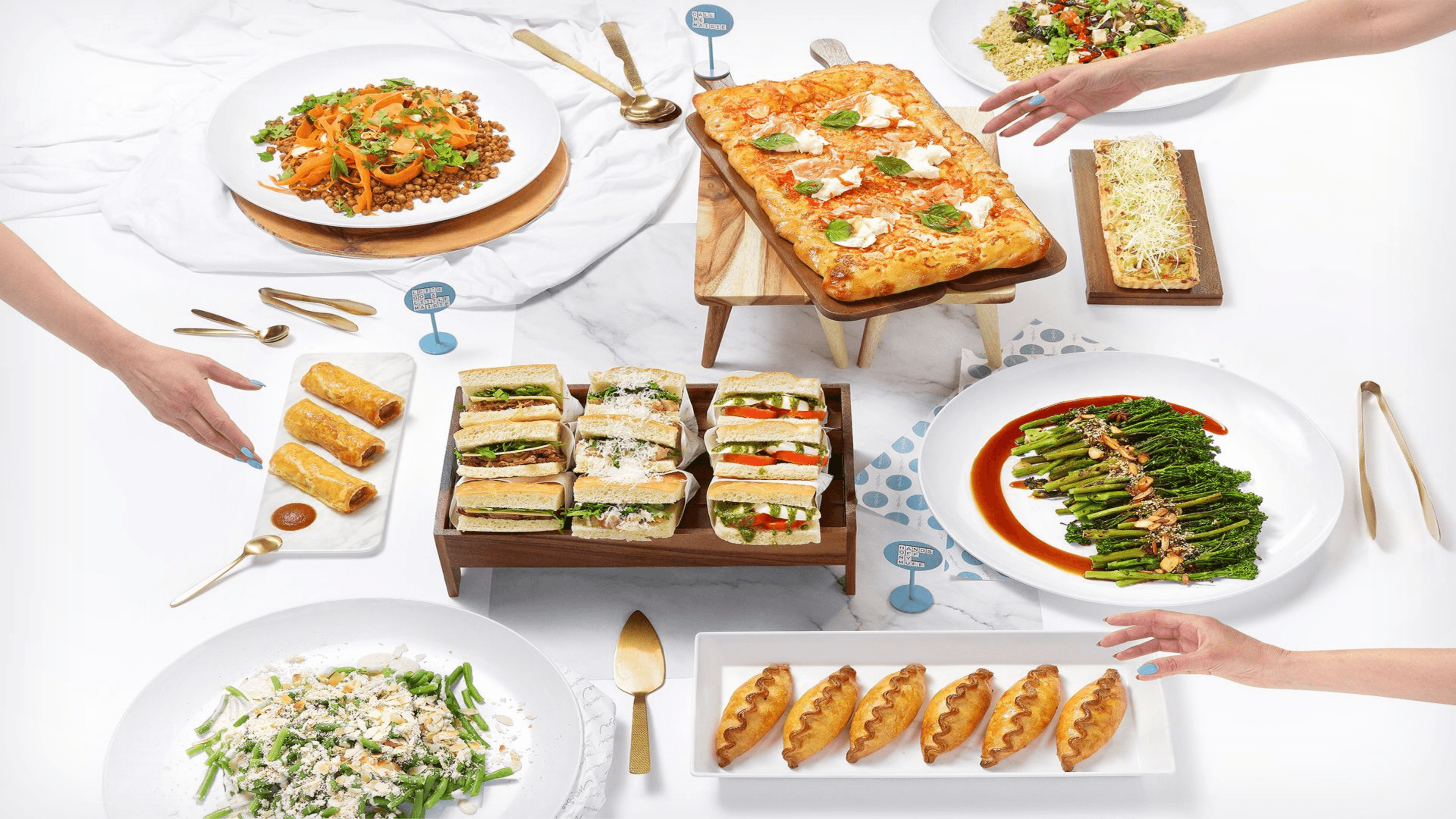
A Maisie catering spread, sandwiches, salads and fresh baking laid out to share
In closing

A little magic, still on the menu.

We do not work with Maisie day to day anymore, and that is the quiet proof of a brand done right. It stands on its own now, still drawing crowds on 17th Ave with the delicate packaging they line up to photograph.
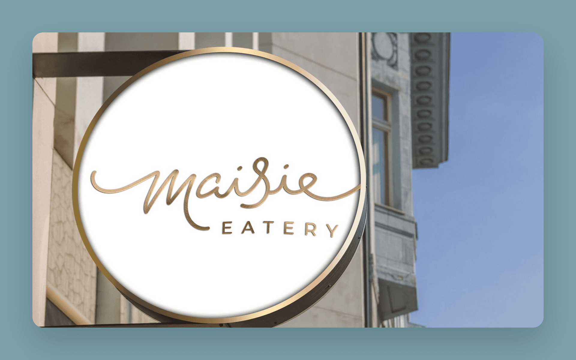
The gold Maisie Eatery blade sign outside the Sam Centre

MORE PROJECTS

Melo flavour waves and fruit line doodles on warm cream
BrandStrategyWebsite Design+2

Melo

With the ready-to-drink market full of new players, drinkers are open to more than seltzers and craft brews. Enter Melo Mead, a new name on the Alberta liquor scene, reimagining what mead could be. We built the whole thing: the name, the brand, the packaging, the 3D product and the website.

Explore
Co-op Learning / CHF BC brand mark
StrategyBrandWebsite Design+1

Co-op Learning for CHF BC

With an aging main site, building and managing events and resources was becoming a tall task for the CHF BC team. Our project work was scoped around simplifying the CMS experience to allow the marketing and resource teams to easily build and modify their site without the restrictions of their old, regulated infrastructure.

Explore
The Krown K mark on a dark brand field
Software DevelopmentWebsite DevelopmentDigital Infrastructure+1

Krown

Krown Rust Control protects vehicles across North America through a network of 300+ dealers. With Daughter Creative on brand and design, we rebuilt Krown as a headless platform: one Next.js and Sanity build that powers the main site, hundreds of dealer microsites, and a full booking experience, in English and French.

Explore
See all projects
Paper Crane / Studio
CALGARYVANCOUVER·© 2026

A digital transformation studio building considered, durable web work for ambitious operators.

Services
  • Creative
  • Strategy
  • Website Development
  • Software Development
  • Business Automation
  • ─AI Automation
  • ─Workflow Automation
Navigate
  1. 01About Us
  2. 02Our Work
  3. 03Contact Us
Elsewhere
© 2026   PAPER CRANE MEDIA LTD.
Terms & Conditions
Privacy Policy