Skip to content
ServicesOur WorkAbout
Let's Talk
NavigateMENU / 04
01About
02Our Work
03Services
StrategyCreativeWebsite DevelopmentSoftware DevelopmentBusiness Automation
04Contact
More
BlogFlight Program
Elsewhere
Case study

A mead brand, built from the name up

Updated July 15, 2026

Brand

Strategy

Website Design

Website Development

Creative

With the ready-to-drink market full of new players, drinkers are open to more than seltzers and craft brews. Enter Melo Mead, a new name on the Alberta liquor scene, reimagining what mead could be. We built the whole thing: the name, the brand, the packaging, the 3D product and the website.
See the Site
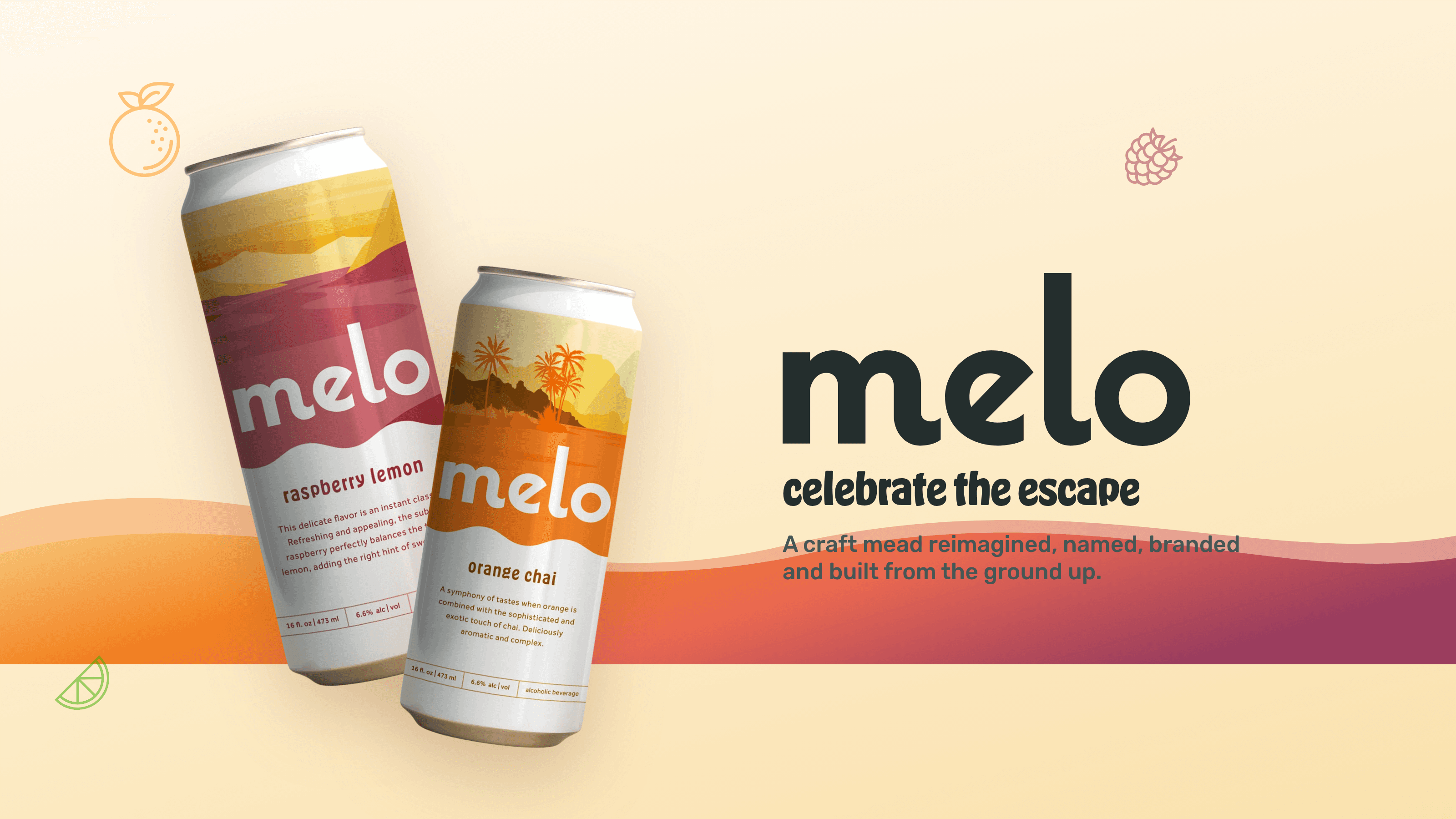
Melo sunset hero with the wordmark and two flavour cans
Detail

Changing the perception of mead

Mead is the oldest drink there is, and it arrived carrying a lot of baggage: horned Vikings, honeycombs, goblets of sweet honey wine. Melo wanted none of that. They came to us with a better idea, a mead for right now, and almost nothing else. No name, no look, no website.

So we started at the very beginning. We helped name the company, then built the brand, the language and the whole world it lives in, all the way through to the can in your hand and the site you visit.
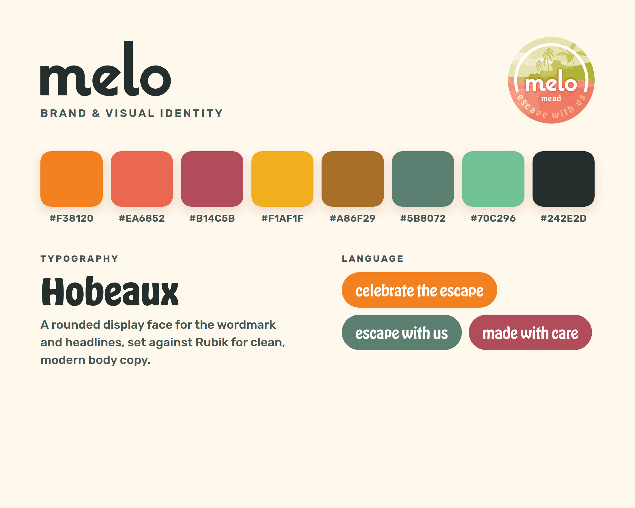
The Melo identity: wordmark, sunset palette, type and brand language
Field note

It started with a name

Before anything else there was the word: Melo. Warm, easy, a little sunlit. From there we built a full identity around it.

A rounded wordmark, a sunset palette pulled from real fruit, a Hobeaux and Rubik type pairing, and a voice that says celebrate the escape and means it.

Detail

Everything, end to end

This was a nuts-to-bolts build. We didn't pick up one piece of it, we made all of them:
  • Naming, brand strategy and the full visual identity
  • Logo, packaging and four illustrated can designs
  • Brand language, tone of voice and the world around it
  • 3D product renders modelled from the real cans
  • A custom Next.js website with a live 3D can viewer
  • Online infrastructure, a store locator and email capture
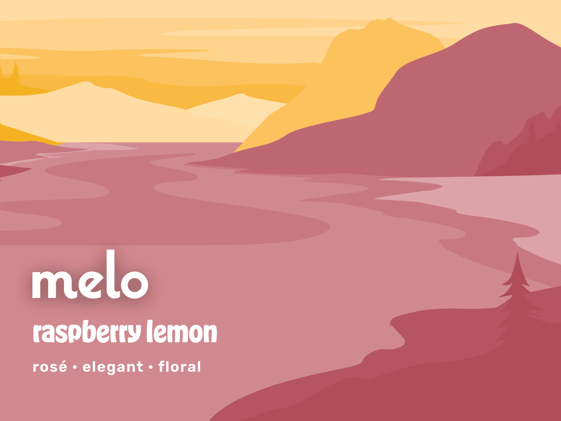
Raspberry lemon: a rose-pink lake at dusk
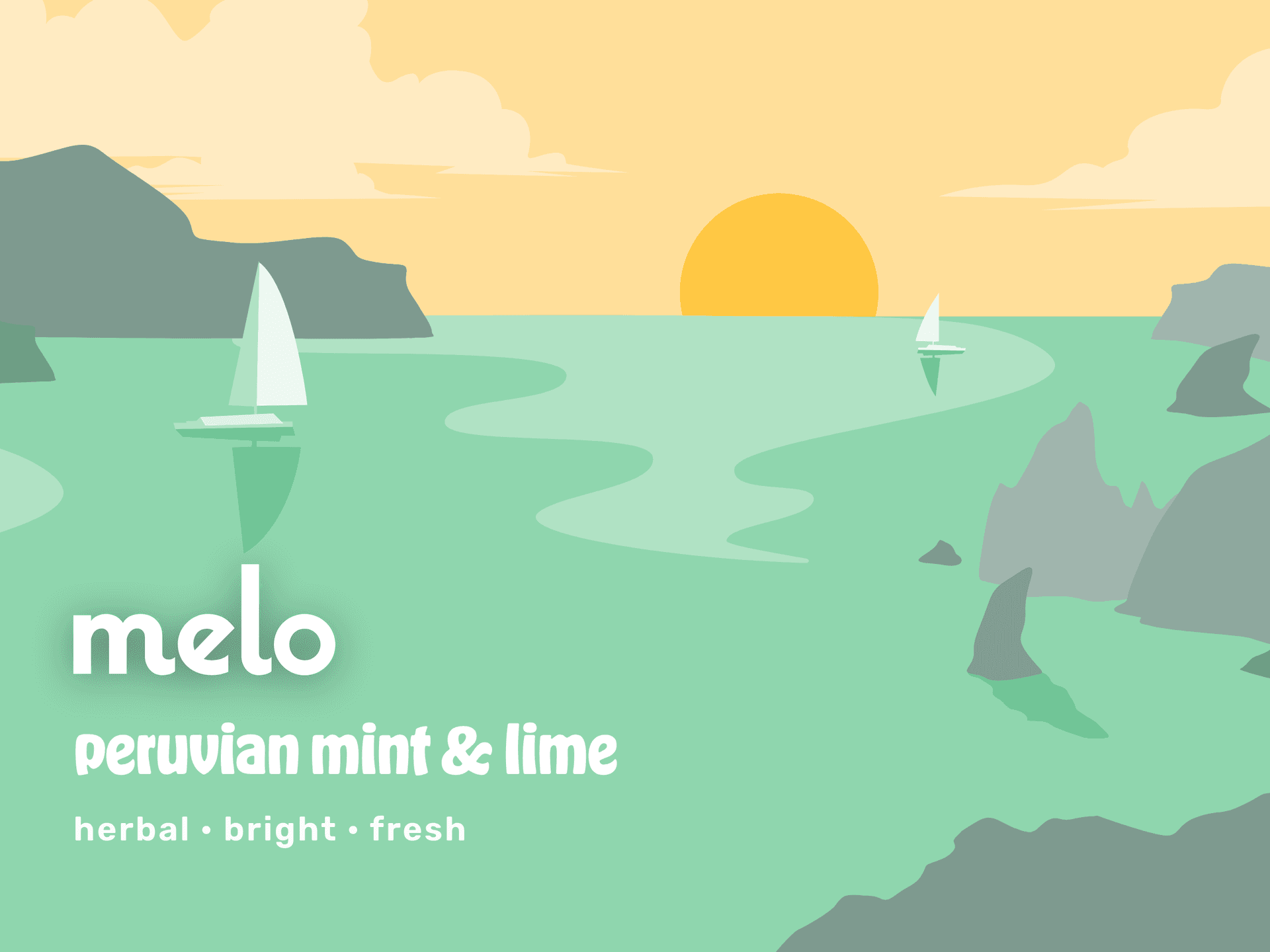
Peruvian mint and lime: a cool green coast
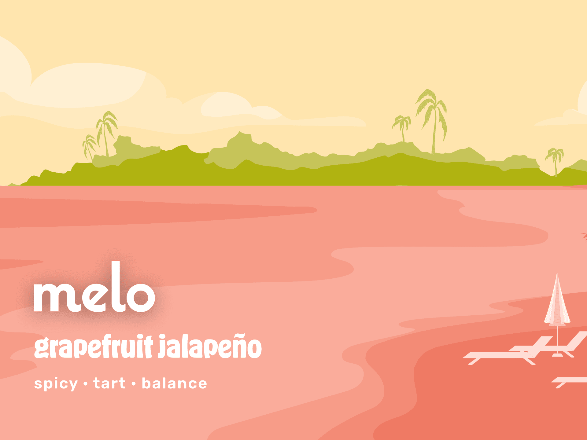
Grapefruit jalapeño: a warm sandy shore
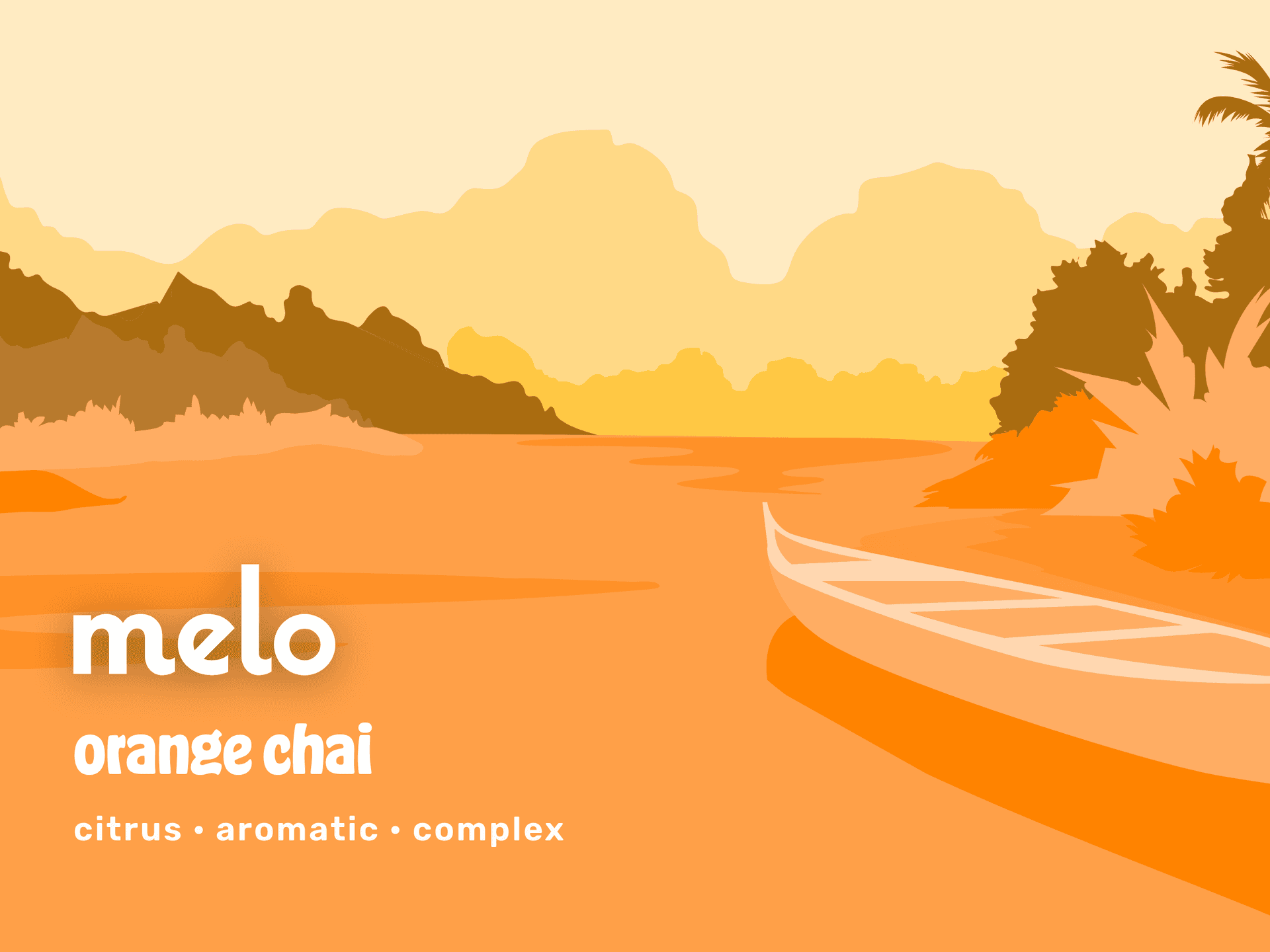
Orange chai: a golden-hour river
Detail

A world for every flavour

Each flavour got its own escape. Raspberry lemon opens on a rose-pink lake, peruvian mint and lime on a cool green coast, grapefruit jalapeño on a warm sandy shore, orange chai at golden hour.

One illustration system, four moods, all unmistakably Melo.
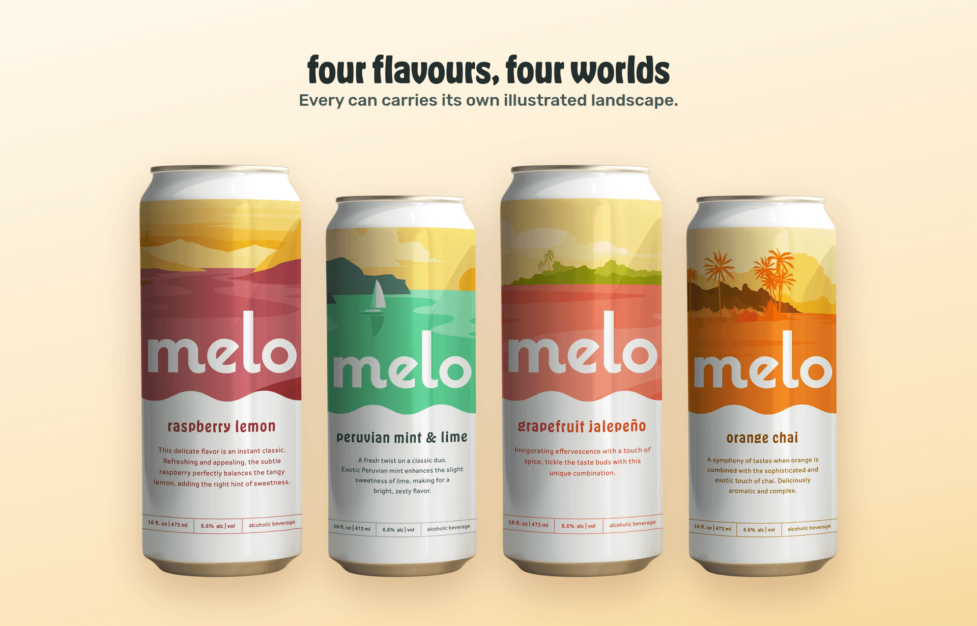
The four Melo cans, four flavours, four worlds
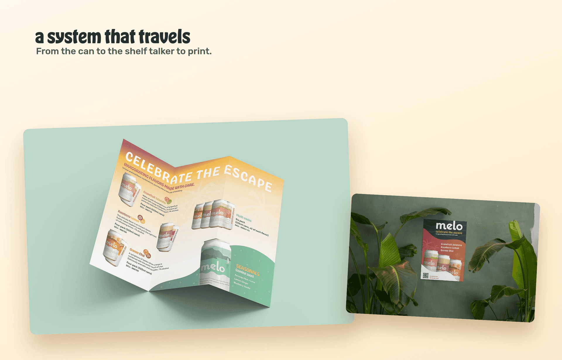
Melo printed collateral: trifold brochure and shelf poster
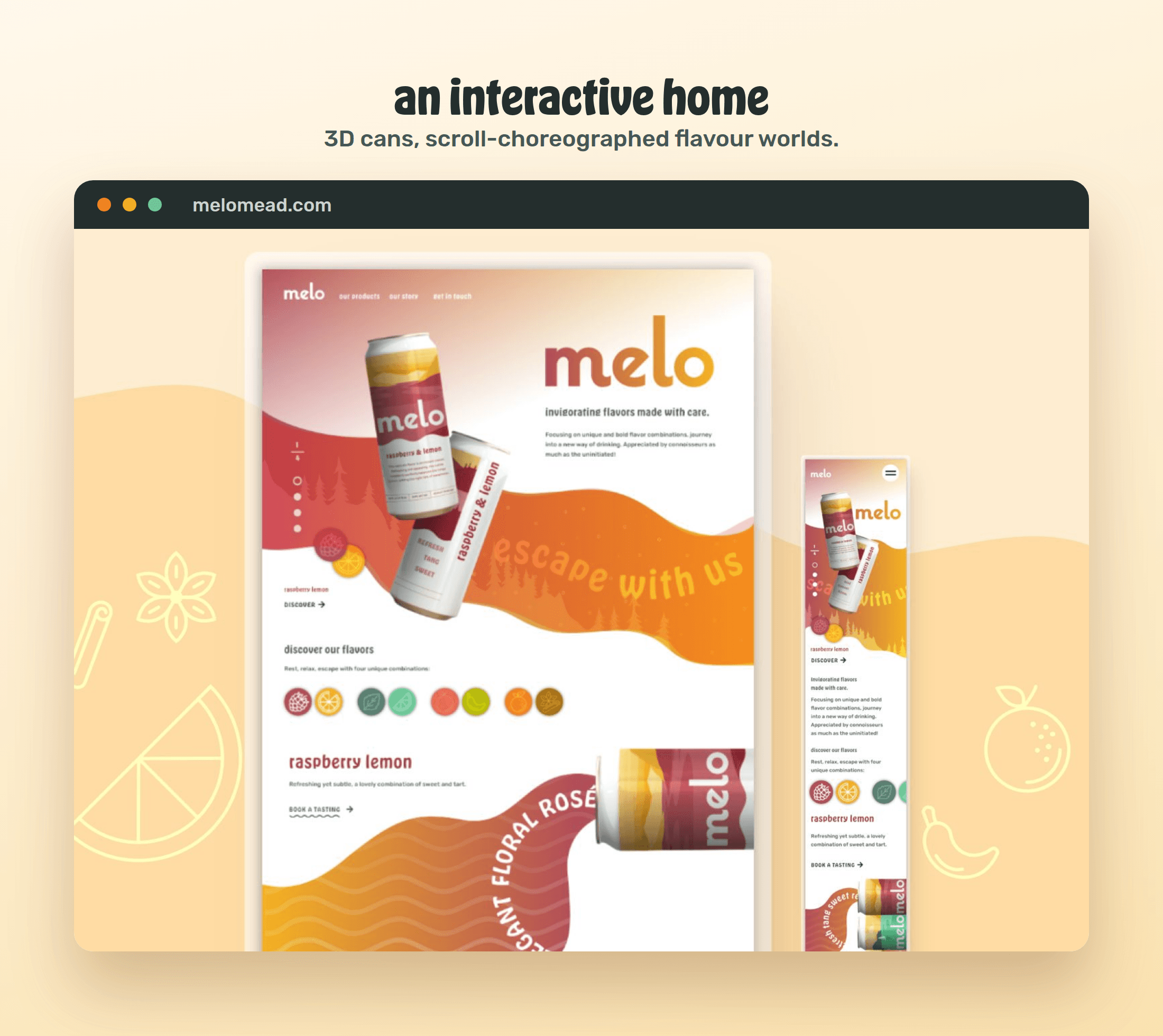
The Melo website, with 3D cans and scroll-driven flavour worlds
Field note

Built to move

The site had to feel like the brand: alive. We built it in Next.js with a real 3D can you can spin, sunset waves that flow as you scroll, and flavour worlds that animate into view.

Fast, custom, and made entirely in-house.
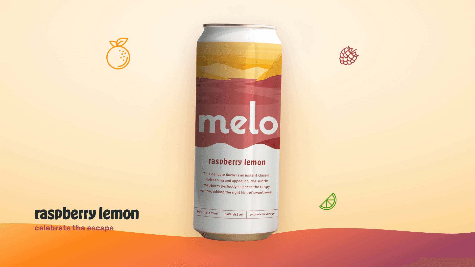
A Melo raspberry lemon can on the sunset, the brand's signature 3D viewer
Measured outcomes

The numbers

A brand that earned its place on the shelf.

01
Gold
International MUSE Award for packaging and branding
02
37+
Alberta liquor stores in the first four months
03
4
signature flavours, each its own world
04
100%
designed, built and shipped in-house
Detail

Our foot in the door

Melo was our first real step into food and beverage, and it opened the door. It let our team stretch across naming, illustration, packaging, 3D and code, and it showed what we can do when a client hands us a blank page and a lot of trust.

In their words01 / 01

We are absolutely thrilled with the brand work that Paper Crane has done to help kickstart Melo. The creativity and attention to detail in every element, from the can designs to the engaging website, have truly set our brand apart in the market, and it's making a difference on in-store sales which is amazing. Working together was great.

Brendan Collins

Owner, Melo Mead

In closing

Celebrate the escape

From a single word to a brand on the shelf, Melo is Paper Crane doing what we love most: building a whole world from scratch, and having fun the whole way through.
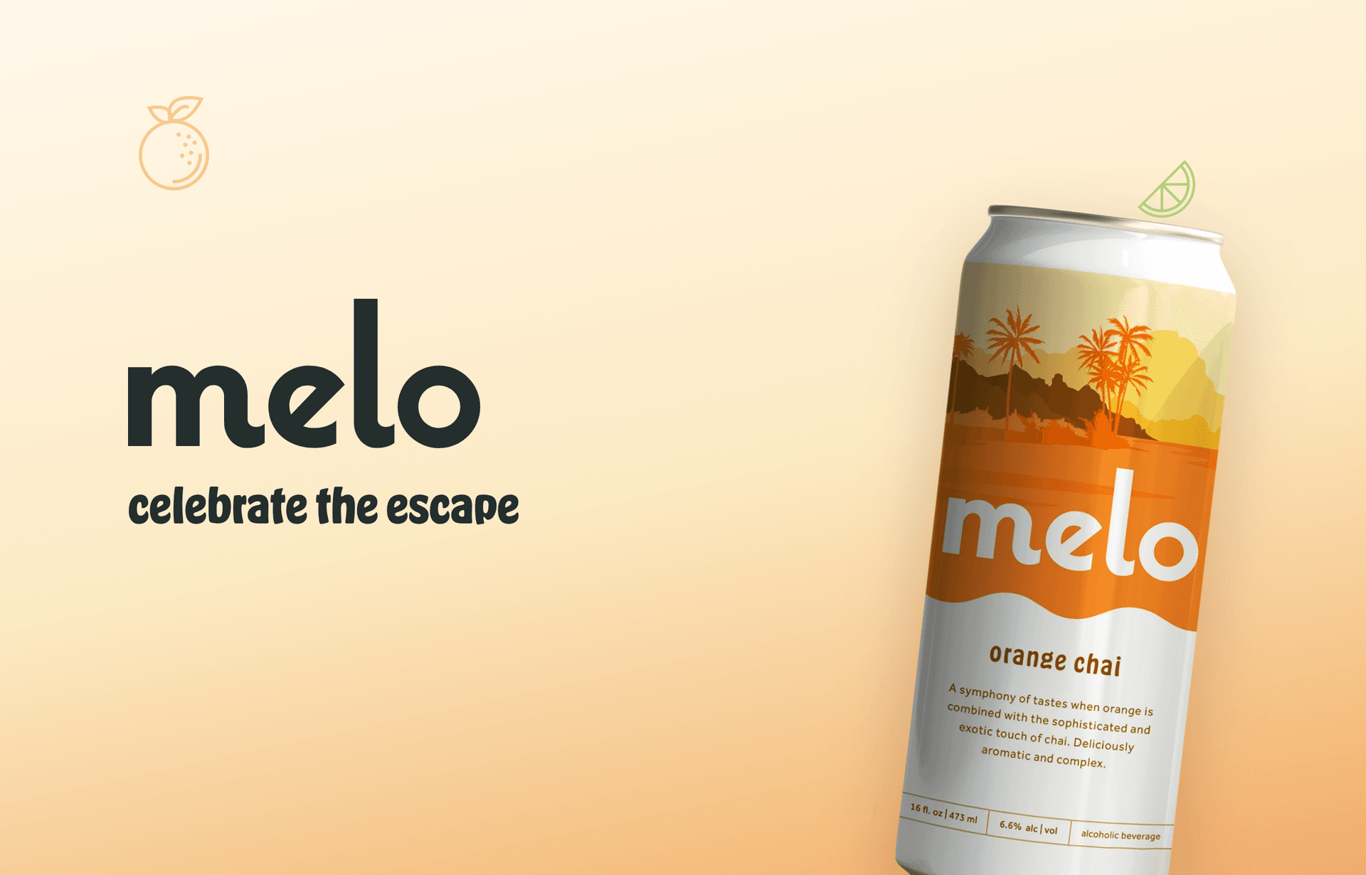
Melo wordmark and orange chai can on a warm sunset close

MORE PROJECTS

A fresh Maisie catering spread laid out to share
BrandCreativeStrategy+2

Maisie

Maisie Eatery brought something new to Calgary's Sam Centre: an elevated all day eatery with a cheeky, fairy tale heart. We built the whole brand, from name and packaging to website and launch, and it went on to win three MUSE Creative Awards.

Explore
SocialNext brand mark on a dark navy backdrop
Software DevelopmentStrategyDigital Infrastructure+1

SocialNext

SocialNext runs digital-marketing and social-impact events across Canada — conferences, summits and speaker series. We'd supported them for years, first in Notion, then in Airtable. In 2026 we rebuilt the whole operation as a bespoke application they own: the first product Paper Crane has shipped end-to-end on our own software substrate.

Help for Dementia bloom mark on brand blue
BrandStrategySoftware Development+1

Help for Dementia

Help for Dementia is the Alzheimer Society of Alberta and Northwest Territories' home for dementia learning and support. Over three years we rebranded it, rebuilt the learning platform from the ground up, and added an AI resource assistant and a resilience tool that meet people wherever they are.

Explore
See all projects
Paper Crane / Studio
CALGARYVANCOUVER·© 2026

A digital transformation studio building considered, durable web work for ambitious operators.

Services
  • Creative
  • Strategy
  • Website Development
  • Software Development
  • Business Automation
  • ─AI Automation
  • ─Workflow Automation
Navigate
  1. 01About Us
  2. 02Our Work
  3. 03Contact Us
Elsewhere
© 2026   PAPER CRANE MEDIA LTD.
Terms & Conditions
Privacy Policy