NavigateMENU / 04
More
Elsewhere
Strategy
Brand
Creative
Marketing
A campaign strategy and visual identity for the Visual Arts Center of New Jersey, an eighty-five-year-old arts institution in Summit, NJ. We turned an institutional gallery into an inclusive, human-centered third space, and united its museum, studio, and community programs under one idea, delivered from Calgary.
The Visual Arts Center of New Jersey has spent more than eighty-five years bringing art and people together in Summit, New Jersey. But three parts of the same institution, its museum exhibitions, its studio school, and its community programs, had drifted into three separate stories.
Awareness rarely traveled beyond Summit, and for many newcomers the place still carried a quiet elite barrier: the feeling that you needed the right vocabulary to belong. They came to us for a campaign that could pull those threads back together. We took the whole thing on from Calgary. Creativity, it turns out, knows no borders.
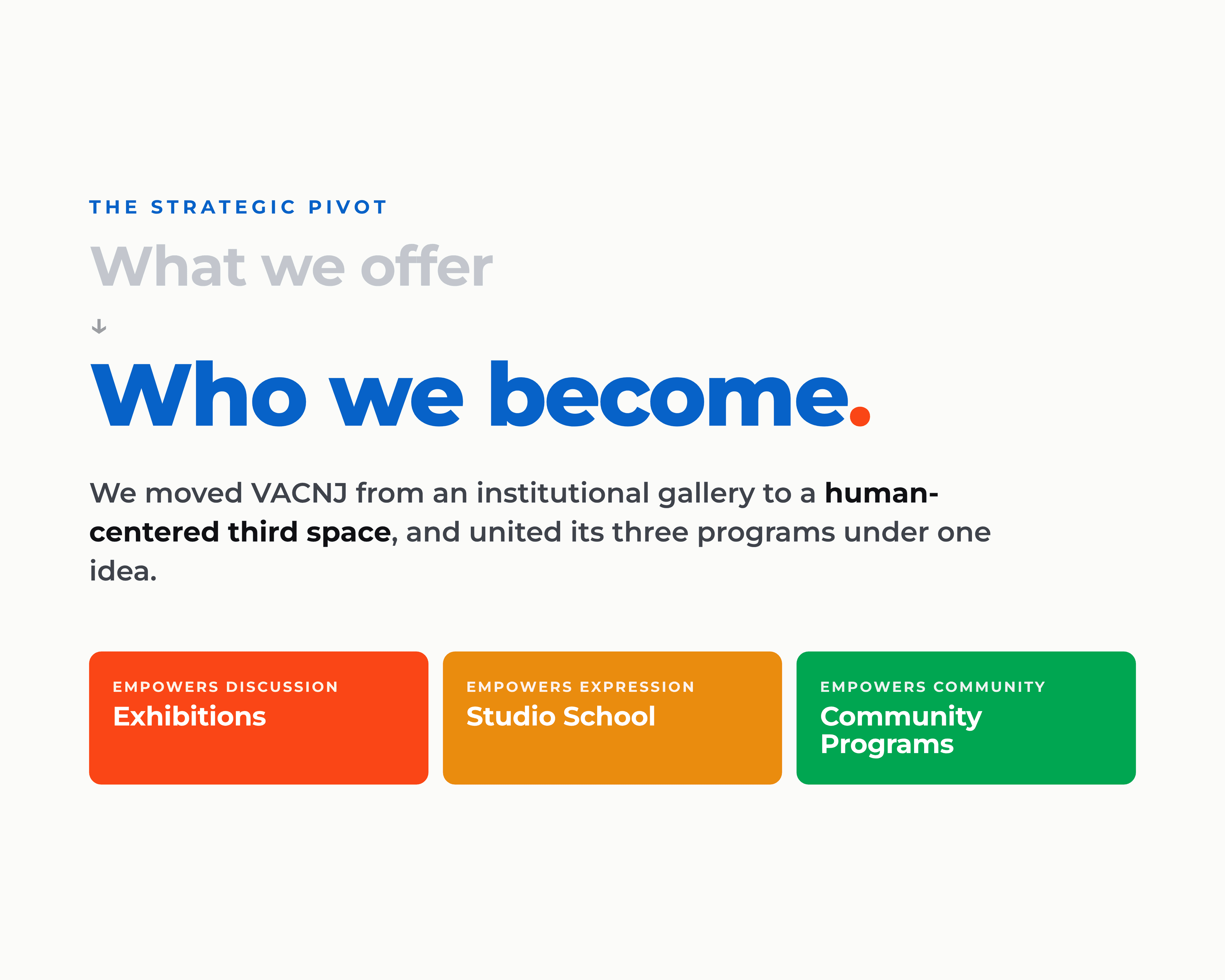
The strategy started with one move: stop talking about what the Center offers, and start talking about who people become inside it. Art as a catalyst for change, not a gallery to admire from a polite distance.
That reframed VACNJ from an institutional gallery into a human-centered third space, a place to belong. And it gave the three programs a single idea to stand under.
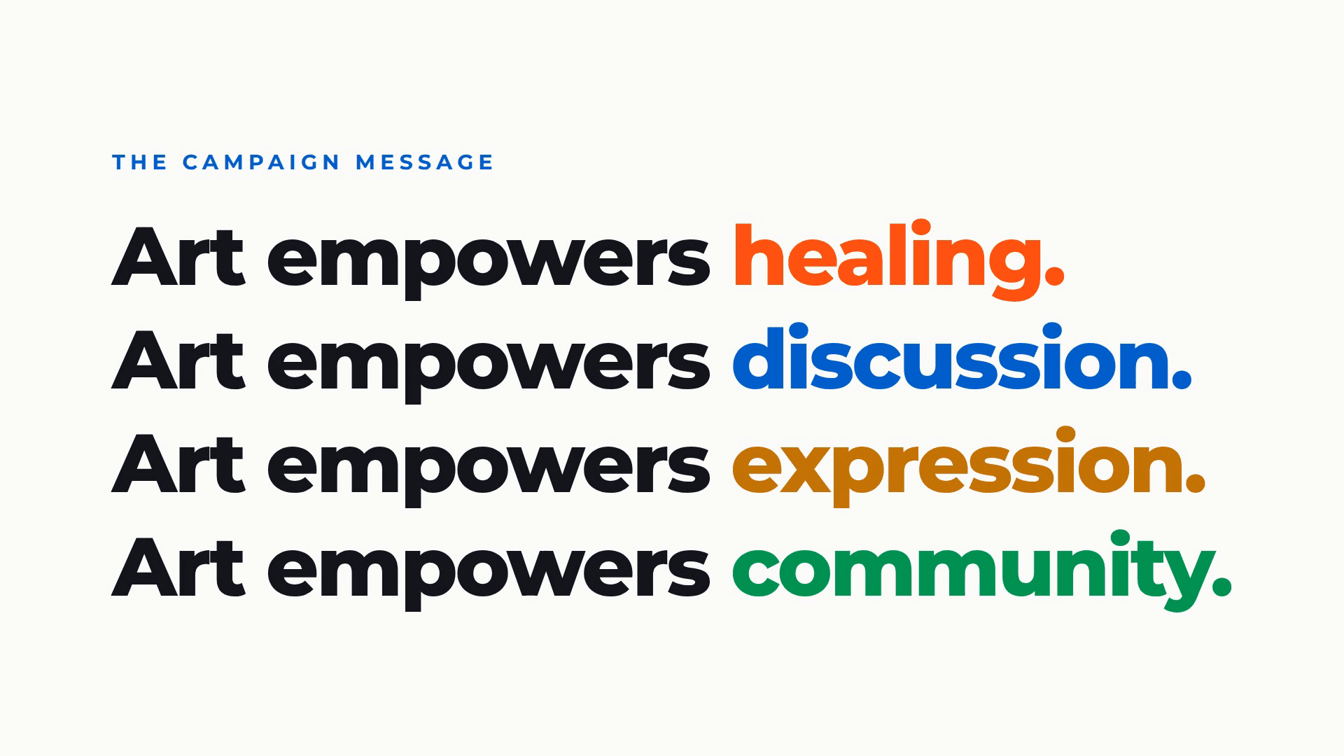
We built the campaign on a simple architecture. Art empowers, four ways, one for each side of the Center:
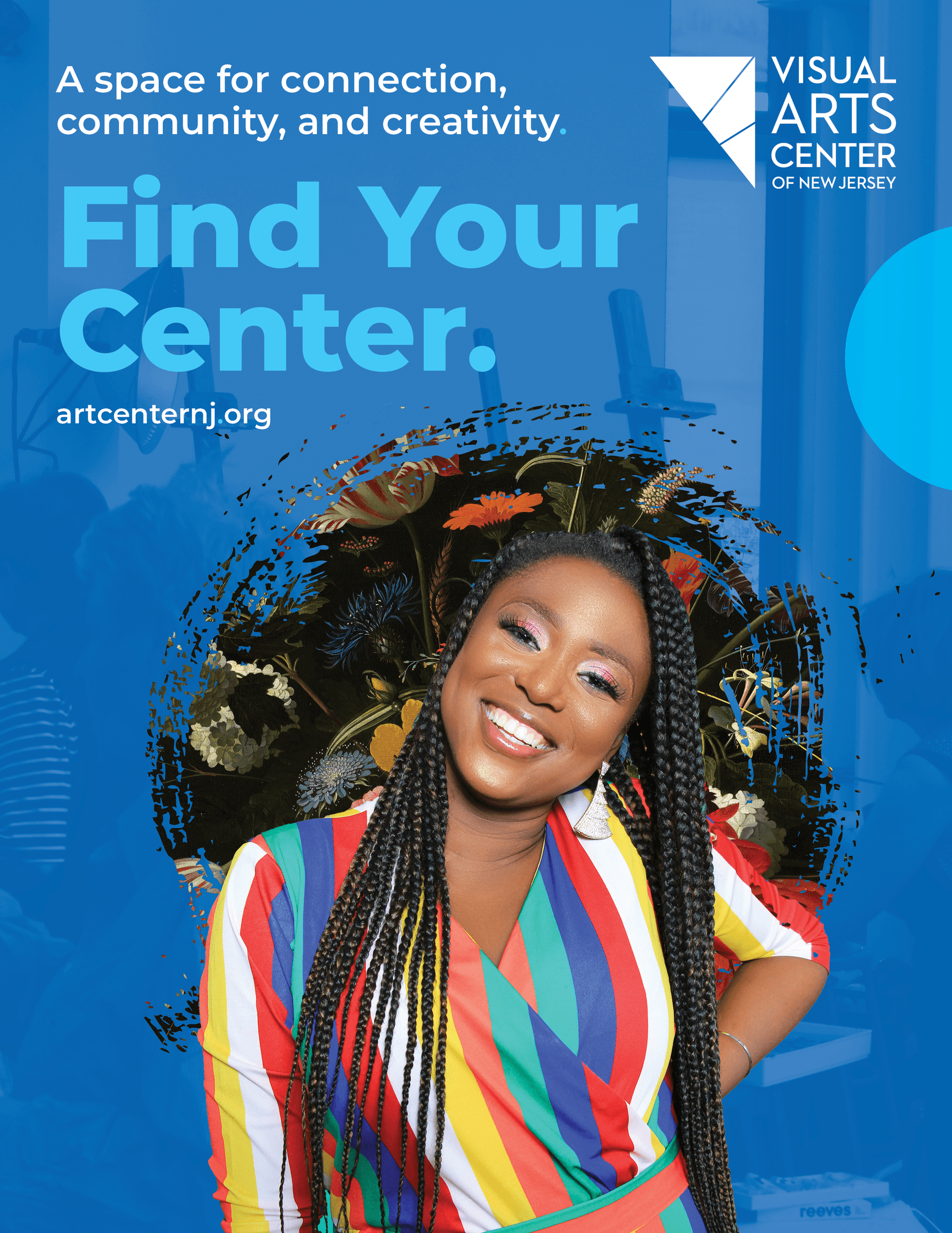
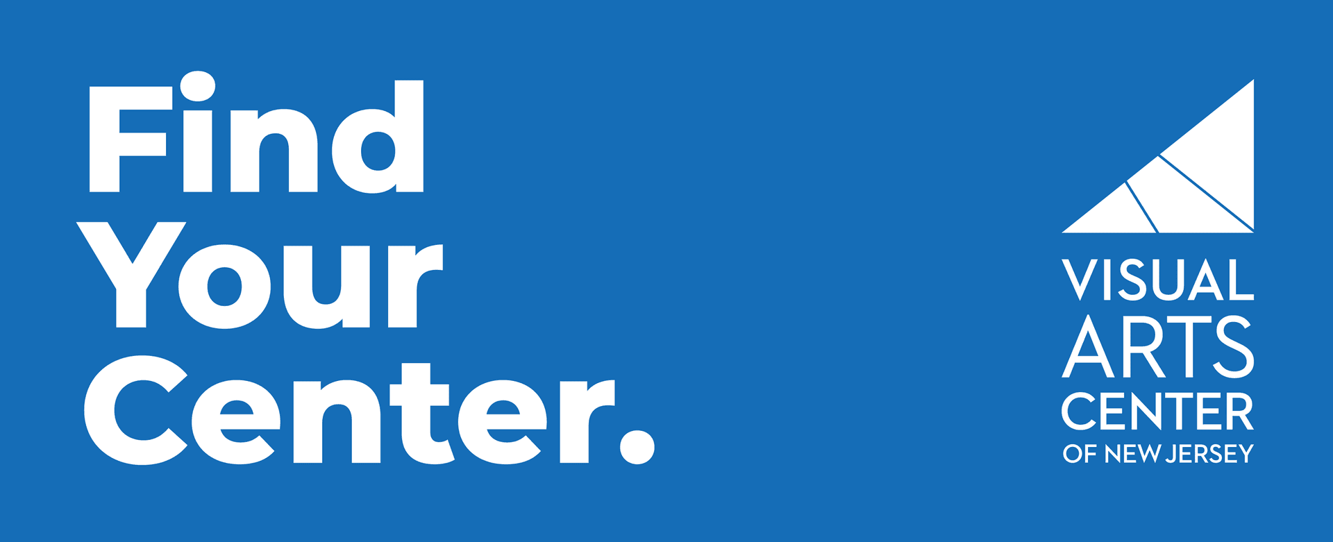
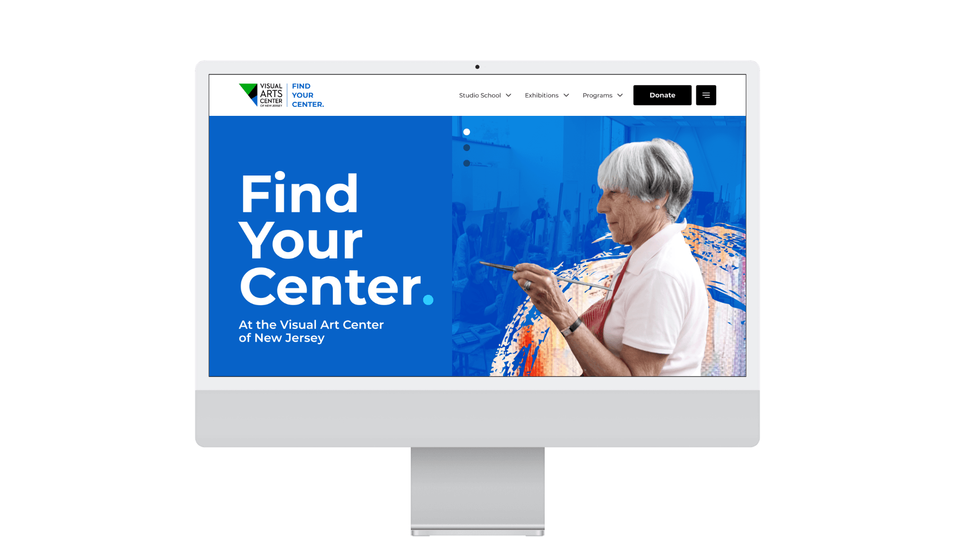
At the center of it all, one line that flexes across every audience and program: Find your center.
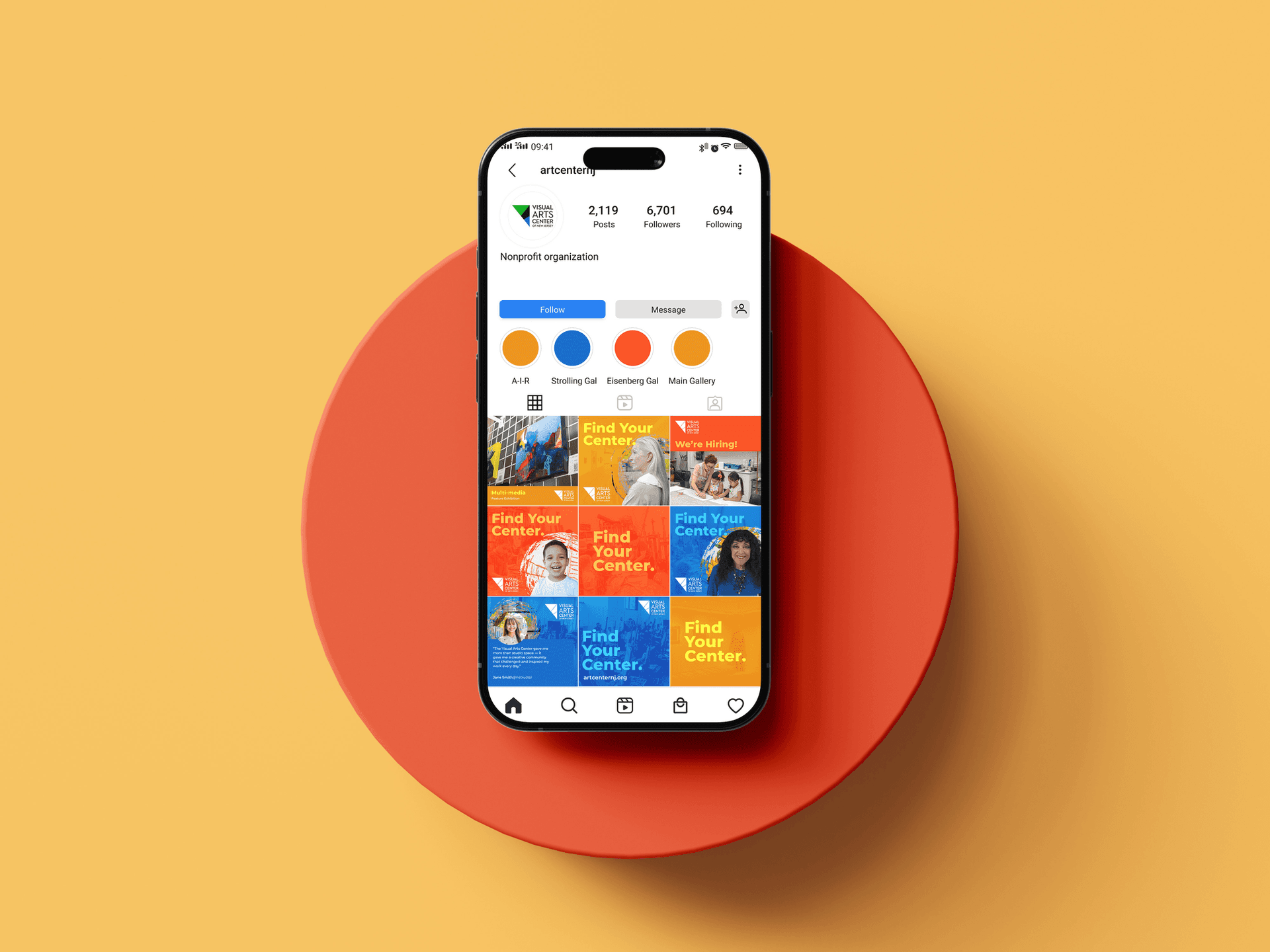
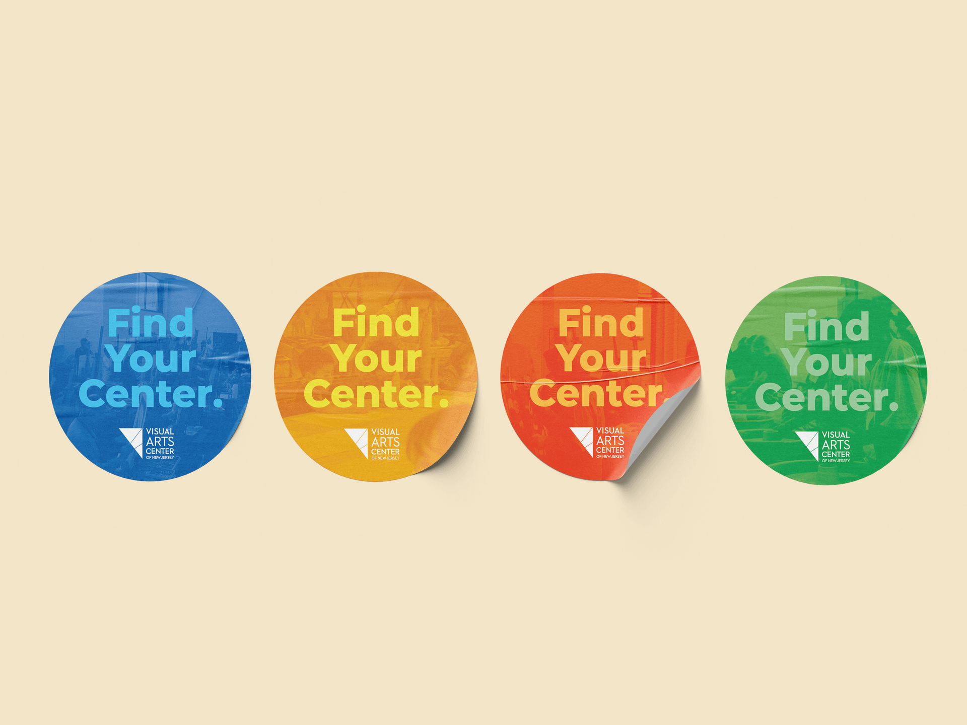
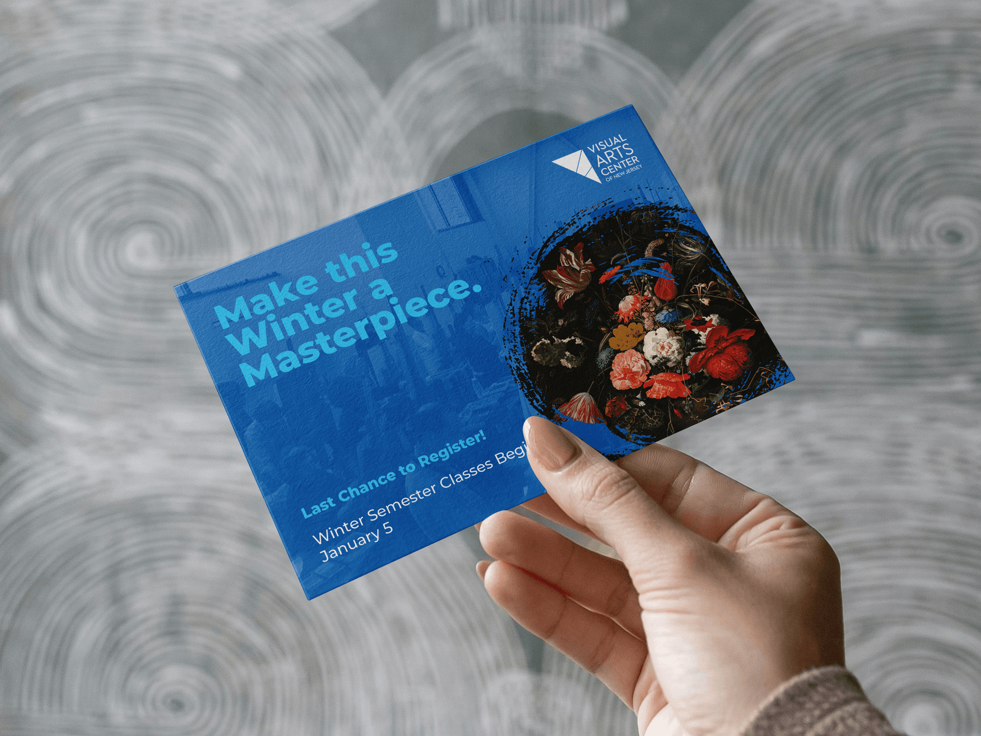
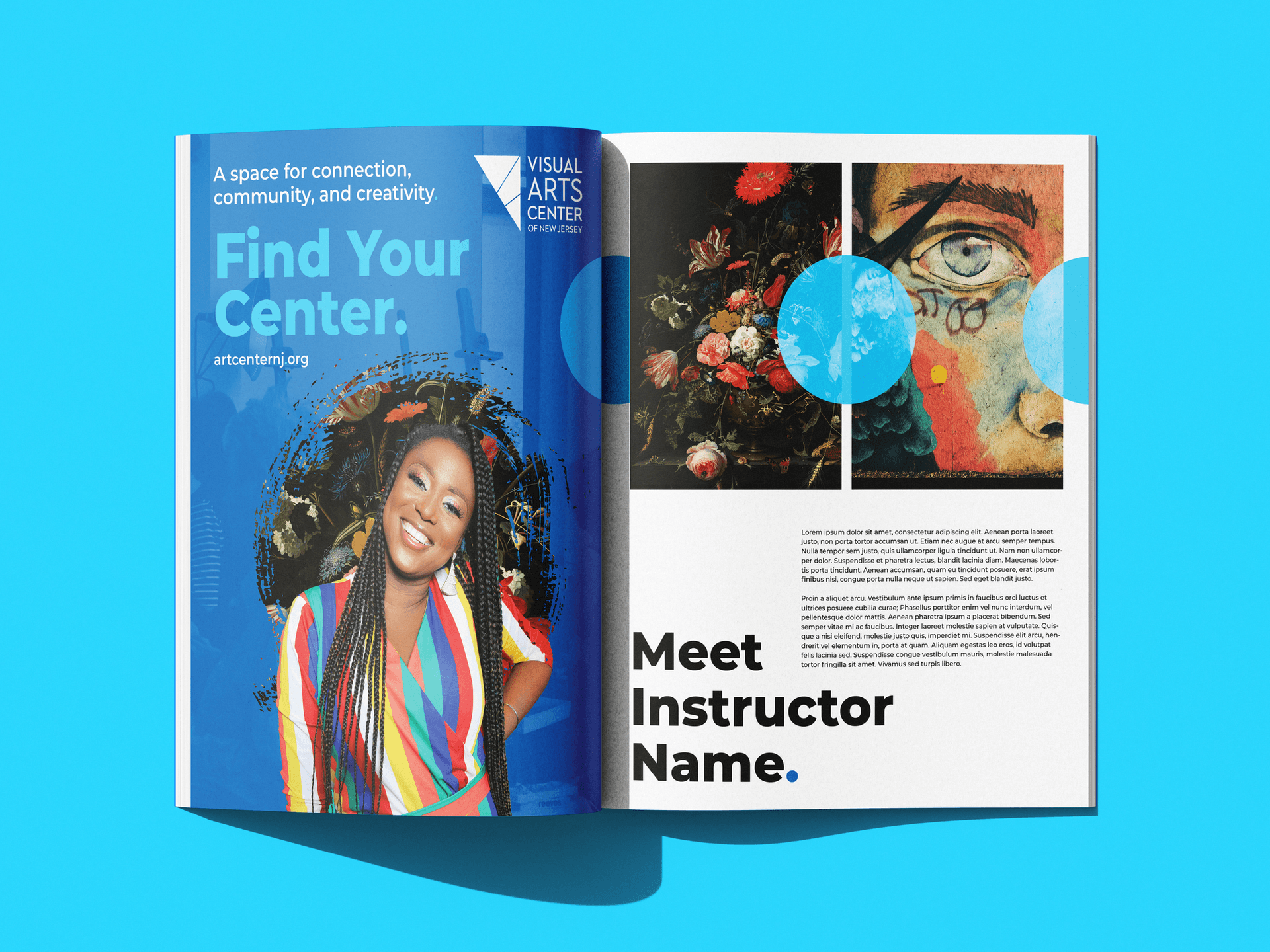
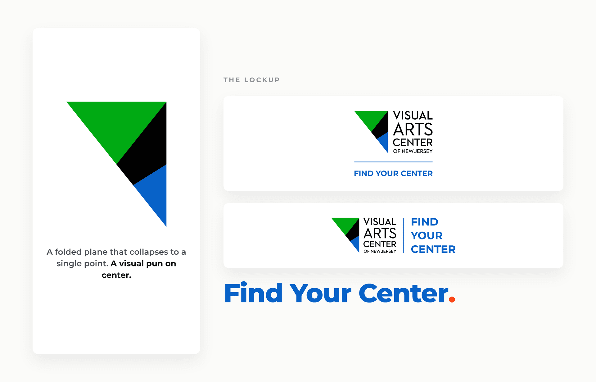
Then we gave the idea a face. A new logo, a faceted plane that folds down to a single point, a visual pun on center. A palette of four confident colours, each named and paired: Denim Blue, Golden Orange, Grapefruit Red, and Basil Green. Montserrat doing all the talking.
And one quiet signature: the period after Find Your Center. turns a slogan into a statement. Every rule got written down, so the Center can keep making things that look unmistakably like themselves long after we hand it over.
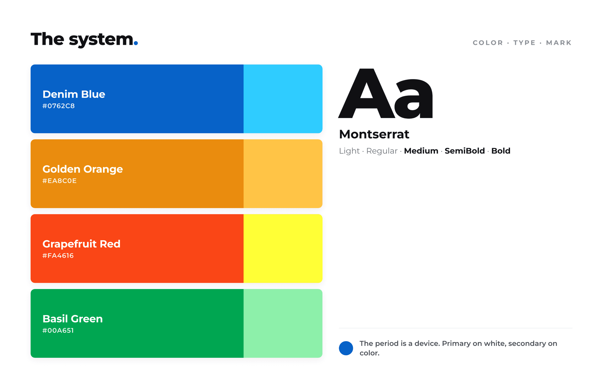
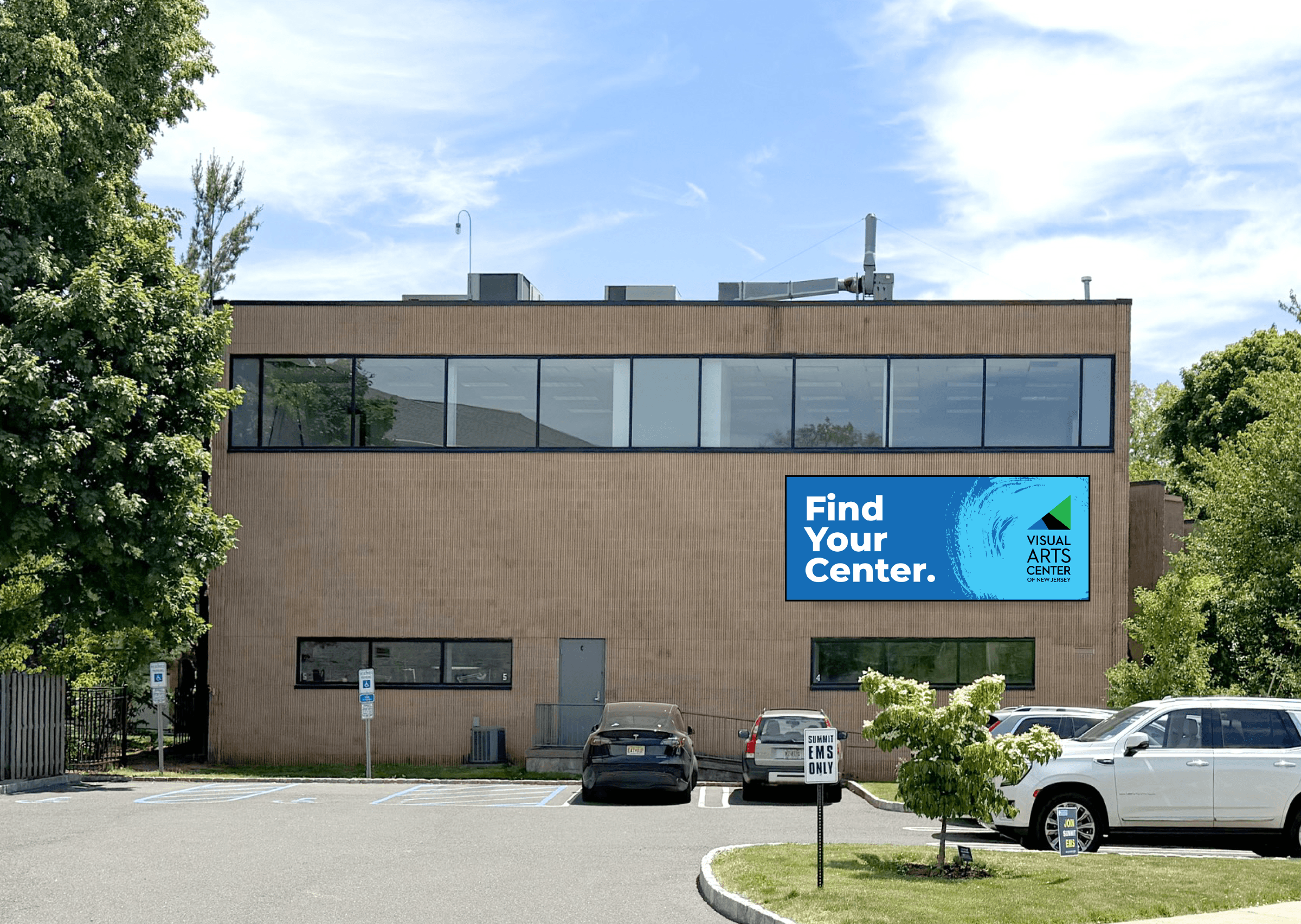
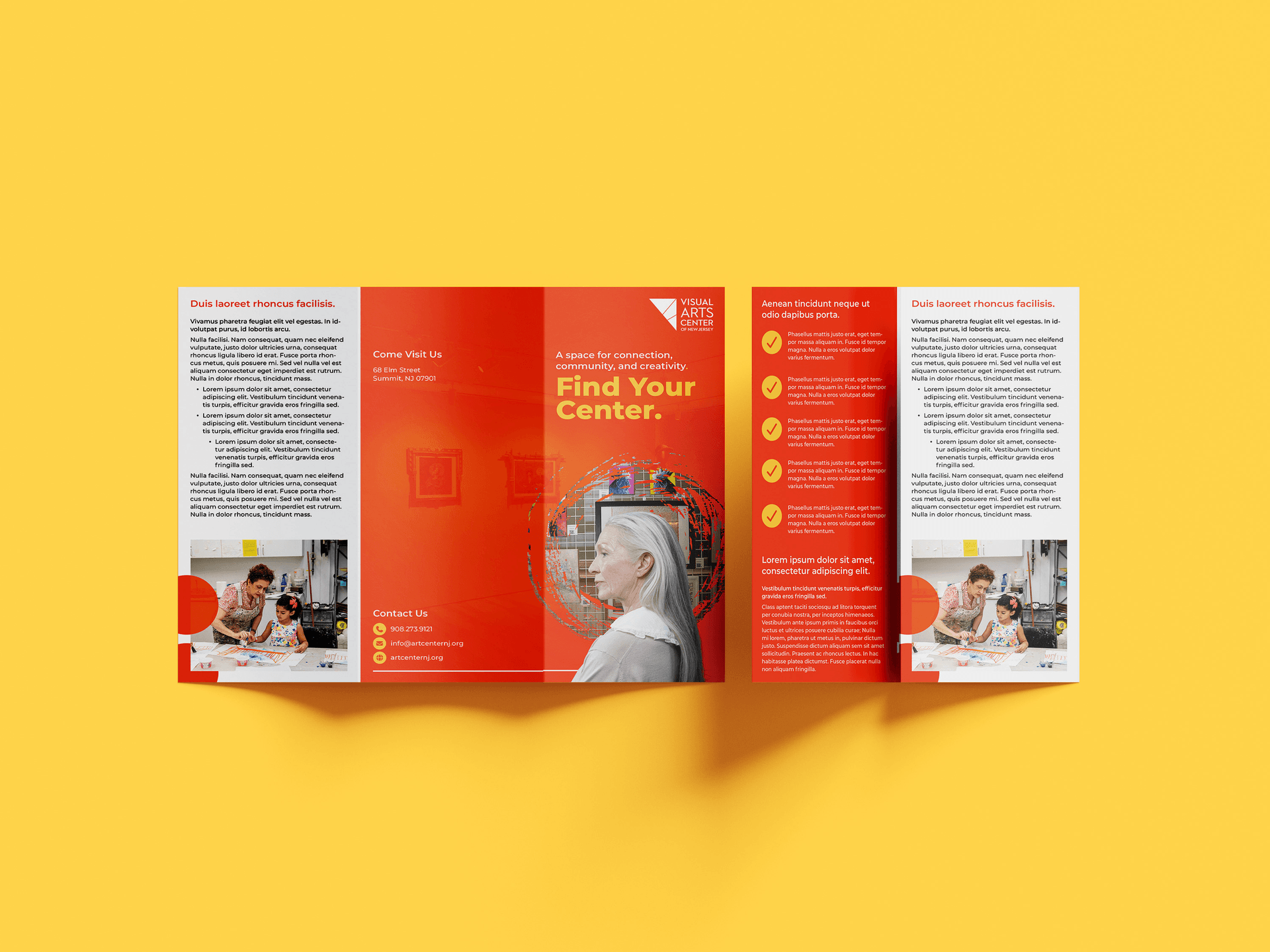
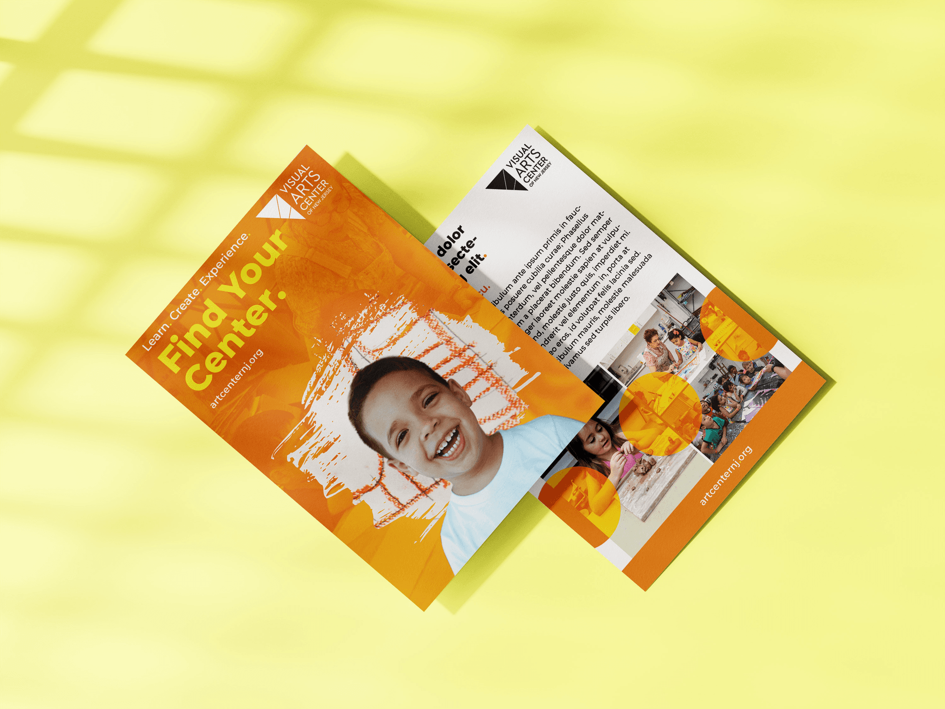
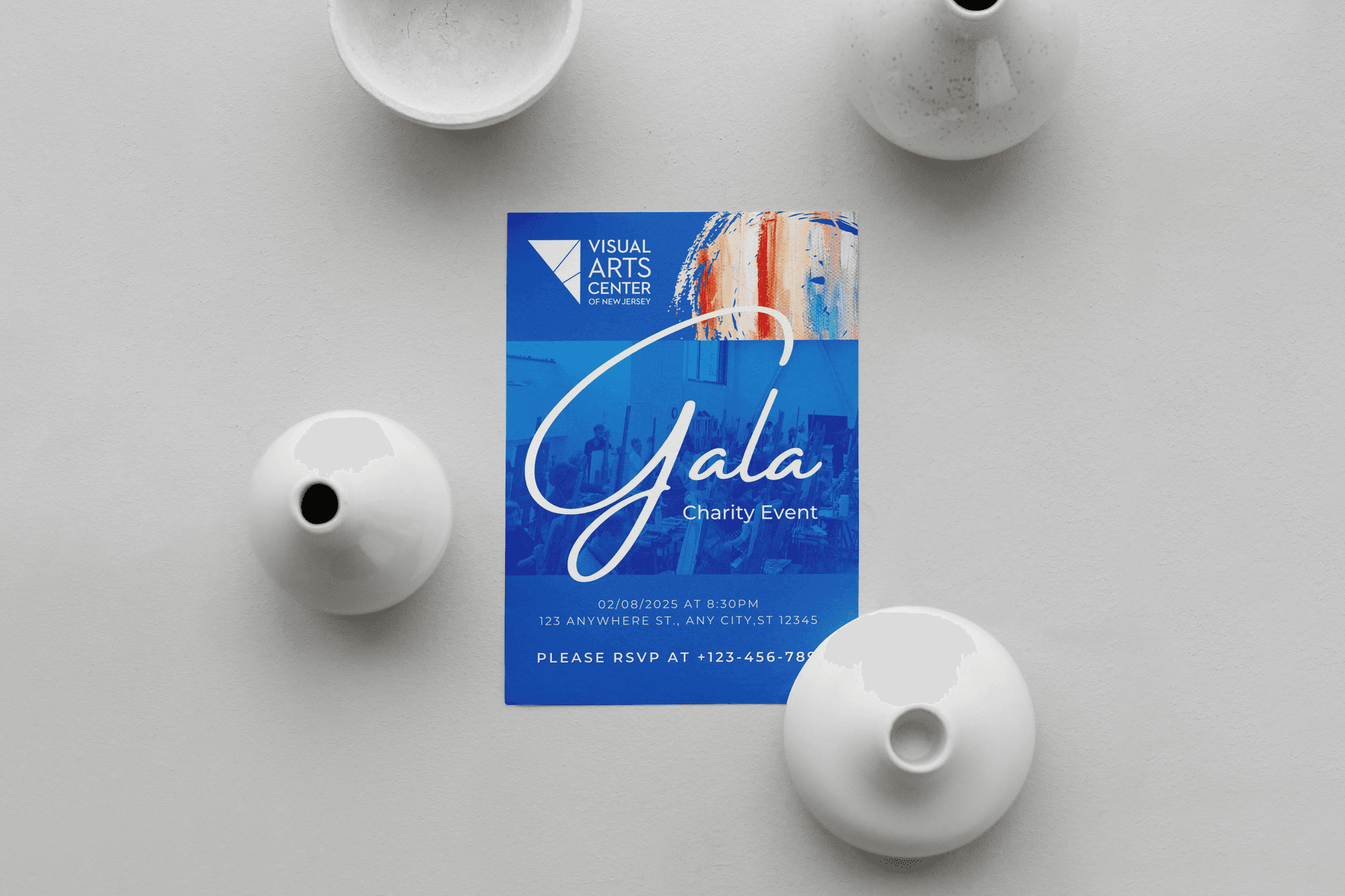
The real test of an identity is whether it holds up out in the world. This one runs across postcards and brochures, a magazine and a gala invitation, stickers and social feeds, digital ads, a responsive website, and a sign on the actual building in Summit.
Same idea, same colours, same warmth, whether you meet it on a phone or on the wall.
Here is the part we are proudest of. Brand work like this usually gets softened by committee, every bold choice sanded down until what is left is safe and forgettable. That did not happen here.
For the first time anyone at the Center could remember, the direction landed to unanimous agreement, on both the strategy and the identity. No horse-trading, no watered-down compromise. Just a room full of people who care about this place, aligned on what it stands for and ready to go build it.
A whole institution, brought back to its center, and a campaign ready to carry that invitation across New Jersey and beyond. Built with care, from one creative community to another.