NavigateMENU / 04
More
Elsewhere
Brand
Strategy
Creative
Website Design
Website Development
Pancreatic cancer is one of the deadliest cancers on the planet. But PCNA's message was diluted across two brands and two websites. We unified them into one uncompromising home that treats the stakes with the seriousness they deserve.
Pancreatic Cancer Canada and its US counterpart had been running as separate organizations, with separate websites and a message that had softened over the years. Patients, caregivers, and donors were left searching across scattered pages for what they needed.
The rebrand was the moment to fix that. Not a fresh coat of paint, but one unified home with a voice bold enough to match the disease it confronts.
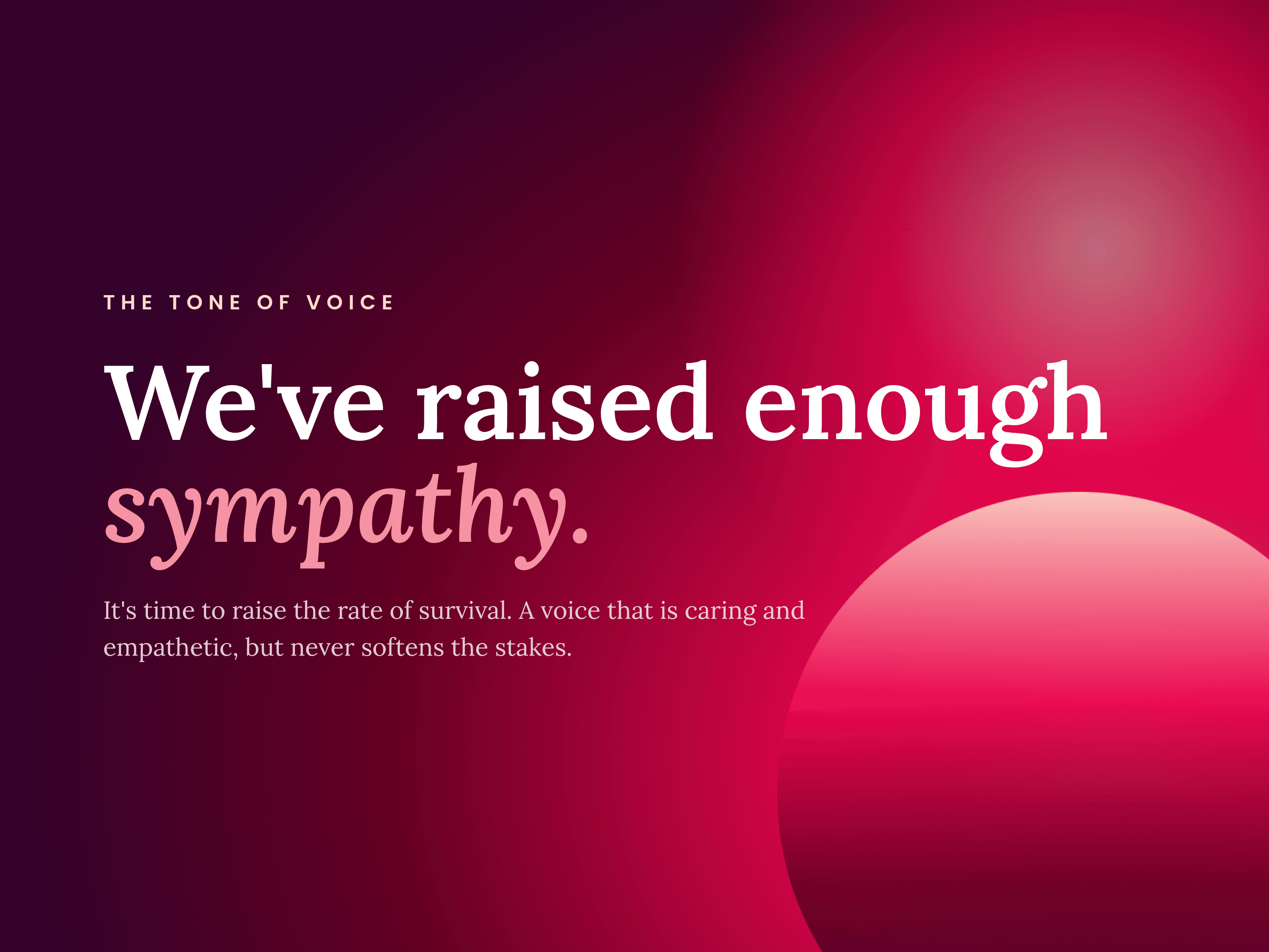
Most cancer charities lean on hope and survivor stories. PCNA does the opposite. We helped shape a voice that is caring and empathetic, but never softens the mortality of pancreatic cancer.
It reframed the ask entirely. Supporting this cause is no longer a nice thing to do. It is a necessity, and every line across the site carries that weight.
Pancreatic cancer does not respect borders, and neither should the response to it. Uniting the two organizations under one North American banner meant people on both sides could benefit from the same research, the same funding, and the same support.
The website is where that union becomes real. One place instead of two.
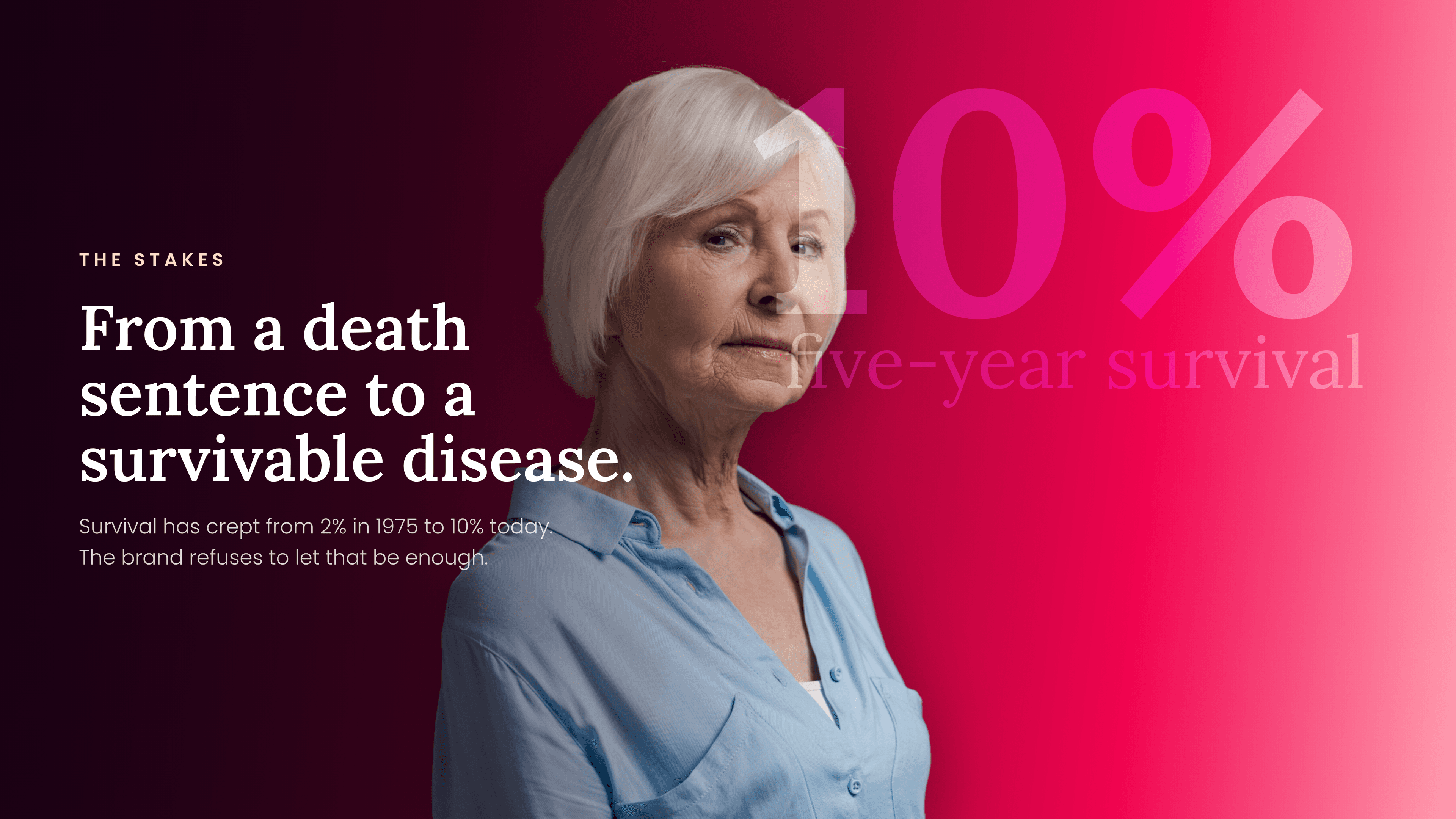
The numbers are why the tone had to change.
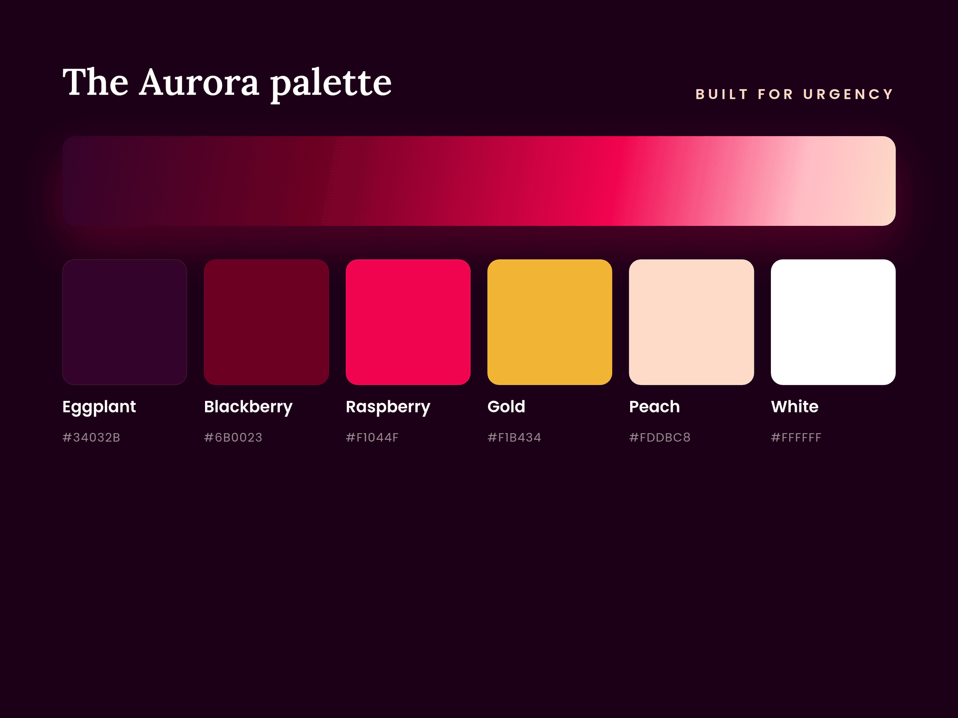
We drew the brand toward the seriousness of the disease. Deeper, more dramatic colour, and a signature gradient we call Aurora that runs from eggplant through blackberry to a raspberry glow.
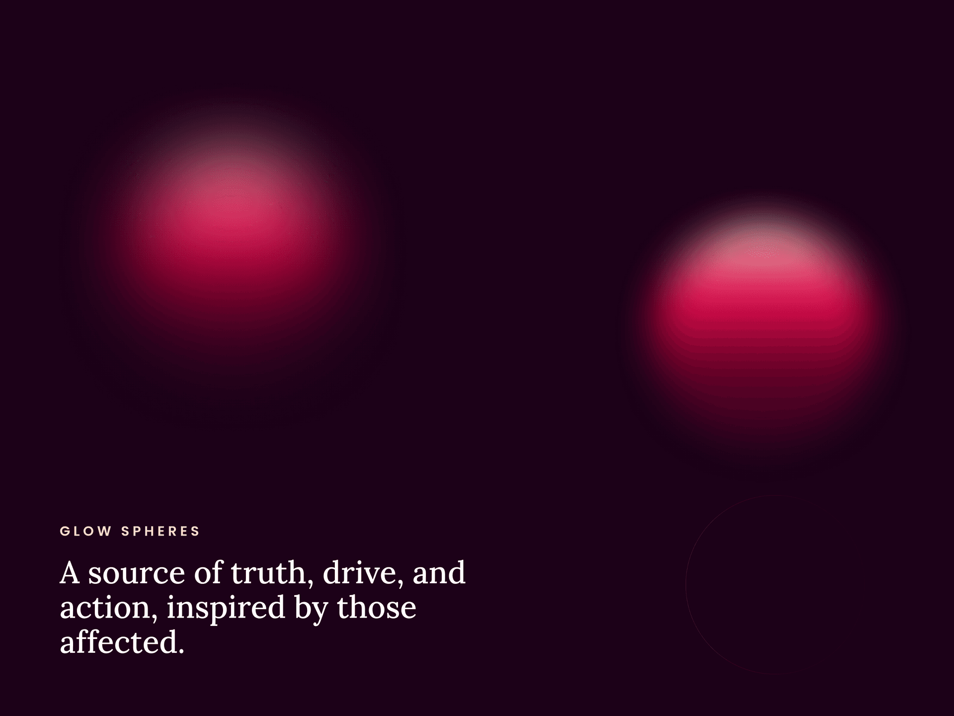
Paired with it are the glow spheres: a quiet symbol of truth, drive, and the people this work is for.
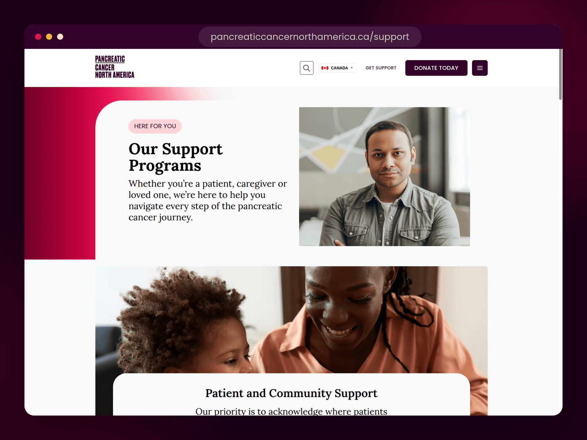
With the brand set, we rebuilt the website around the people who use it. We mapped the journeys of patients, caregivers, and donors, then shaped the architecture around them instead of the org chart.
Redundant pages were consolidated and the essentials promoted, so support, research, and ways to give are easy to find and easy to act on.
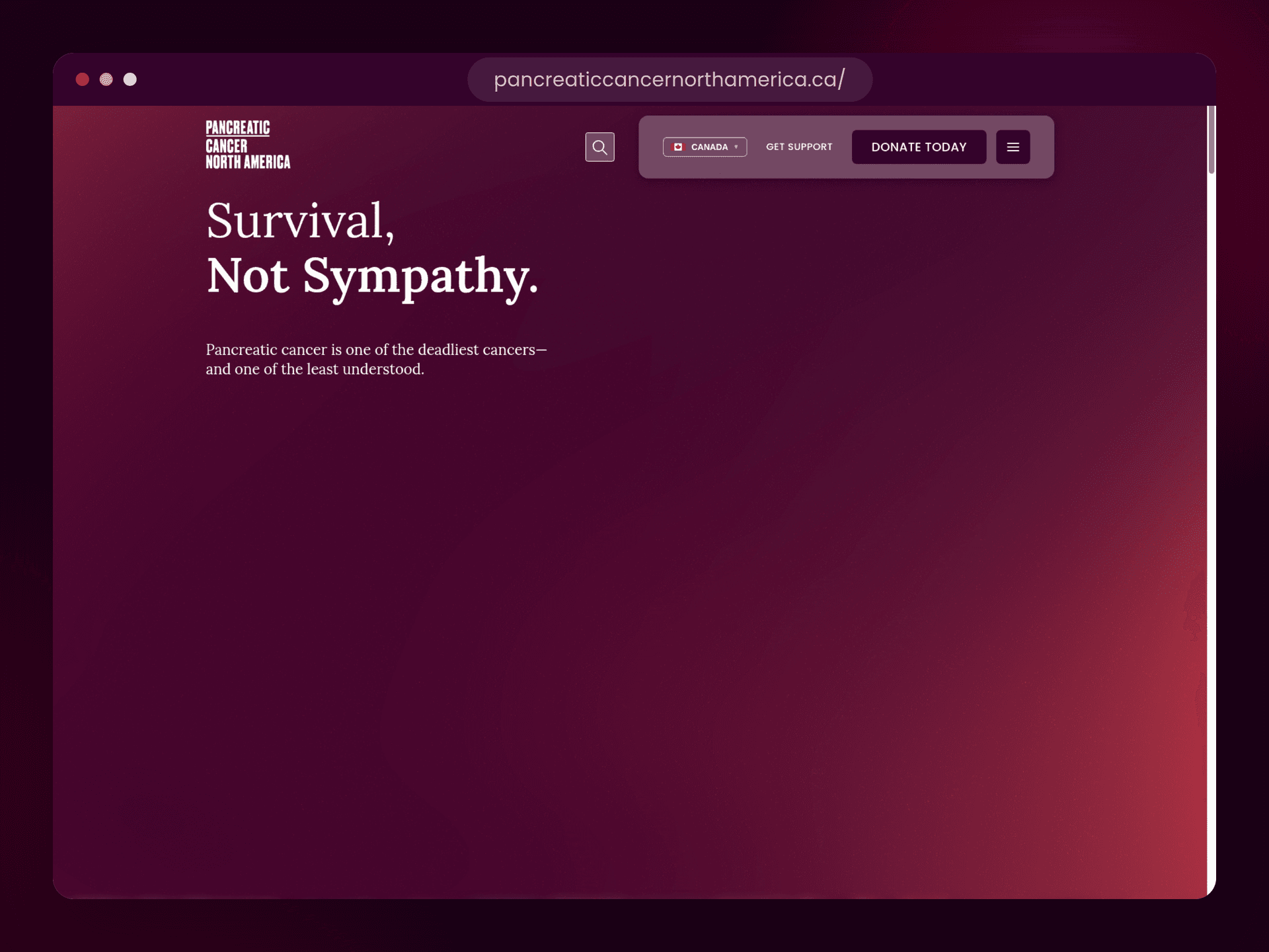
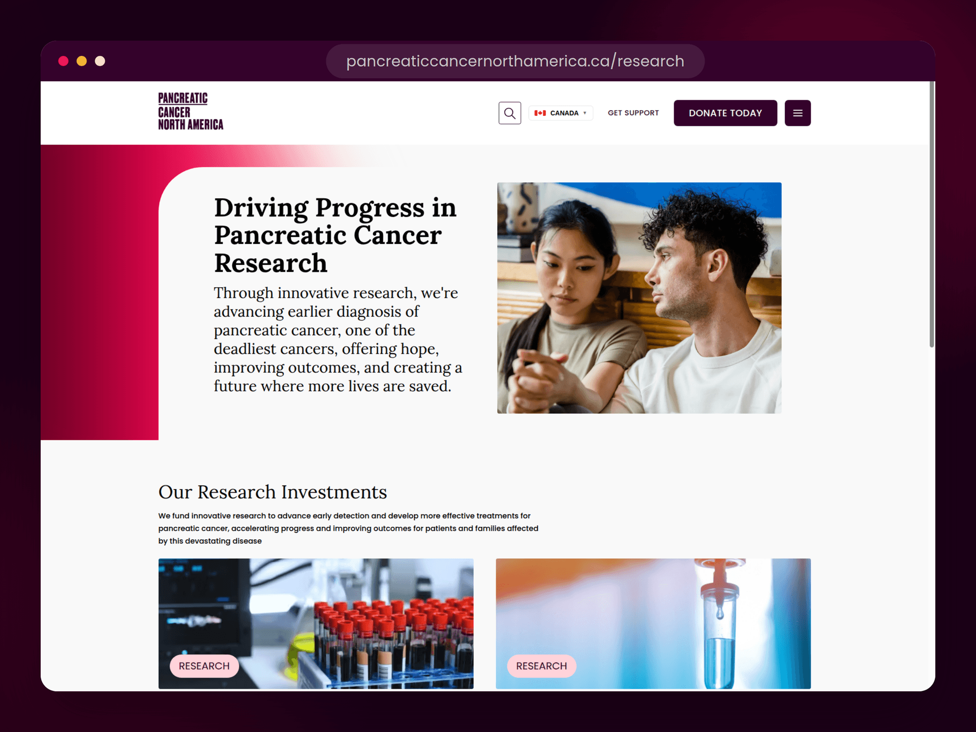
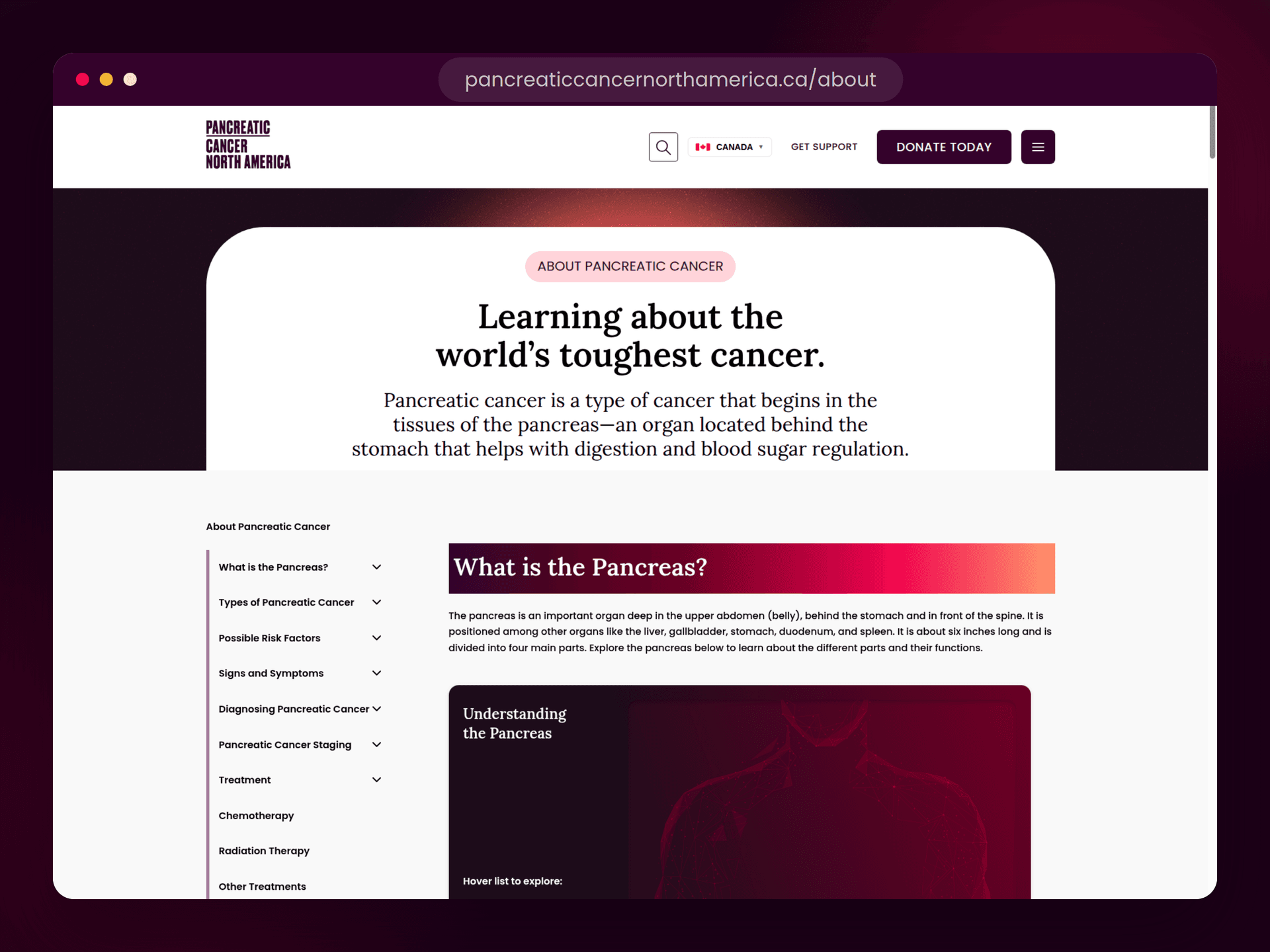
PCNA launched with a single, unmistakable presence, one that treats the stakes with the seriousness they deserve. Internally, the team gained a platform they can actually maintain and grow.
The brand that came out of this work is now rolling out across PCNA's other channels, and the site keeps expanding as their team builds on the system.
We do our best work for organizations doing good in the world. It is why we keep coming back to this space, alongside teams like CCASA and Help for Dementia.
Pancreatic cancer has touched nearly everyone on our team in some way. Getting to push back, even a little, by making this brand land harder and raise more for the cause, is the kind of work we are proud to do.
The rebrand is the anchor for everything that follows: campaigns, donor journeys, patient resources. We are still working alongside PCNA as it grows into its new identity.