Skip to content
ServicesOur WorkAbout
Let's Talk
NavigateMENU / 04
01About
02Our Work
03Services
StrategyCreativeWebsite DevelopmentSoftware DevelopmentBusiness Automation
04Contact
More
BlogFlight Program
Elsewhere
Case study

A region's whole public record, finally usable.

Updated July 18, 2026

Website Design

Website Development

Digital Infrastructure

Software Development

A ground-up WordPress rebuild for one of British Columbia's largest regional districts. We replaced a rigid, dated CMS with a full design system and a page-building kit the RDCK team runs themselves, then moved hundreds of pages, bylaws and services across without breaking a single URL.
See the Site
A region's whole public record, finally usable
Detail

Where it started

The RDCK covers 23,153 square kilometres of mountain country in southeastern British Columbia, from Nelson and Creston out to Nakusp. It runs about 200 active services from 105 locations for a little over 62,000 residents. All of that has to live somewhere public.

The website they had could not carry it. Their old CMS gave the team rich text fields and forms to fill in, and almost nothing else. No accordions, no tables, no cards, nothing staff could assemble on their own. Anything past typing a paragraph meant filing a request and waiting on a developer. At this size that stops being an inconvenience and starts being a bottleneck on public information.

So they came to us with a clear ask: move us to WordPress, and give us a way to actually manage our own site.
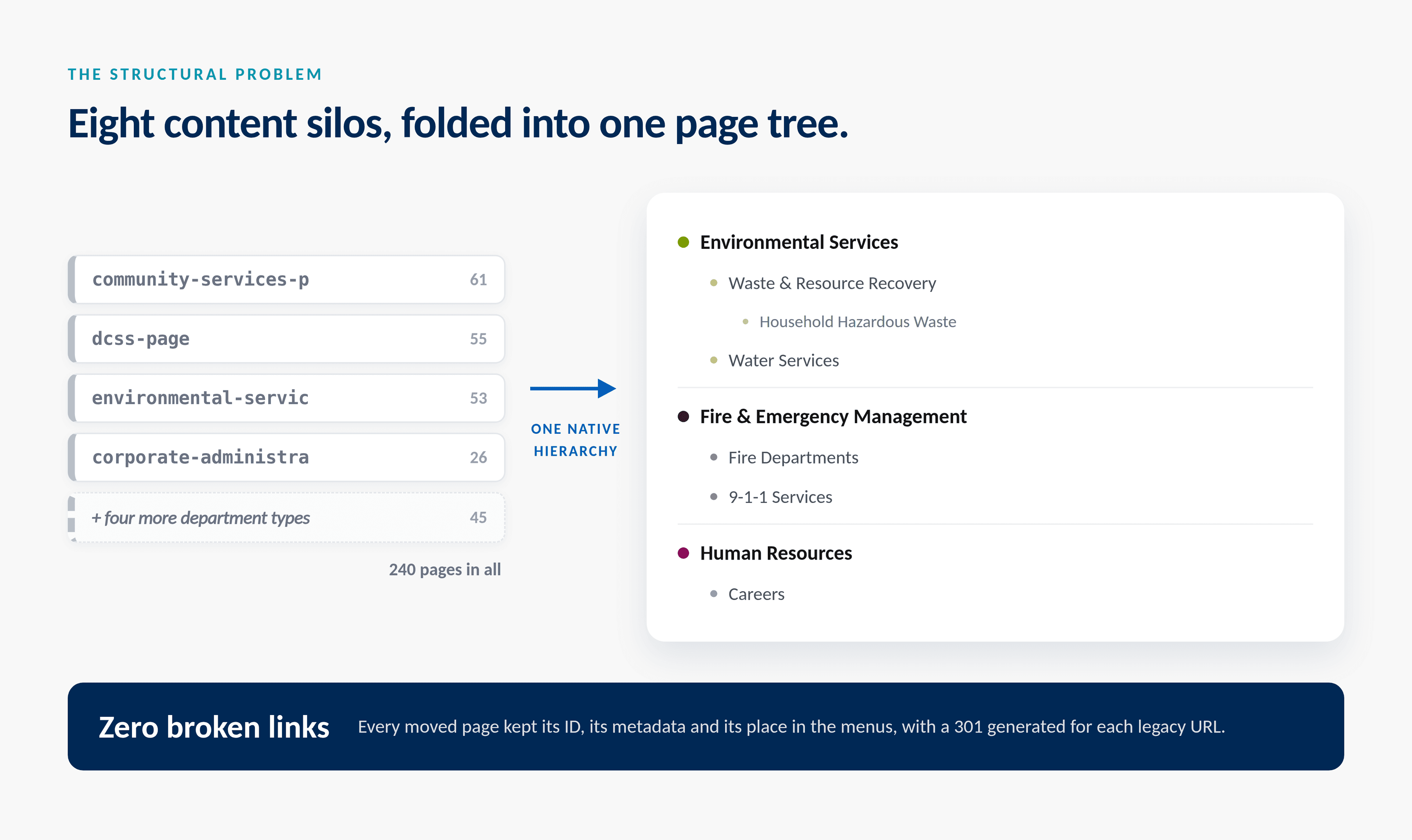
Eight legacy department content types folded into a single page hierarchy
Field note

Eight silos, one page tree

Underneath the surface, the content had grown into eight separate department content types, roughly 240 pages that could not see one another. Navigation, theming and search all had to be special-cased per department, which is why nothing about the old site felt consistent.

We folded the whole thing into one native page hierarchy. Every page kept its ID, its metadata and its position in the menus, and every legacy address got a redirect written for it, so nothing that had been linked, bookmarked or printed on a notice board broke on launch day.

Detail

What we built

WordPress was the platform they asked for. What we handed over sits closer to a small system than a theme:
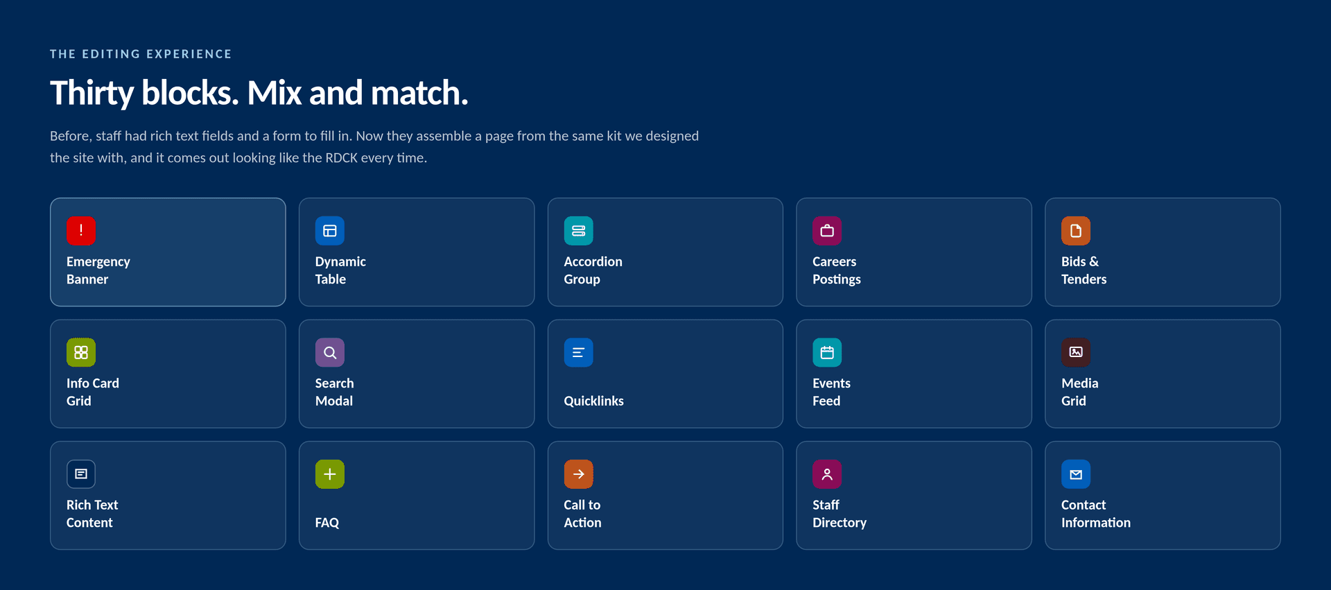
  • A library of about thirty editor blocks, so staff assemble pages from the same kit we designed the site with
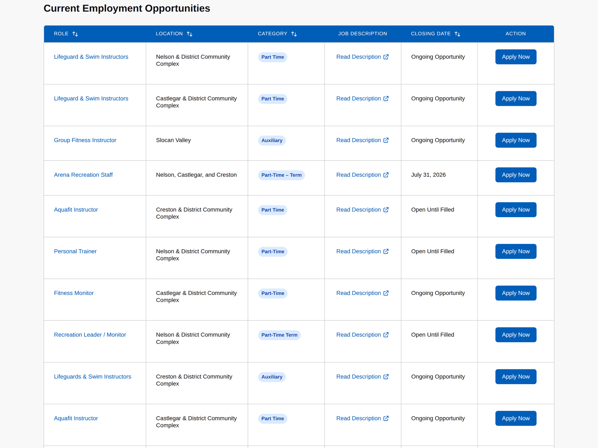
  • A careers system with a sortable, filterable job table that the HR team runs in-house instead of renting a job board
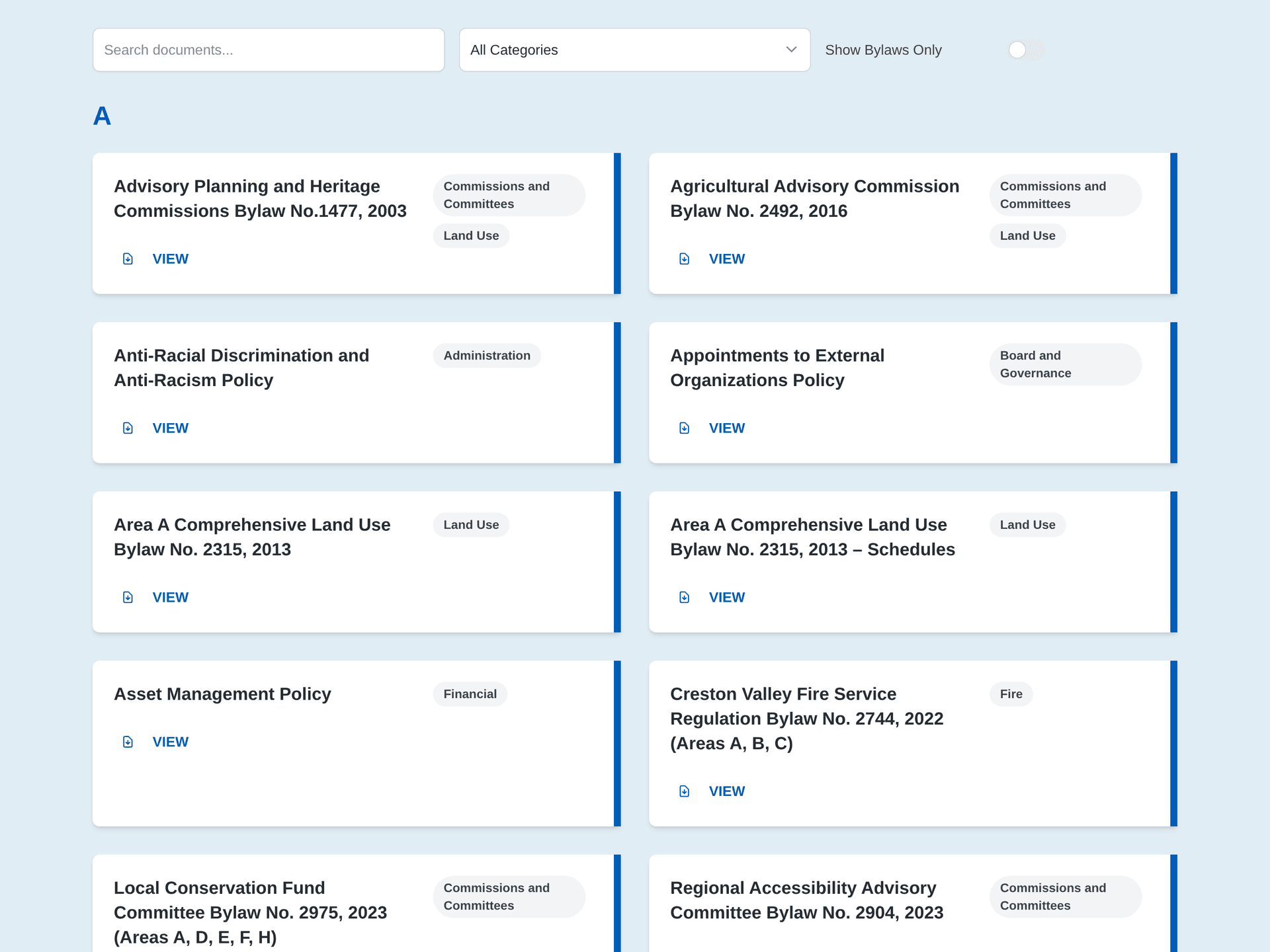
  • A bylaws and policies library of nearly 150 documents, filtered live in the browser by keyword, category and letter
  • A bids and tenders listing that flips itself to closed when the deadline passes
  • Emergency alert banners with priority levels, publishable in about a minute from one settings screen
  • An events system on The Events Calendar with custom templates, filtering and calendar views
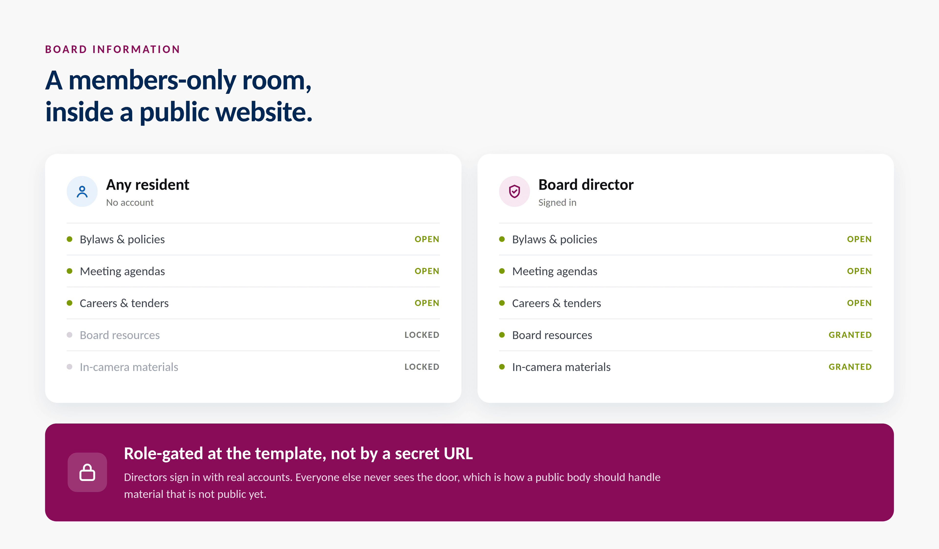
  • A members-only resource area for board directors, gated by real authenticated accounts
The careers table, sortable by role, location, category and closing date
The bylaws and policies library with live keyword, category and letter filtering
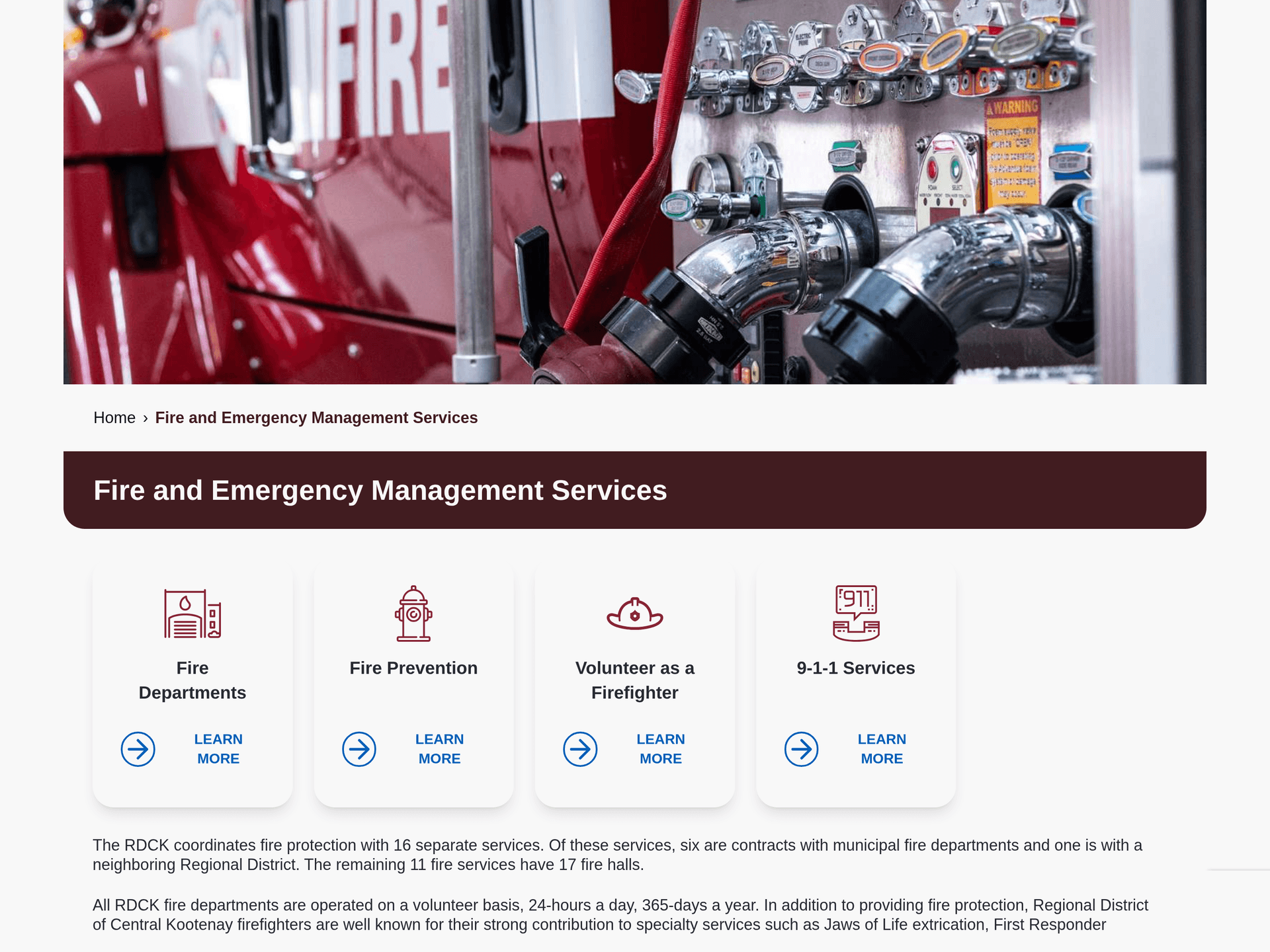
The Fire and Emergency Management department page in its own colour
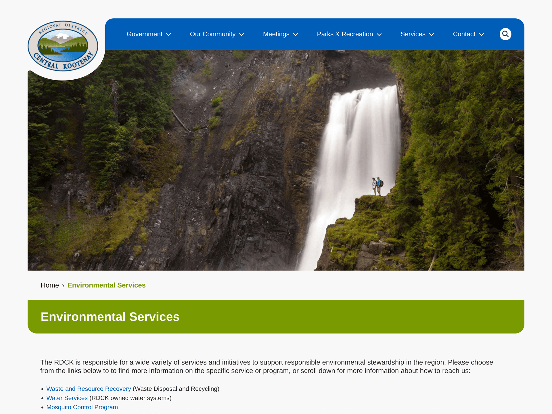
The Environmental Services department page in its own colour
Detail

One kit, drawn from scratch

The RDCK kept their crest and their blue. Everything else came from us: the palette logic, the type scale, the card and button treatments, the oversized headings, the rounded blue chrome, and the mountain motifs that quietly tie the whole thing back to the Kootenays.

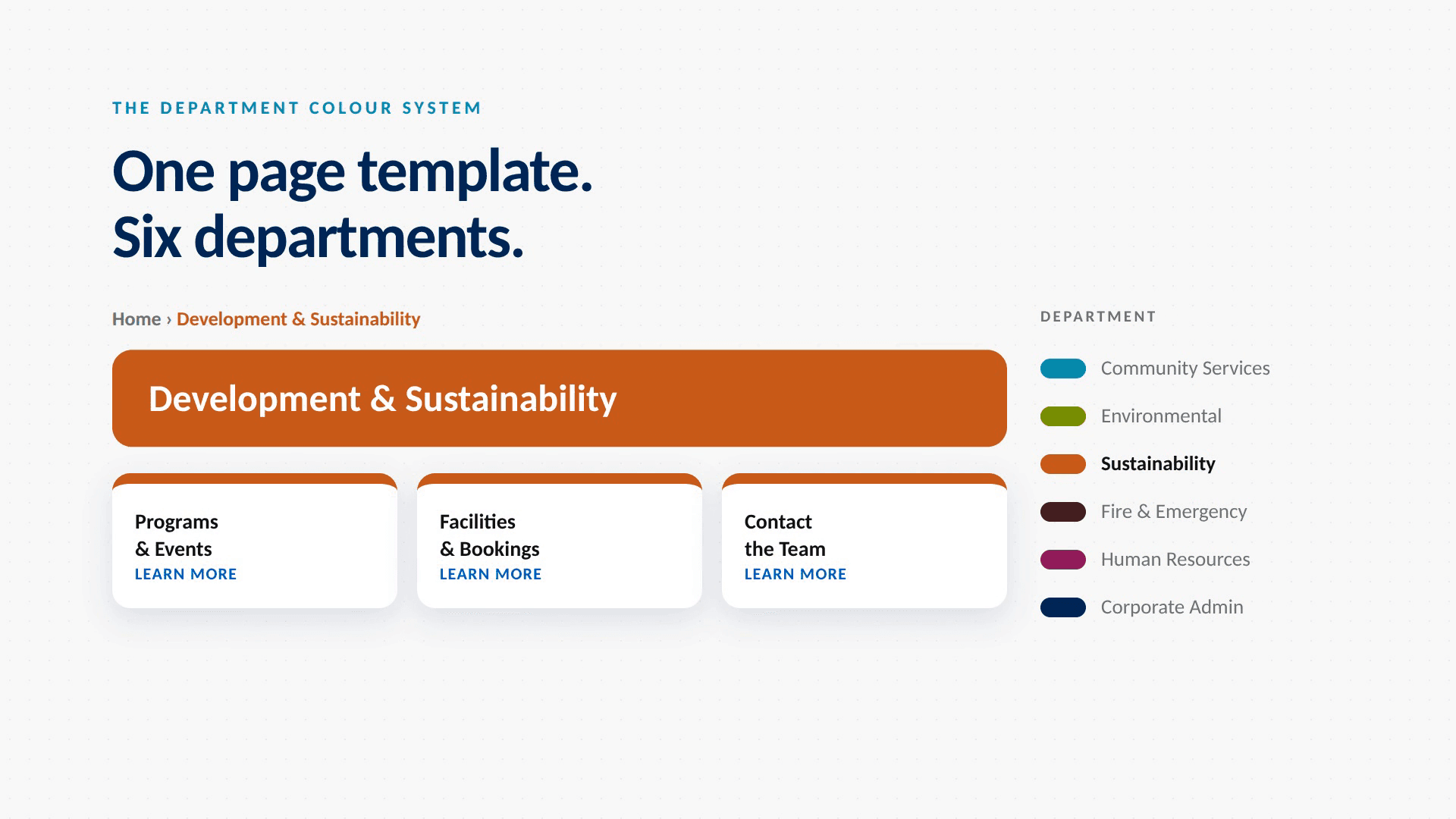
The part we are fondest of is the department colour system. Each department carries its own accent, and a page works out which one to wear from where it sits in the page tree. Staff never choose a hex code. They move a page and the colour, the sidebar and the breadcrumbs all follow it.
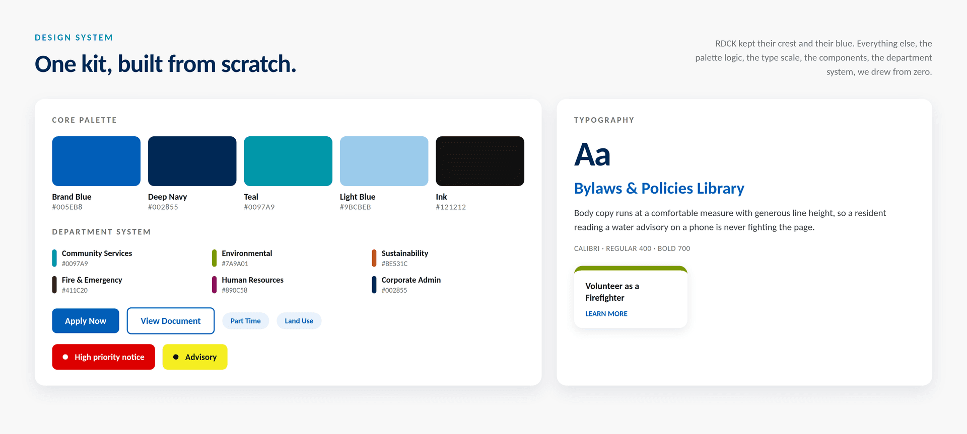
The RDCK design system: core palette, department colours, type and components
The block library staff build pages from
One page template shown in each department's colour
Public resources open to everyone, board materials gated behind authenticated accounts
Field note

A locked room inside a public website

Board directors need somewhere to read material that is not public yet. We built that into the site rather than beside it: a resources area gated at the template by real authenticated accounts, not a secret link that gets forwarded around.

Residents never see the door. Directors sign in and find everything where they expect it. For a public body handling material on its way to becoming public, that distinction matters.

Measured outcomes

The shape of it

A sense of what moved, and what the team runs now.

01
245
pages in a single hierarchy, in place of eight disconnected silos
02
149
bylaws and policies, searchable and filterable in the browser
03
557
events carried across, alongside 720 news posts
04
30
editor blocks the RDCK team builds pages with
05
0
broken addresses, with a redirect written for every legacy URL
Detail

The other half of the picture

The main site is one of two things we have built with the RDCK. The other is RDCK Engage, their public engagement platform, which they had been renting at enterprise prices until we rebuilt it as a lean WordPress application they own outright. Read the RDCK Engage case study for that side of the work.

In closing

Built for the people who run it

A regional district is not a brand campaign. It is water advisories, job postings, bylaws and meeting agendas, every day, for 62,000 people spread across a lot of mountain. The best result we could hand over was a website their own team can keep current without ever calling us.

Planning a migration?
The RDCK crest above the Kootenay ridges

MORE PROJECTS

The AKBLG mark over the Kootenay ridges
BrandWebsite DesignWebsite Development+1

AKBLG

A full rebrand and website rebuild for the association that represents thirty local governments across the Kootenay and Boundary region. We drew a new identity from the mountains, water and sun already in their name, then built it into a low maintenance open source platform their own small team runs, convention after convention.

Explore
The Pain Connect maple leaf network mark on deep teal
Website DesignWebsite DevelopmentSoftware Development

Pain Connect

Pain Connect is the Chronic Pain Network's national platform for connecting Canadians to pain research. It is a website and a working micro application: a searchable directory of studies, a database that matches people to them, an admin portal, and the email flows that tie it all together. Built for McMaster University's Chronic Pain Network, so that the people who live with pain have a say in the research that shapes their care.

Explore
A fresh Maisie catering spread laid out to share
BrandCreativeStrategy+2

Maisie

Maisie Eatery brought something new to Calgary's Sam Centre: an elevated all day eatery with a cheeky, fairy tale heart. We built the whole brand, from name and packaging to website and launch, and it went on to win three MUSE Creative Awards.

Explore
See all projects
Paper Crane / Studio
CALGARYVANCOUVER·© 2026

A digital transformation studio building considered, durable web work for ambitious operators.

Services
  • Creative
  • Strategy
  • Website Development
  • Software Development
  • Business Automation
  • ─AI Automation
  • ─Workflow Automation
Navigate
  1. 01About Us
  2. 02Our Work
  3. 03Contact Us
Elsewhere
© 2026   PAPER CRANE MEDIA LTD.
Terms & Conditions
Privacy Policy