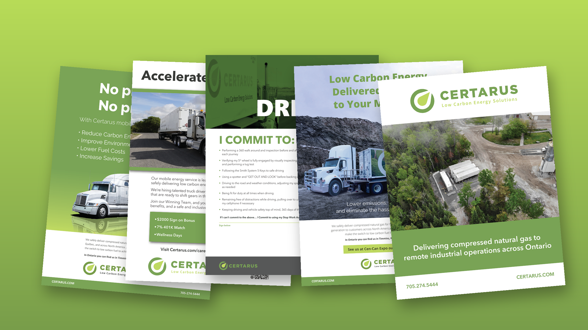
Ads, recruitment and brand design for Certarus
Certarus trucks compressed natural gas to mines, remote camps and industrial sites across North America, from offices in Calgary and Houston. From 2021 to 2024 we were its design team on call: magazine and airport ads, recruitment campaigns, safety pieces, a PowerPoint template and a corporate style guide.
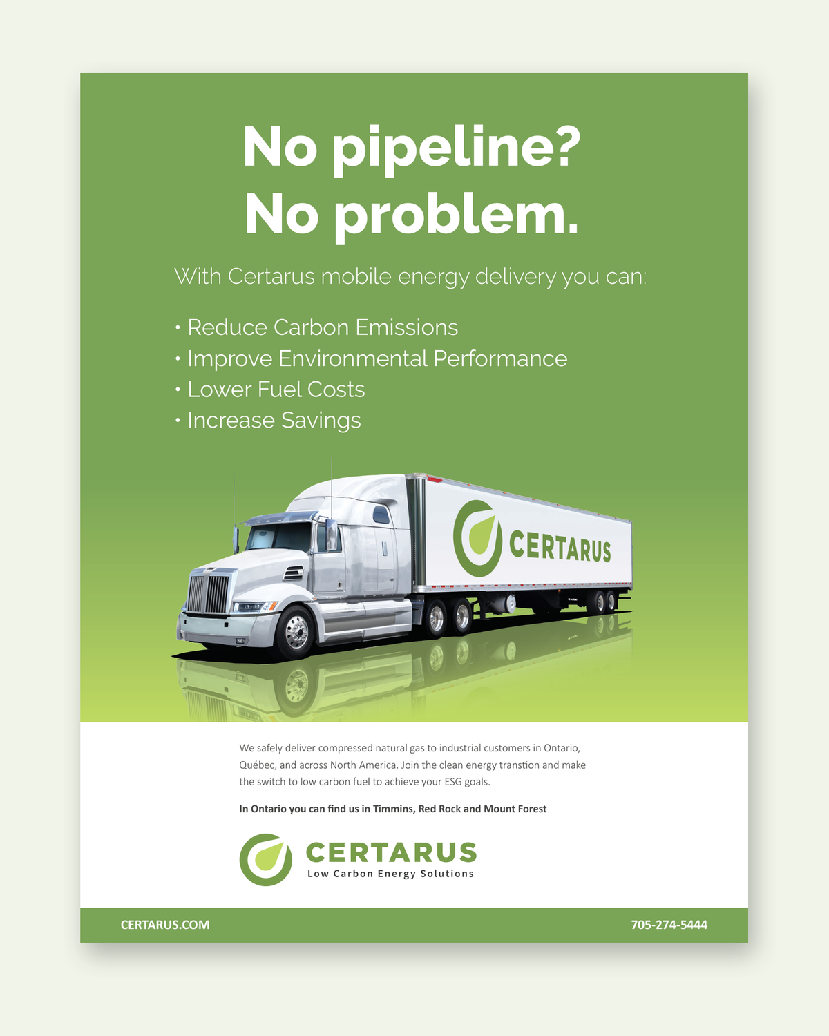
No pipeline? No problem.
Certarus brings natural gas to the places a pipeline doesn't reach. In October 2021 its marketing manager came to us with three things he needed quickly: a magazine ad for Ontario, a branded Tim Hortons card, and a scratch-and-sniff card that teaches workers what a gas leak smells like.
Two days later he had concepts for all three. He picked one of each, sent back a few copy changes, and kept sending more work.
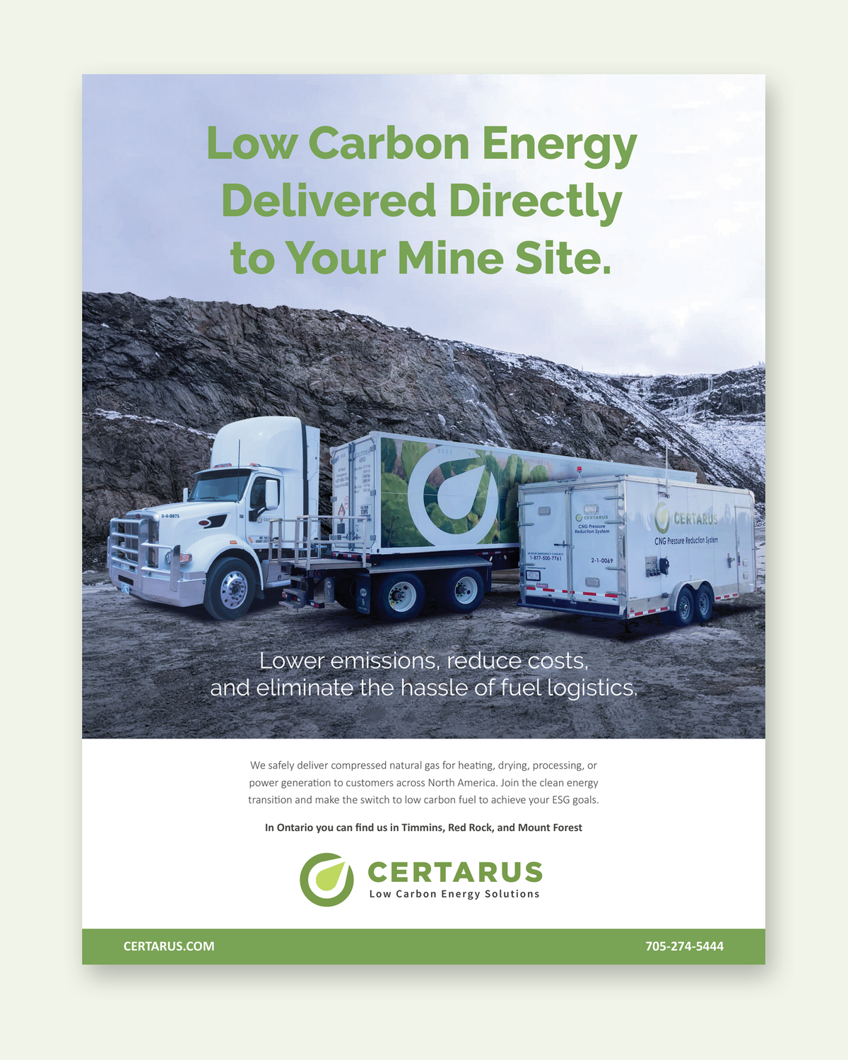
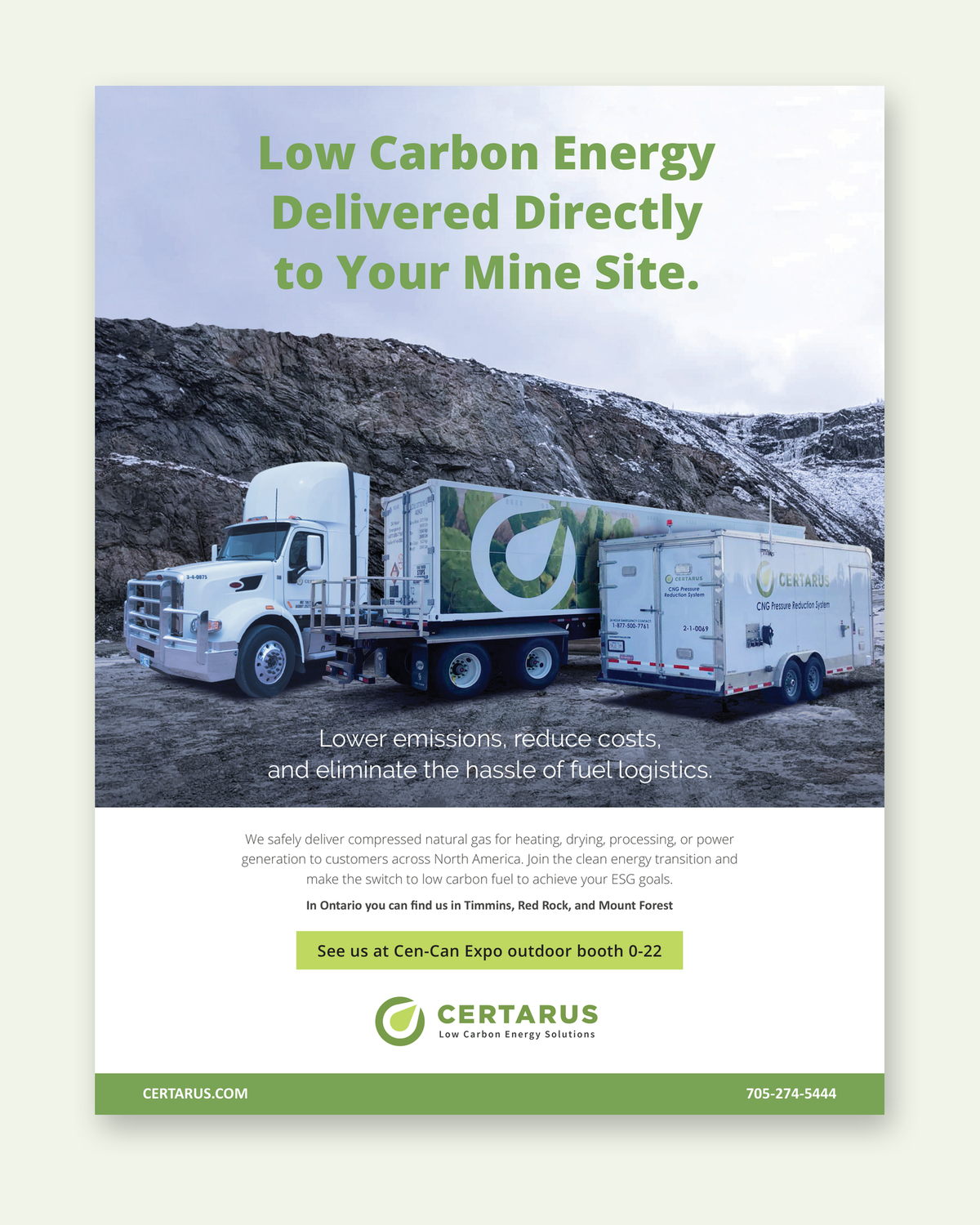
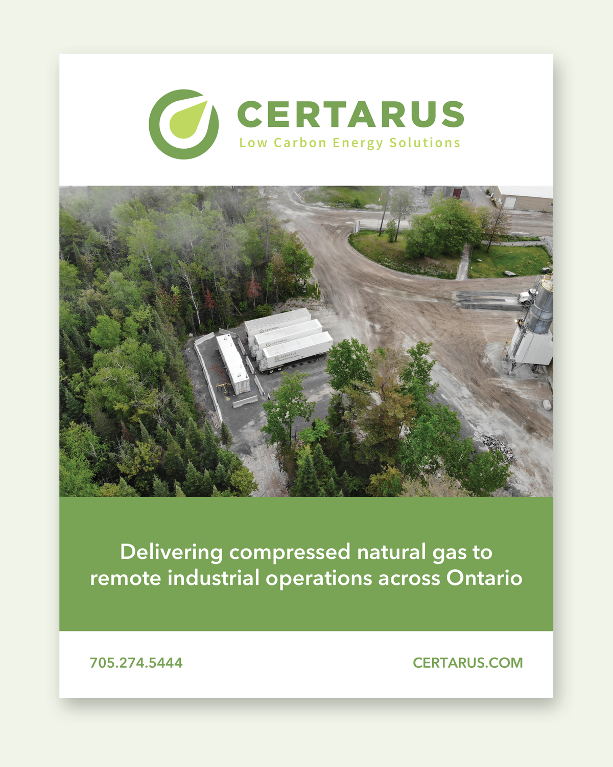
Ads for the mine site and the baggage hall
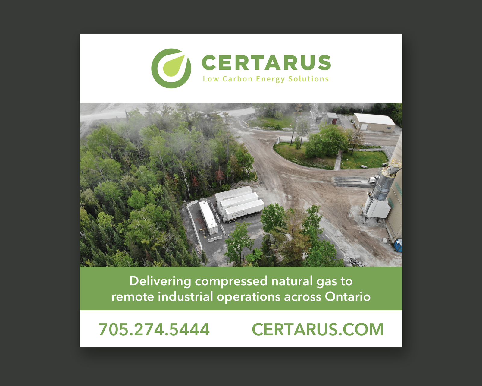
We designed full-page ads for Mining Life and other trade publications, a half-page ad in English and French for Ontario and northwestern Québec, and a large sign in the baggage hall at Calgary's airport.
Certarus came back to us whenever an ad needed updating, from 2021 to 2024.
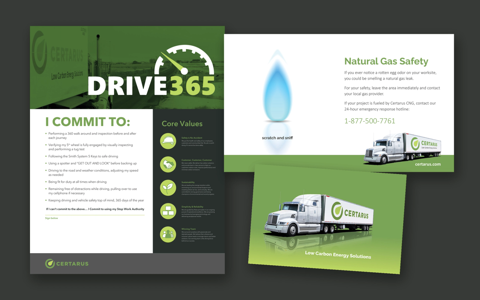
Safety pieces
The scratch-and-sniff card puts the smell of a gas leak and the 24-hour emergency line on one card. The I Commit poster turns the Drive365 driving rules into a pledge drivers sign at their facility. We also designed a branded Tim Hortons card.
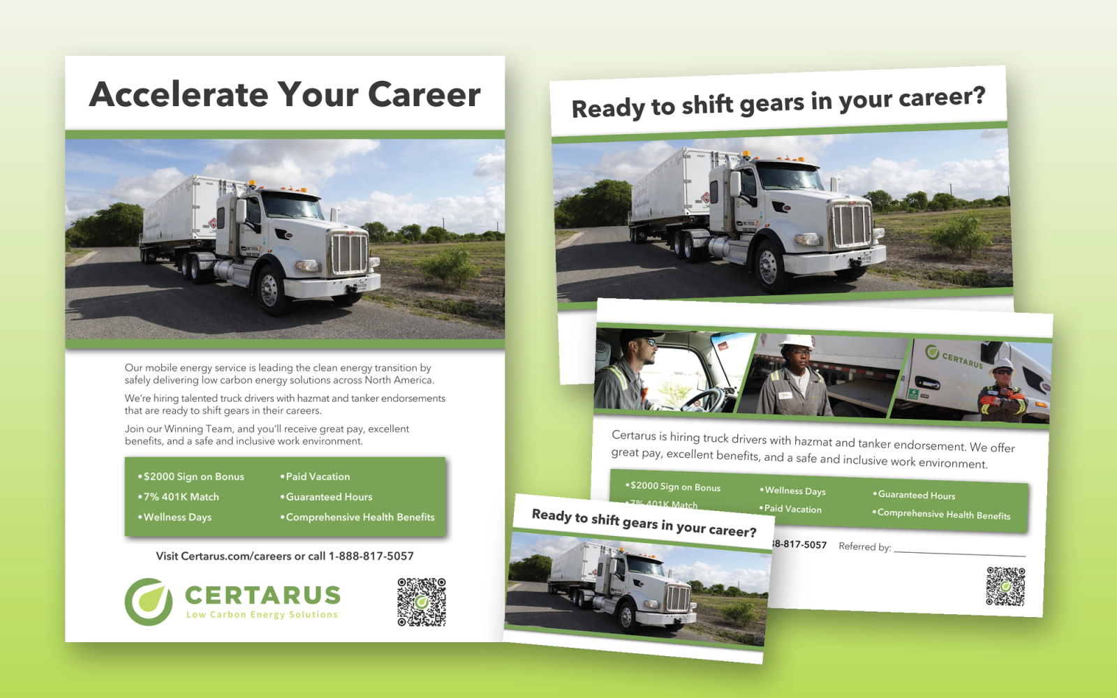
Recruiting for 90 positions
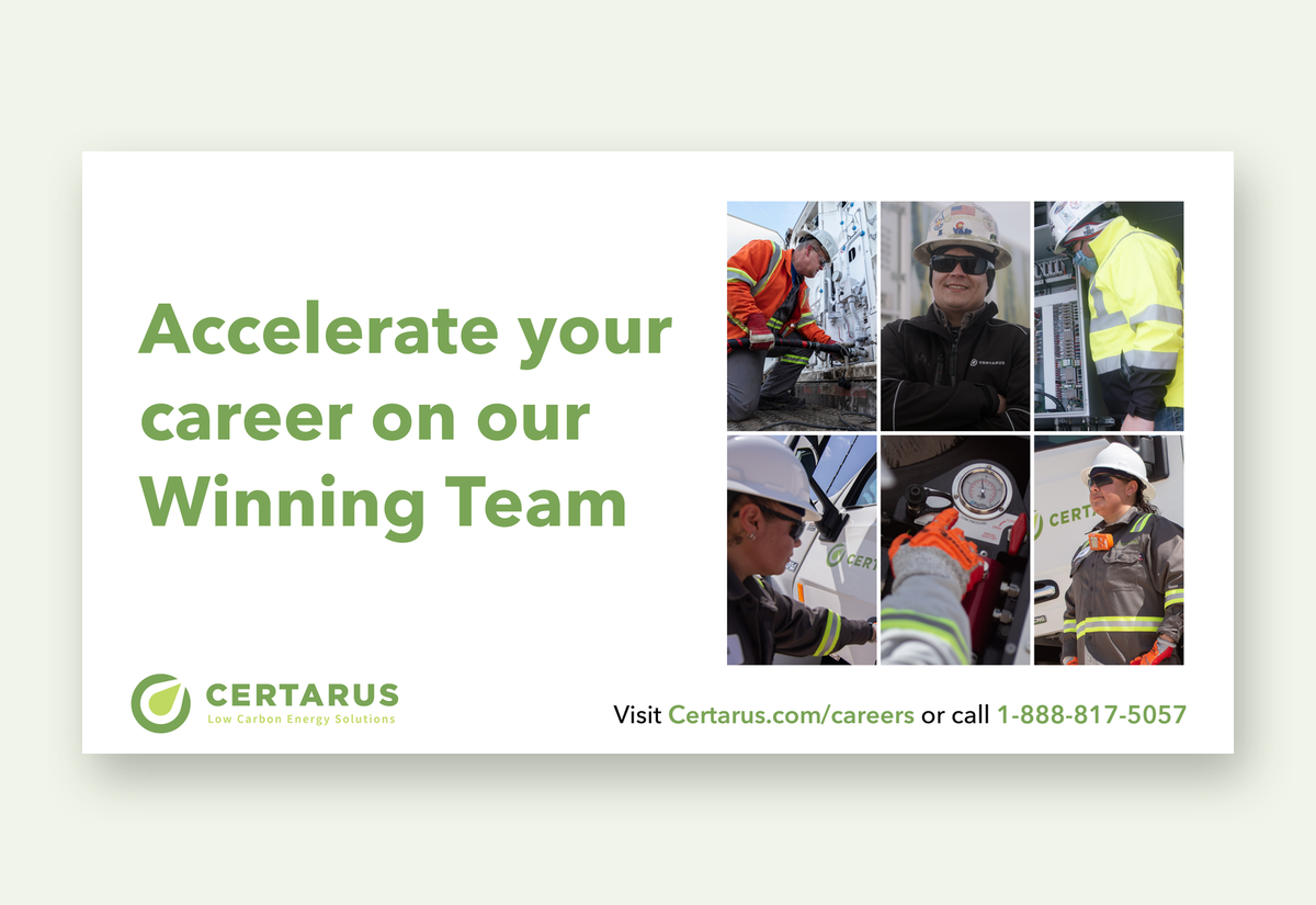
In late 2021 Certarus was recruiting for 90 open positions. We made three LinkedIn ads: one for drivers, technicians and engineers, one for management, sales and safety, and a general one. The ads use crowds of people to form the Certarus drop logo and one of its trucks.
In 2022 we added a recruitment poster for truck stops and a matching postcard that drivers hand to people they'd like to bring on, with a line for the driver's name so they get the referral bonus.
PowerPoint template
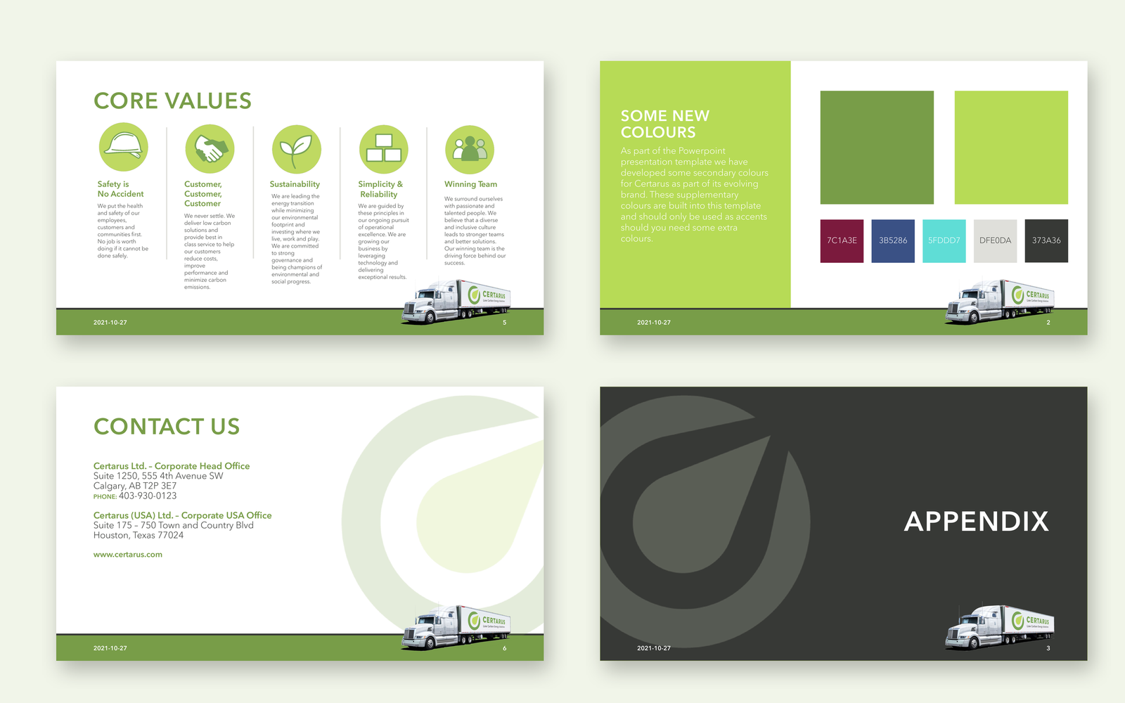
Certarus wanted staff to build on-brand presentations without design skills. We rebuilt its PowerPoint template with master slides, consistent bullets and readable type, and added secondary colours for the brand to grow into.
Corporate style guide
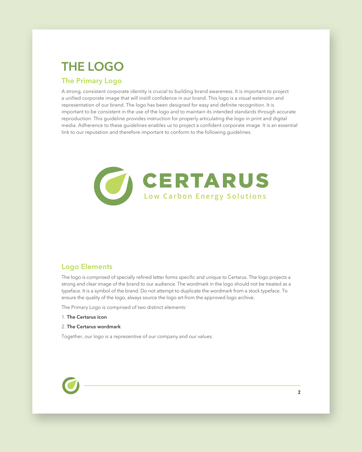
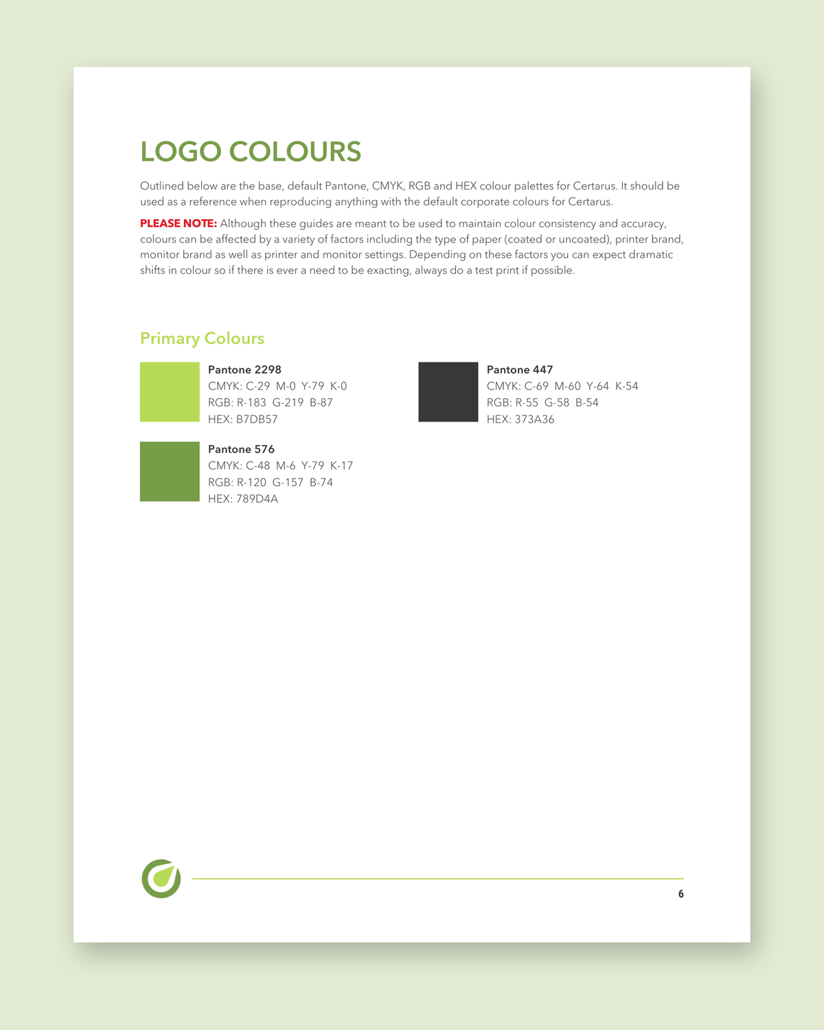
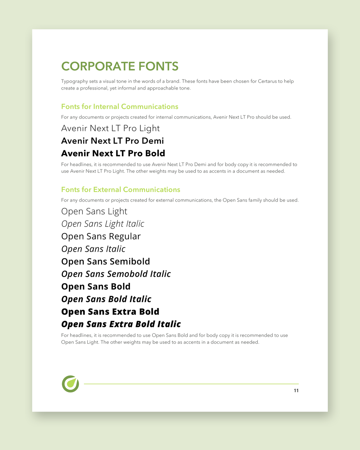
In 2022 we put together the Certarus corporate identity style guide: logo versions and misuse, colours, clear space, minimum sizes, and fonts for internal and external use.
We recommended using less of the dark grey, which reads as carbon for a low-carbon company. Certarus kept it, since it had just gone onto the new website and merchandise, so we worked it into the template and the guide.
The work in numbers
- of design for Certarus, from late 2021 to 2024
- 3 years
- finished pieces, from wallet cards to an airport sign
- 20+
- from the first brief to concepts for three pieces
- 2 days
- open positions behind the recruitment campaign
- 90
A design team on call
Certarus needed designers who knew the brand and could turn around an ad, a poster or a sign whenever one came up. We do the same for energy and industrial companies of every size.
More projects
See all projects
Media and Entertainment
SocialNext
SocialNext runs digital-marketing and social-impact events across Canada — conferences, summits and speaker series. We'd supported them for years, first in Notion, then in Airtable. In 2026 we rebuilt the whole operation as a bespoke application they own: the first product Paper Crane has shipped end-to-end on our own software substrate.
Read
Non-Profit
PCNA
Pancreatic cancer is one of the deadliest cancers on the planet. But PCNA's message was diluted across two brands and two websites. We unified them into one uncompromising home that treats the stakes with the seriousness they deserve.
Read
Non-Profit
CCASA
For more than 25 years, Calgary Communities Against Sexual Abuse has been a steady presence for people affected by sexual violence. When they were ready to carry that work into a new decade, they came to us for a brand that felt less like a help line and more like a friend. We rebuilt their identity from the ground up.
Read