NavigateMENU / 04
More
Elsewhere
Software Development
Website Design
Digital Infrastructure
Pain Connect worked so well that the Chronic Pain Network came back for a second platform. We designed and built Pain Atlas, the most comprehensive directory of pain researchers in Canada: self-managed profiles, a searchable map of who's working where, moderated messaging, and a full admin console behind it.
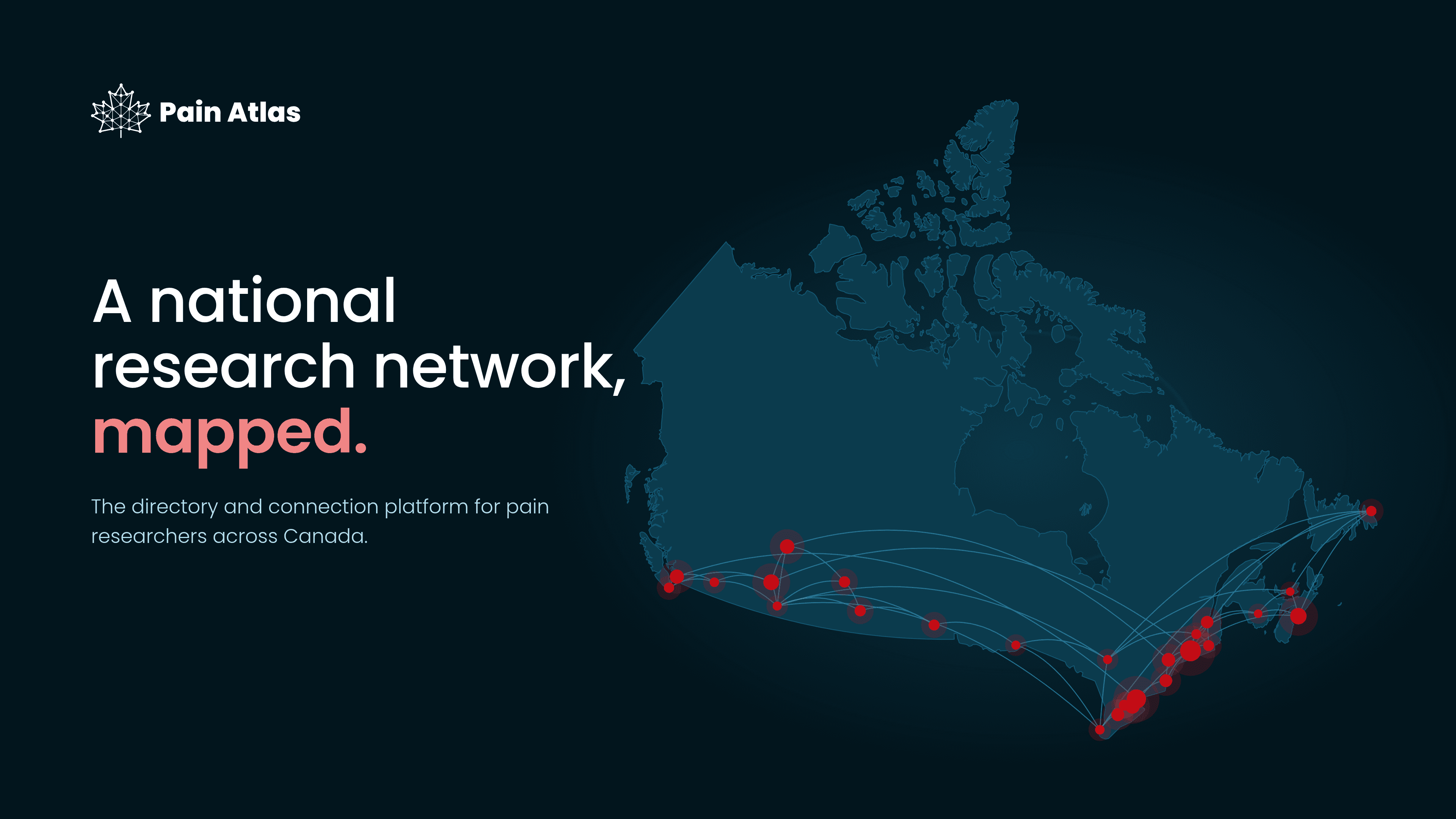
We built Pain Connect for the Chronic Pain Network, a platform that connects people living with chronic pain to the researchers and studies looking for them. It took off, and it worked.
So CPN, a national network based at McMaster University, came back to us with the next step. Pain Connect served patients. Pain Atlas would serve the researchers themselves: one national place to show their work, find each other, and build teams.
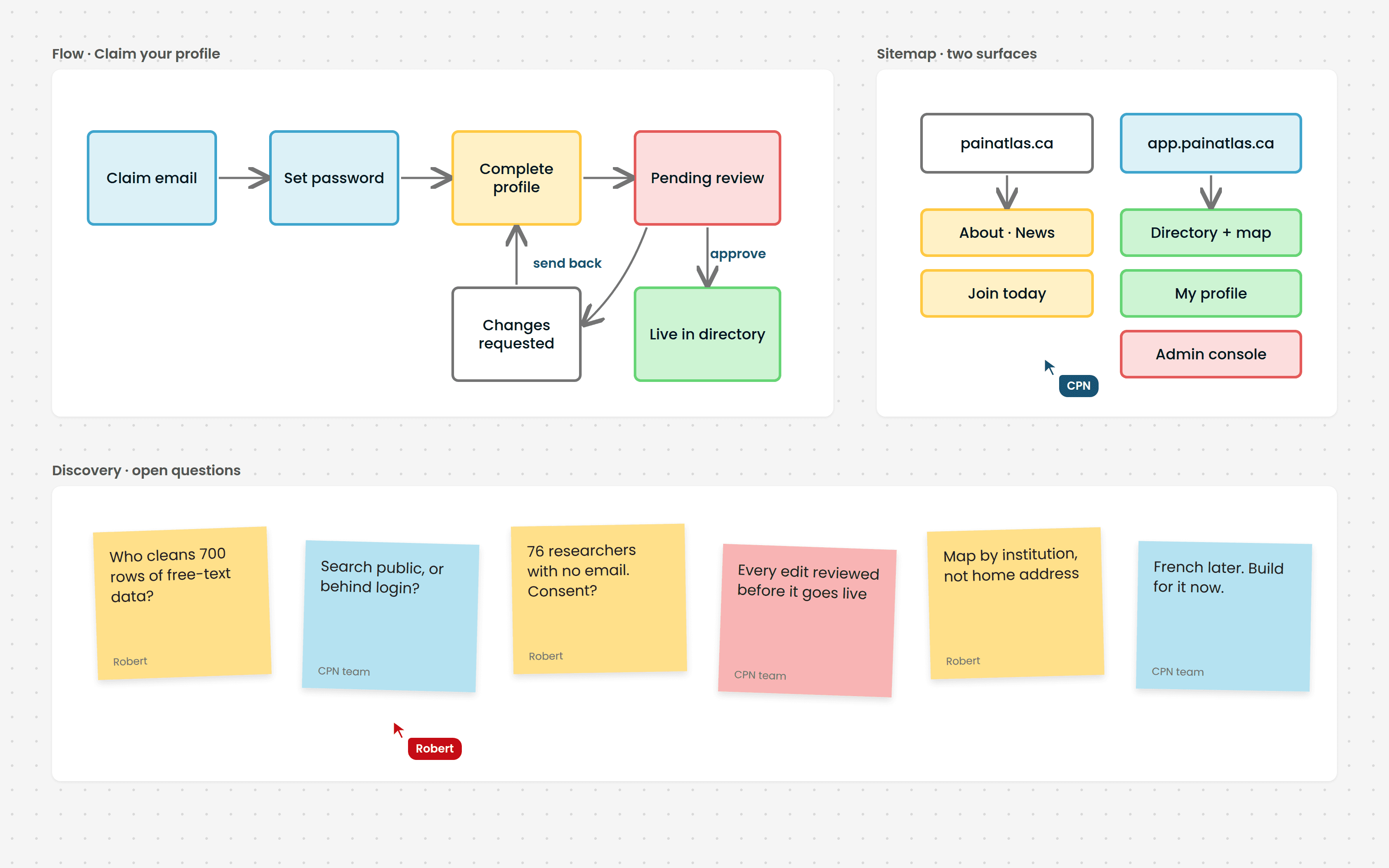
We started on the board, not in code. User flows for claiming a profile, a sitemap split across two sites, and a wall of open questions we worked through with the CPN team.
Those answers shaped the product. Search moved behind a login, every change goes through review, and the map shows institutions, never home addresses.
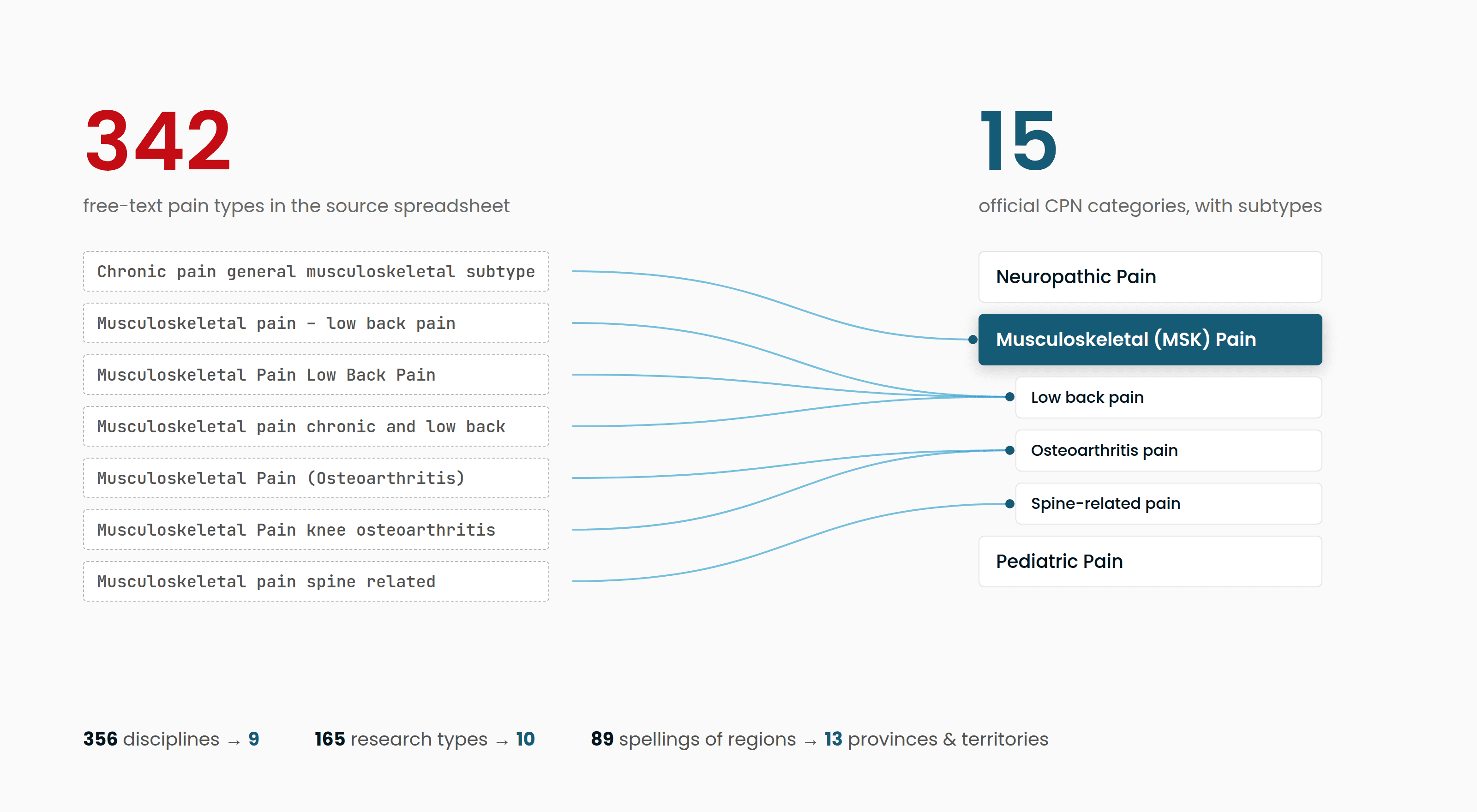
CPN's starting point was a spreadsheet of about 700 researchers, built by hand over years. It described pain types 342 different ways.
We mapped all of it onto CPN's official categories, so every profile arrived clean and searchable on day one.
A full platform, built to last and to grow with the network:
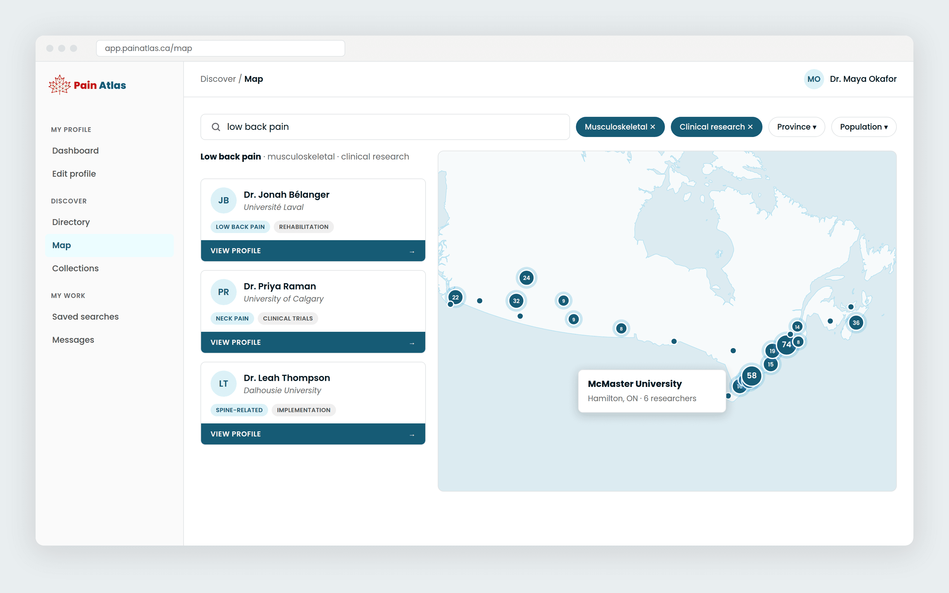
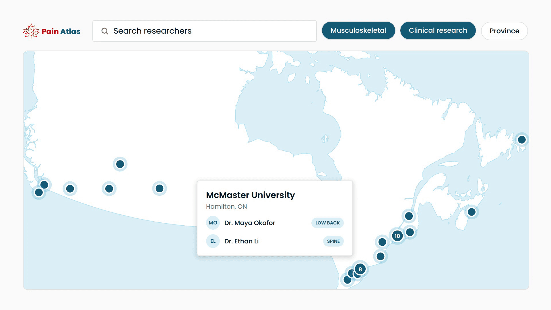
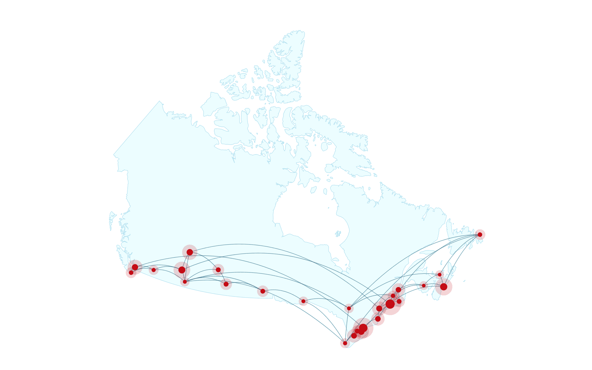
The directory and the map are two views of the same search. Pick a pain type or a discipline and the map narrows with you, right down to the institutions doing that work.
A list of names becomes a picture of who is working on what, and where.
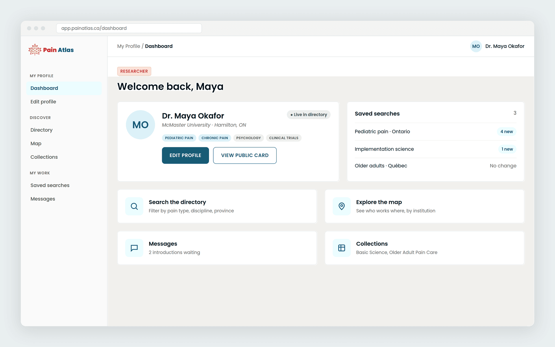
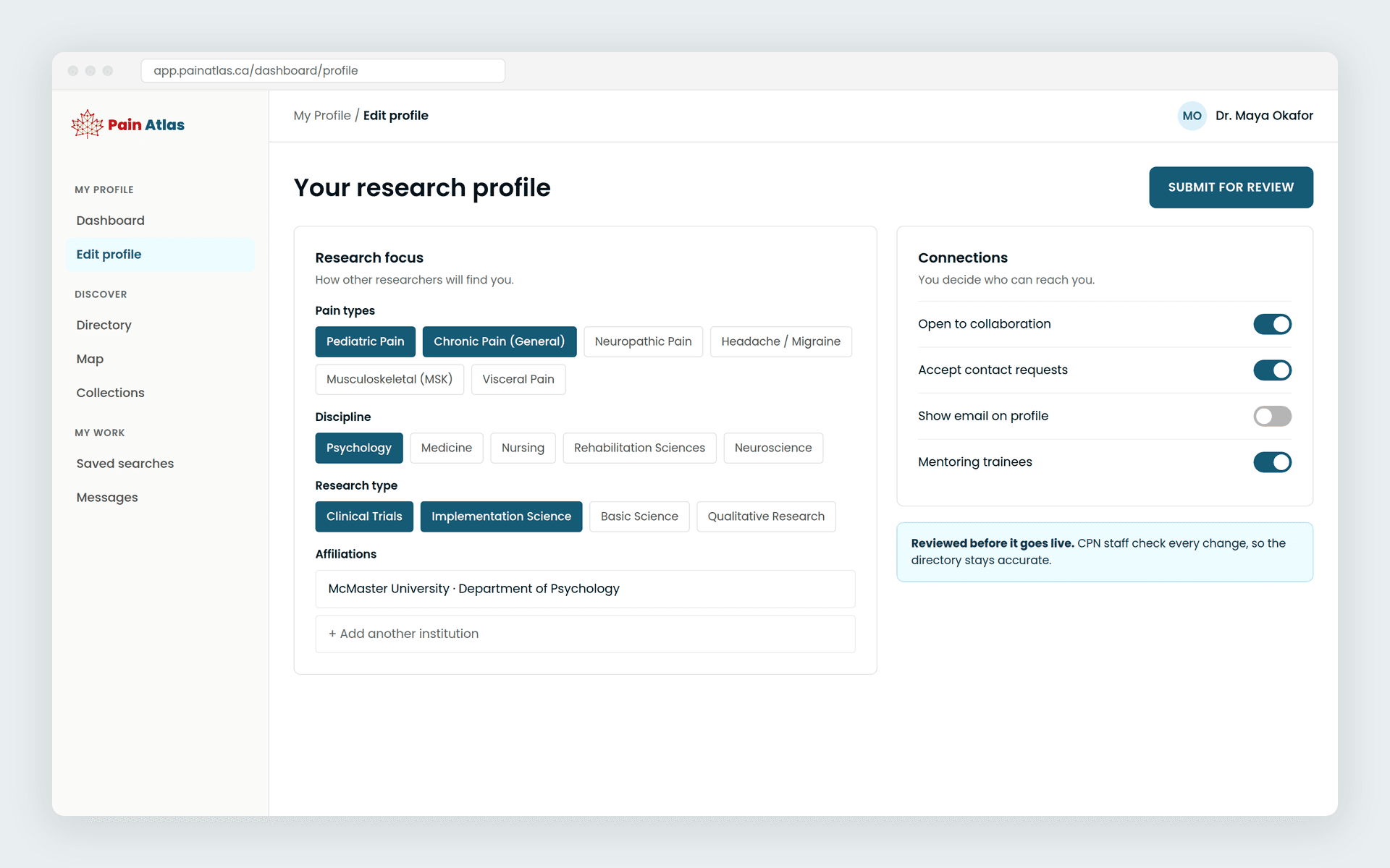
Researchers and CPN staff use the same system, but they see very different things.
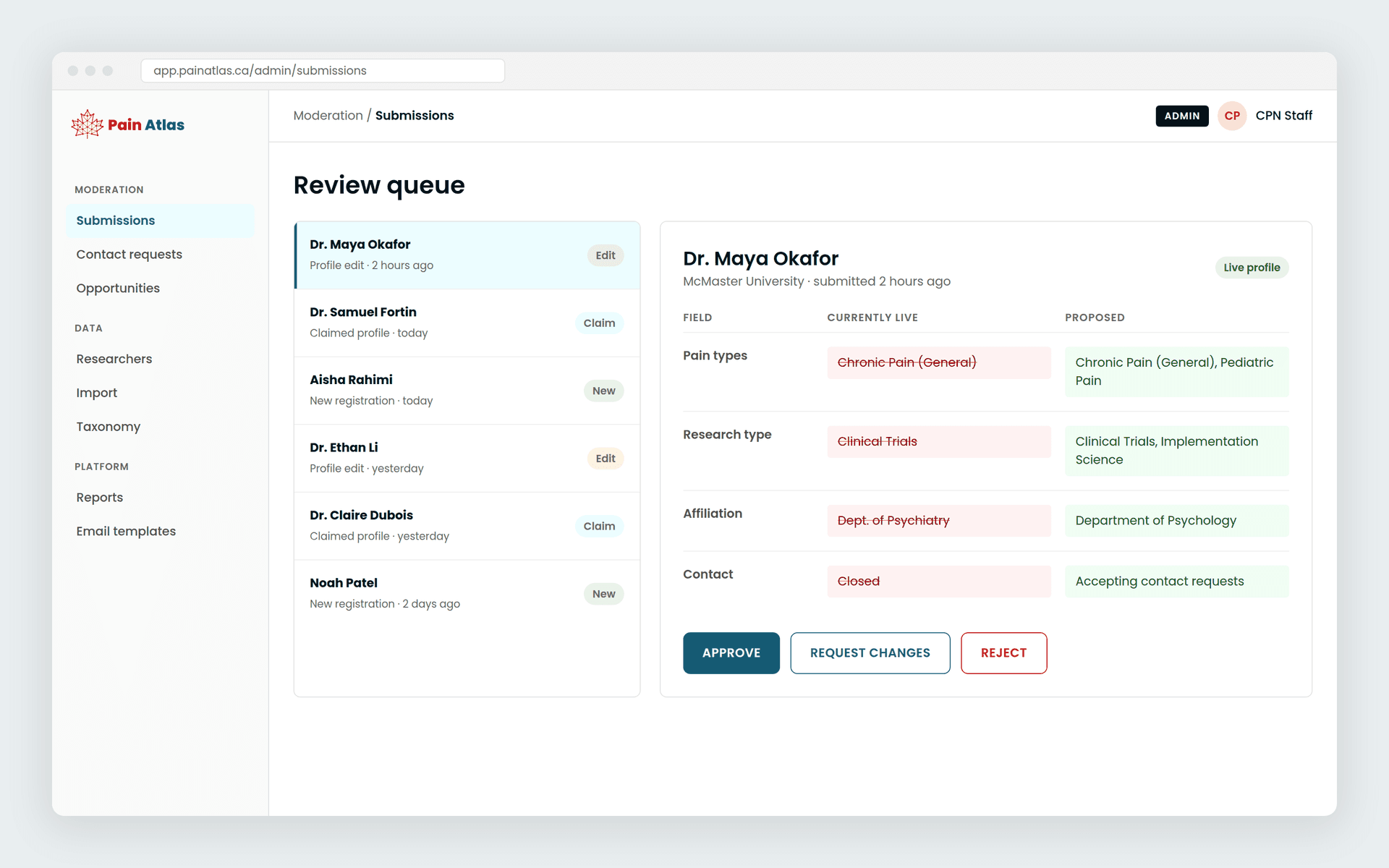
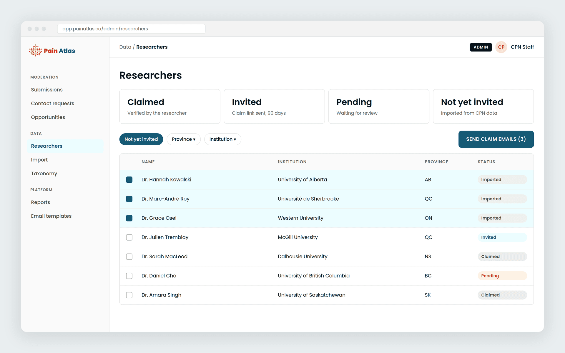
Researchers get a calm, simple space to build their profile, choose who can reach them, and find collaborators. Moderators get the tools to keep a national directory trustworthy: a review queue that shows exactly what changed, bulk claim invitations, imports and reporting.
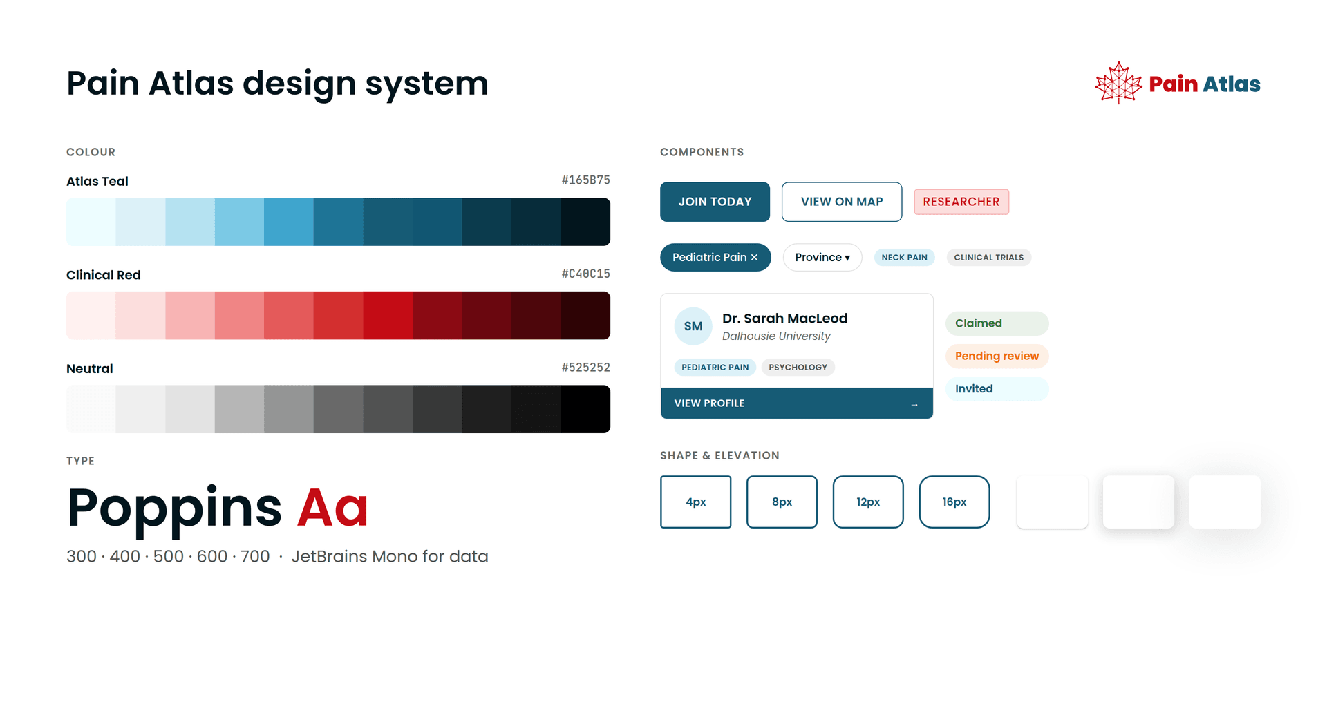
CPN brought the Pain Atlas identity. We turned it into a full design system, with colour ramps, type, components and states, so every screen feels like one product.
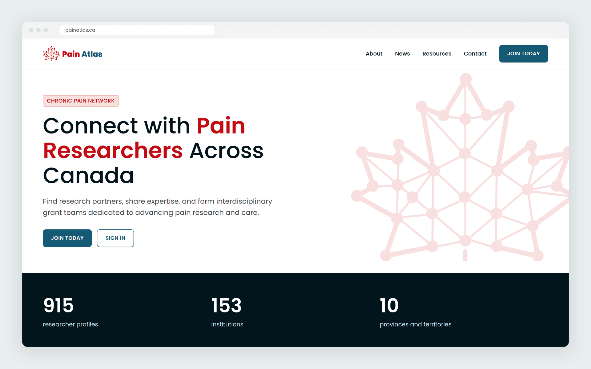
The public site at painatlas.ca runs on the same system. It's where researchers first sign up, and the CPN team edits it themselves.
It's early days, and the community is already busy. Hundreds of researchers have claimed and updated their profiles and started reaching out to each other.
Next, we're planning ways to bring Pain Atlas and Pain Connect closer together.
We design and build custom software that people log into because it helps them, with the admin tools to keep it running well. If you have a network or a dataset that deserves better, let's talk.
Related: Nonprofit website design